Voting period is over. Please don't add any new votes. Voting period ends on 14 Aug 2014 at 21:30:29 (UTC)
-
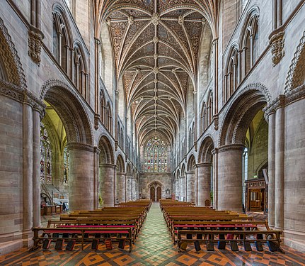
 The nave looking east
 -
 The nave looking west
 -
 The choir
 -
 The lady chapel


- Reason
- All four images are interesting and very detailed views of Hereford Cathedral's nave, choir and lady chapel respectively. I think the view of the choir is particularly beautiful.
- Articles in which this image appears
- Hereford Cathedral
- FP category for this image
- Wikipedia:Featured pictures/Places/Interiors
- Creator
- User:Diliff
- Support as nominator – Ðiliff «» (Talk) 21:30, 4 August 2014 (UTC)
- When I hear Herford, I think SAS... but that's from being a Tom Clancy fan Comment - The nave, looking east, seems to lean outwards on the lefthand side (my issue here). There's a bit of warping near the edges, but considering the apparent angle that's okay (and it's only really distracting when you look at the heads on the wall). Is the actual church not straight? — Crisco 1492 (talk) 00:49, 5 August 2014 (UTC)
- It's rare for these churches to be perfectly straight and the columns are of the Norman era; it's fundamentally a 12th century building, although various ruins and other disasters make it a bit of a mishmash of styles. I'm not sure what you mean by the nave looking east seeming to lean outwards though. Do you mean the columns or the walls behind the columns? The columns appear to bulge ever so slightly in the middle, but fundamentally appear straight to me (no significant lean). Did you measure the lean or was it just a visual perception of lean? Ðiliff «» (Talk) 07:59, 5 August 2014 (UTC)
- No, not measured. I think the appearance of a lean in the thumbnail is coming from the contrast between how three and a third panes of glass are visible in the left side whereas only three (and a tenth, if I'm feeling generous) are visible on the right; were you perhaps slightly off center? This may also be the lack of contrast between the white windows and grey columns/walls. That being said, if there is lean it's negligible at full size (measuring it, I see the bulge, but no real lean) and the technical quality on all of the images is up to your usual standard. — Crisco 1492 (talk) 08:34, 5 August 2014 (UTC)
- These inconsistencies in the symmetry are a continual bane of my work. Sometimes, yes, it's because I wasn't quite centred properly, sometimes it's because the building itself, or the seating in the nave, etc is not centred properly. It only takes a few centimetres off-centre to really mess with the symmetry, particularly because the wider the view, the more prominent it becomes. Sometimes the columns themselves are not precisely aligned or are staggered on each side, and it could be the case in this image (or it could be that the window is not aligned with its opposite). Another frustrating thing is that the nave and choir/presbytery/chancel are often not along exactly the same axis. I just got back from part II of my Cathedrals project (working on the photos currently) and there were some great examples of this. You would expect to be able to look down the aisle of the nave and straight through the middle to the end of the cathedral, but quite often they deviate slightly, either angled away or at the same angle as the nave but off centred. I actually mentioned it to one of the volunteer guides at a cathedral and she, with a twinkle in her eye, said that it is usually explained as representing the figure of Christ on the cross (as most cathedrals are cross-shaped when seen from above), slumped to one side! I suggested back to her that it could be a convenient excuse for poor surveying and she agreed. Anyway, I digress, but perfect symmetry is usually little more than an ideal. Ðiliff «» (Talk) 09:14, 5 August 2014 (UTC)
- Sounds like it! If I'm ever in Europe, I'll have to take a look at some of these old churches. They are all quite beautiful – even if they're a little off centre.
 — Crisco 1492 (talk) 12:20, 5 August 2014 (UTC)
- Sounds like it! If I'm ever in Europe, I'll have to take a look at some of these old churches. They are all quite beautiful – even if they're a little off centre.
- These inconsistencies in the symmetry are a continual bane of my work. Sometimes, yes, it's because I wasn't quite centred properly, sometimes it's because the building itself, or the seating in the nave, etc is not centred properly. It only takes a few centimetres off-centre to really mess with the symmetry, particularly because the wider the view, the more prominent it becomes. Sometimes the columns themselves are not precisely aligned or are staggered on each side, and it could be the case in this image (or it could be that the window is not aligned with its opposite). Another frustrating thing is that the nave and choir/presbytery/chancel are often not along exactly the same axis. I just got back from part II of my Cathedrals project (working on the photos currently) and there were some great examples of this. You would expect to be able to look down the aisle of the nave and straight through the middle to the end of the cathedral, but quite often they deviate slightly, either angled away or at the same angle as the nave but off centred. I actually mentioned it to one of the volunteer guides at a cathedral and she, with a twinkle in her eye, said that it is usually explained as representing the figure of Christ on the cross (as most cathedrals are cross-shaped when seen from above), slumped to one side! I suggested back to her that it could be a convenient excuse for poor surveying and she agreed. Anyway, I digress, but perfect symmetry is usually little more than an ideal. Ðiliff «» (Talk) 09:14, 5 August 2014 (UTC)
- No, not measured. I think the appearance of a lean in the thumbnail is coming from the contrast between how three and a third panes of glass are visible in the left side whereas only three (and a tenth, if I'm feeling generous) are visible on the right; were you perhaps slightly off center? This may also be the lack of contrast between the white windows and grey columns/walls. That being said, if there is lean it's negligible at full size (measuring it, I see the bulge, but no real lean) and the technical quality on all of the images is up to your usual standard. — Crisco 1492 (talk) 08:34, 5 August 2014 (UTC)
- It's rare for these churches to be perfectly straight and the columns are of the Norman era; it's fundamentally a 12th century building, although various ruins and other disasters make it a bit of a mishmash of styles. I'm not sure what you mean by the nave looking east seeming to lean outwards though. Do you mean the columns or the walls behind the columns? The columns appear to bulge ever so slightly in the middle, but fundamentally appear straight to me (no significant lean). Did you measure the lean or was it just a visual perception of lean? Ðiliff «» (Talk) 07:59, 5 August 2014 (UTC)
- Support set. Another great church interior. — Crisco 1492 (talk) 08:34, 5 August 2014 (UTC)
- Support set. A fantasy scenery. Brandmeistertalk 09:01, 6 August 2014 (UTC)
- I suppose the only thing that the third image is lacking is a throne made of swords... ;-) Ðiliff «» (Talk) 09:06, 6 August 2014 (UTC)
- Apparently:) Brandmeistertalk 09:16, 6 August 2014 (UTC)
- I suppose the only thing that the third image is lacking is a throne made of swords... ;-) Ðiliff «» (Talk) 09:06, 6 August 2014 (UTC)
- Oppose I didn't check them all in detail, but I think the processing needs to be toned down here, especially since EV wins over anything else here. It really has a strong "HDRish" signature, and I've checked that the cathedral doesn't necessarily look like that. The choir, which can be seen on the "nave looking east" and eponym pictures doesn't look consistent ; do I miss something? - Blieusong (talk) 18:00, 6 August 2014 (UTC)
- I think maybe you are missing something because I don't think it does look particularly HDRish. I mean, it is HDR, but doesn't look like typical overdone HDR renderings IMO. It's hard to compare directly to other images because these cathedrals look very different depending on the lighting conditions (direction and angle of sunlight, which lights are turned on etc). But here is an image of the nave, and I think it looks extremely similar. The only significant difference is that the choir lights are not turned on in my image. Regarding the inconsistent look of the choir between the nave shot and the choir image, I'm not sure. I don't think it's related to the processing though. I suspect that they have turned on the choir lighting between the nave shot and the choir shot, which has changed the white balance requirements. When there is a strong orange incandescent lighting, I usually reduce the white balance colour temperature so that it isn't so overwhelmingly orange. This has the effect of making the ambient light more blue. So basically, I think the difference is mainly due to the lighting changes and then the white balance changes to compensate for this. I haven't processed this image any differently to all the others. Yes, that doesn't mean that processing couldn't end up being too strong, but I look at these images and I don't think they misrepresent. I could go back and find the middle exposures and stitch it again using them and see if it ends up looking like the HDR version (but obviously with darker shadows and blown highlights) if that would help. Ðiliff «» (Talk) 20:54, 6 August 2014 (UTC)
- OK, here's the completely unprocessed, middle exposure stitch. As I said, the only adjustment that was made in Lightroom was the white balance adjustment of the RAW files prior to export. Everything else is 100% defaults, including linear tone curve (most people have medium contrast but I prefer to use linear for my tone mapping) for a slightly flatter contrast. I don't think it looks that different to the image on Wikipedia to be honest. It's slightly more vivid (which I think is mainly because the overexposed areas are recovered and therefore appear to have more saturation), there's a bit more contrast and there's more detail in the shadows as you would expect. If I could give myself any criticism over this image, it might be the slightly overly saturated blue reflection on the right side of the choir stalls which is the result of the mixed lighting and the white balance compromise, but other than that, it's got the same tonality IMO. Your thoughts? Ðiliff «» (Talk) 21:32, 6 August 2014 (UTC)
- I'm at work now, so this is a quick check, but two things : you're probably right that the inconsistency comes from the lights turned on between shots ; and the less processed shot looks much better IMO because of less saturation, but mainly because of less "clarity LR slider" effect (that HDRish thing I meant). I would offset WB towards warmer side as well to make up for the blue light on the sides, but maybe it just looked like that right then. You know better than me ;) I'll have a more careful look at it tonight if you still mind. - Blieusong (talk) 07:08, 7 August 2014 (UTC)
- I hadn't touched the clarity slider (but that isn't really the same thing as HDR, they both play with local contrast but not necessarily in the same way as Photomatix or similar). What you're describing is probably just a general boost in contrast (which as Colin pointed out in another nomination, also increases saturation as a by-product). I tried warming up the WB but it didn't work at all (which is probably why I didn't use it originally), it just washed out the colours and gave it an unpleasant yellow cast. What I've done instead is reduced the saturation of the blues and darkened the choir stalls. I think this has improved things. I've uploaded this over the top of the existing image. It hasn't fundamentally changed the tonality though, so you might still have an issue with that. But to be honest, I don't, and don't really want to change it too much, I think the single exposure stitch looks too flat. Ðiliff «» (Talk) 09:54, 7 August 2014 (UTC)
- Yes, I really meant it has a similar effect as the Clarity slider (which seems to increase contrast only on the mid tones). Understand you don't want to alter it. I still think it's behind the "too HDRish" line (as least as much as the nom on Commons you comment on), see [1] for comparison. - Blieusong (talk) 17:43, 8 August 2014 (UTC)
- My issue with the nom on Commons (here's the link for others who are trying to follow) isn't simply that it was 'too much HDR', it was the more about the method he was using to processing it. The tonality is completely different to mine. That Hereford Cathedral image that you linked to isn't nearly as bad as some of them and although I would say it's slightly too bright, I probably wouldn't oppose that one. But his HDR processing is very inconsistent. Some of them aren't too bad (although the stained glass is almost always a pale blue and with a sort of halo softness around it, probably due to coma from the lens I guess), but some of them are just really not nice. The trouble with HDR is that it's really hard to explain in words why something looks good or doesn't. If you can't see the difference in tonality between my images and his, well.. I can't explain it, but I see it. :-) Maybe you see something with my images that I don't see. Anyway, I don't want this discussion to be about his photography as it's a bit inappropriate to be criticising them in response to your critique of mine! Ðiliff «» (Talk) 23:40, 8 August 2014 (UTC)
- I don't think you're personally aiming at author, so it's fine (in my view anyways). Yes, it's a very difficult thing to explain, especially in a language which I'm not native with... ;) I do also HDR, so I have an idea of what the signature of overdone HDR is, but can't really explain either. For the sake of EV, maybe a good practice to introduce would be to show a processed picture side by side with an unprocessed one (taken with very neutral setting) for future noms. - Blieusong (talk) 10:48, 10 August 2014 (UTC)
- Your English is very close to native. I never have any problem understanding you, although occasionally I can see that you (along with most other non-English speakers) use words that would be considered correct but unusual to native English speakers. ;-) I don't think it's really a good idea to do a side by side comparison with unprocessed images though. As well as being extremely time-consuming to do for every image I create, there is a slight bad faith element to it, that anyone would have to continually justify their artistic and technical choices and prove that they aren't misrepresenting a scene. I'm happy to show my Lightroom settings or an unprocessed version of my image when I feel it's important for the discussion (such as here), but I'm not prepared to do that for every image to preempt assertions that my photos are not representative. In any case, unprocessed images are often not representative either, they're just a baseline to compare changes to. It is usually the case that processed images are actually more accurate in terms of representing what the eye sees (I should add some caveats though: When processed by someone who intends to represent a scene accurately, and who has an understanding of how to do so!). Ðiliff «» (Talk) 12:05, 10 August 2014 (UTC)
- Thank you. It's a bit easier when writing (Google translate is my friend ;)). Yes after a second thought, I think it's not necessary, and this can be done on per case basis when needed (as you did here). Also, "overdone HDR" being a rather subjective issue, it's resolved by this very voting process. I think it's slightly overdone here, other reviewers don't think so. I'm fine with that. btw I agree that an unprocessed picture may not be representative, and that non HDR can be overcooked as well. As you mentionned the unprocessed pic would only serve as a reference, which I think helps a lot to tell if one went too far or not. Enough digressing from me... - Blieusong (talk) 12:04, 11 August 2014 (UTC)
- I always welcome your comments and have a lot of respect for them, even if you are often more critical than most. I appreciate that. Yes, it seems that others don't agree that it's overdone, but with so few voters on the English FPC, it's difficult to know for sure. As it stands now, it will fail to be promoted, not because of your oppose vote but because of insufficient votes from everyone else! Ðiliff «» (Talk) 14:10, 11 August 2014 (UTC)
- I consider a duty to be critical and demanding, this is FPC after all ;) and it shouldn't end up like something à la Facebook where reviewers would only raise their thumb up. But I hope I don't have bad faith. Also, you are greatly responsible for the bar set so high! I don't know the promotion thresholds on en:FPC, but maybe they should be lowered down given the decline of contributors on Wikipedia in general. - Blieusong (talk) 21:17, 11 August 2014 (UTC)
- I always welcome your comments and have a lot of respect for them, even if you are often more critical than most. I appreciate that. Yes, it seems that others don't agree that it's overdone, but with so few voters on the English FPC, it's difficult to know for sure. As it stands now, it will fail to be promoted, not because of your oppose vote but because of insufficient votes from everyone else! Ðiliff «» (Talk) 14:10, 11 August 2014 (UTC)
- Thank you. It's a bit easier when writing (Google translate is my friend ;)). Yes after a second thought, I think it's not necessary, and this can be done on per case basis when needed (as you did here). Also, "overdone HDR" being a rather subjective issue, it's resolved by this very voting process. I think it's slightly overdone here, other reviewers don't think so. I'm fine with that. btw I agree that an unprocessed picture may not be representative, and that non HDR can be overcooked as well. As you mentionned the unprocessed pic would only serve as a reference, which I think helps a lot to tell if one went too far or not. Enough digressing from me... - Blieusong (talk) 12:04, 11 August 2014 (UTC)
- Your English is very close to native. I never have any problem understanding you, although occasionally I can see that you (along with most other non-English speakers) use words that would be considered correct but unusual to native English speakers. ;-) I don't think it's really a good idea to do a side by side comparison with unprocessed images though. As well as being extremely time-consuming to do for every image I create, there is a slight bad faith element to it, that anyone would have to continually justify their artistic and technical choices and prove that they aren't misrepresenting a scene. I'm happy to show my Lightroom settings or an unprocessed version of my image when I feel it's important for the discussion (such as here), but I'm not prepared to do that for every image to preempt assertions that my photos are not representative. In any case, unprocessed images are often not representative either, they're just a baseline to compare changes to. It is usually the case that processed images are actually more accurate in terms of representing what the eye sees (I should add some caveats though: When processed by someone who intends to represent a scene accurately, and who has an understanding of how to do so!). Ðiliff «» (Talk) 12:05, 10 August 2014 (UTC)
- I don't think you're personally aiming at author, so it's fine (in my view anyways). Yes, it's a very difficult thing to explain, especially in a language which I'm not native with... ;) I do also HDR, so I have an idea of what the signature of overdone HDR is, but can't really explain either. For the sake of EV, maybe a good practice to introduce would be to show a processed picture side by side with an unprocessed one (taken with very neutral setting) for future noms. - Blieusong (talk) 10:48, 10 August 2014 (UTC)
- My issue with the nom on Commons (here's the link for others who are trying to follow) isn't simply that it was 'too much HDR', it was the more about the method he was using to processing it. The tonality is completely different to mine. That Hereford Cathedral image that you linked to isn't nearly as bad as some of them and although I would say it's slightly too bright, I probably wouldn't oppose that one. But his HDR processing is very inconsistent. Some of them aren't too bad (although the stained glass is almost always a pale blue and with a sort of halo softness around it, probably due to coma from the lens I guess), but some of them are just really not nice. The trouble with HDR is that it's really hard to explain in words why something looks good or doesn't. If you can't see the difference in tonality between my images and his, well.. I can't explain it, but I see it. :-) Maybe you see something with my images that I don't see. Anyway, I don't want this discussion to be about his photography as it's a bit inappropriate to be criticising them in response to your critique of mine! Ðiliff «» (Talk) 23:40, 8 August 2014 (UTC)
- Yes, I really meant it has a similar effect as the Clarity slider (which seems to increase contrast only on the mid tones). Understand you don't want to alter it. I still think it's behind the "too HDRish" line (as least as much as the nom on Commons you comment on), see [1] for comparison. - Blieusong (talk) 17:43, 8 August 2014 (UTC)
- I hadn't touched the clarity slider (but that isn't really the same thing as HDR, they both play with local contrast but not necessarily in the same way as Photomatix or similar). What you're describing is probably just a general boost in contrast (which as Colin pointed out in another nomination, also increases saturation as a by-product). I tried warming up the WB but it didn't work at all (which is probably why I didn't use it originally), it just washed out the colours and gave it an unpleasant yellow cast. What I've done instead is reduced the saturation of the blues and darkened the choir stalls. I think this has improved things. I've uploaded this over the top of the existing image. It hasn't fundamentally changed the tonality though, so you might still have an issue with that. But to be honest, I don't, and don't really want to change it too much, I think the single exposure stitch looks too flat. Ðiliff «» (Talk) 09:54, 7 August 2014 (UTC)
- I'm at work now, so this is a quick check, but two things : you're probably right that the inconsistency comes from the lights turned on between shots ; and the less processed shot looks much better IMO because of less saturation, but mainly because of less "clarity LR slider" effect (that HDRish thing I meant). I would offset WB towards warmer side as well to make up for the blue light on the sides, but maybe it just looked like that right then. You know better than me ;) I'll have a more careful look at it tonight if you still mind. - Blieusong (talk) 07:08, 7 August 2014 (UTC)
- OK, here's the completely unprocessed, middle exposure stitch. As I said, the only adjustment that was made in Lightroom was the white balance adjustment of the RAW files prior to export. Everything else is 100% defaults, including linear tone curve (most people have medium contrast but I prefer to use linear for my tone mapping) for a slightly flatter contrast. I don't think it looks that different to the image on Wikipedia to be honest. It's slightly more vivid (which I think is mainly because the overexposed areas are recovered and therefore appear to have more saturation), there's a bit more contrast and there's more detail in the shadows as you would expect. If I could give myself any criticism over this image, it might be the slightly overly saturated blue reflection on the right side of the choir stalls which is the result of the mixed lighting and the white balance compromise, but other than that, it's got the same tonality IMO. Your thoughts? Ðiliff «» (Talk) 21:32, 6 August 2014 (UTC)
- I think maybe you are missing something because I don't think it does look particularly HDRish. I mean, it is HDR, but doesn't look like typical overdone HDR renderings IMO. It's hard to compare directly to other images because these cathedrals look very different depending on the lighting conditions (direction and angle of sunlight, which lights are turned on etc). But here is an image of the nave, and I think it looks extremely similar. The only significant difference is that the choir lights are not turned on in my image. Regarding the inconsistent look of the choir between the nave shot and the choir image, I'm not sure. I don't think it's related to the processing though. I suspect that they have turned on the choir lighting between the nave shot and the choir shot, which has changed the white balance requirements. When there is a strong orange incandescent lighting, I usually reduce the white balance colour temperature so that it isn't so overwhelmingly orange. This has the effect of making the ambient light more blue. So basically, I think the difference is mainly due to the lighting changes and then the white balance changes to compensate for this. I haven't processed this image any differently to all the others. Yes, that doesn't mean that processing couldn't end up being too strong, but I look at these images and I don't think they misrepresent. I could go back and find the middle exposures and stitch it again using them and see if it ends up looking like the HDR version (but obviously with darker shadows and blown highlights) if that would help. Ðiliff «» (Talk) 20:54, 6 August 2014 (UTC)
- Comment — I'm not conversant in these technical processing issues, but to my (inexpert) eye the colors do look rather bright. Sca (talk) 14:12, 12 August 2014 (UTC)
- Do they? The term you're looking for is saturated, I think. Brightness refers to the luminosity. I haven't adjusted the colours except in the choir image, where I actually reduced the saturation. I think that overall, the colours are largely quite muted to be honest. Most of the interior is grey stone. There is some yellowy light coming in from the stained glass windows in the nave photos. Really the only particularly saturated colours are in the choir image, where the orangy incandescent lights are pointing upwards at the ceiling. Ðiliff «» (Talk) 17:22, 12 August 2014 (UTC)
- Perhaps one has been used to more somber church interiors. Certainly a majestic structure of medieval origin. Sca (talk) 17:42, 12 August 2014 (UTC)
- After Blieusong's concern I also started to feel some HDR, but will not retract my support. The file info, however, should mention it in featurable pics, I think. Brandmeistertalk 19:13, 12 August 2014 (UTC)
- Not that I'm discounting what Blieusong has said (although I still disagree about the extent of the HDRness) but I wondered if that discussion would cloud other people's opinion on the matter. The processing used in these images is basically exactly the same as that used in all my recent interior images (which are virtually all HDR). I appreciate that it would be useful to know that it is HDR, but on the other hand, most people don't explain all the other little processing adjustments that they apply to an image... Why is HDR the exception? Hypothetically, if tomorrow, Nikon or Canon release a new camera with 25 stops of dynamic range (most modern DSLRs only have about 12 stops), then we will essentially have a camera that will output what constitutes HDR today. I'm only using that as an example to explain that there isn't anything really magical about HDR (although sometimes, the results do look about otherworldly). HDR can be subtle and it can be garish, depending on how it is used. I happen to think that my images are at the subtle end of the scale, so that's why I'm loathe to simply define my images as HDR when there is such a stigma attached to the word from poor attempts by people in the past. Ðiliff «» (Talk) 19:58, 12 August 2014 (UTC)
- Wrt the consistent processing, I personally found out that a very same recipe can yield both realistic and kitsch results depending on raw material. This may explain I'm opposing here while I found most of your other interiors very good. Or It's me, but there's nothing one can do then. - Blieusong (talk) 18:49, 14 August 2014 (UTC)
- Nobody else is willing cast a vote, either for or against? It's sad when a nomination fails through lack of response rather than any clear mandate. Ðiliff «» (Talk) 17:54, 14 August 2014 (UTC)
Not Promoted --Armbrust The Homunculus 21:32, 14 August 2014 (UTC)