| Introduction | About you | Navigation aids | Metadata | Your scripts | Style | Menus & subpages | Art, Decor, etc. | Hall of Fame |
Style is page layout. Here, we deal with format elements like content structuring, borders, page color, etc. Well, there's a little more to style than that, and the rest is covered here too....
To create a table of contents like the above (that changes its direction of lean randomly), use this code:
<div style="((#invoke:RexxS|wobble)) float:left">__TOC__</div>
Layout themes
[edit]Our "Cheatsheet" is a good starting point for learning basic Wikipedia formatting. A more complete guide is here.
You can take some formatting tips from the standard way Wikipedia articles are laid out. Articles use headings, paragraphs, bulleted lists, etc. However, please take care not to set up a user page that anyone could mistake for an actual article (this is discouraged here).
When you come across an editor (Wikipedian) who seems experienced and sensible, take a look at their user page to see if there are design elements you could incorporate into your own user page.
Portal format
[edit]As of 2018, the Portals Project has made some astounding advancements in portal design, making portals a breeze to create and modify. One possible application of the new portal design is as a user page.
For an example of a user page set up as a portal, see User:The Transhumanist.
Format elements
[edit]Portal components
[edit]Many of the various templates from the growing collection of portal elements can be used to great effect on a user page's design. For example...
Image banner
[edit]((Portal image banner|File:Ethipothala Water Falls.jpg |maxheight=140px |overflow=Hidden )) looks like this:

Picture slideshow
[edit]Conforms to the size of the container or column it is in. On most portals, it is in a half-page-width column. Here, it is full-width single-column:
-
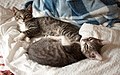
 A litter of kittens suckling their mother (from Kitten)
 -
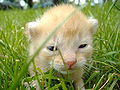
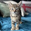 A tabby kitten (from Kitten)
 -
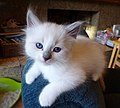
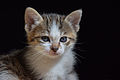 1-month-old kitten (from Kitten)
 -
-
 A pair of sibling kittens from the same litter at 11 weeks old (from Kitten)
 -
 A kitten opening its eyes for the first time (from Kitten)
 -
-
 A newborn Norwegian Forest kitten (from Kitten)


See ((Transclude files as random slideshow)) for more details.
Portal templates
[edit]
Alternate page title header
[edit]Note: This method is a hack which does not work with all Wikipedia skins. For example, users of the Classic skin will have the links at the top of the page covered up by the title.
Alternate title headers are headers that cover up the default header at the top of a page. The default title header has the name of the page in big bold letters. If you don't like how the default looks, follow the instructions below
- First, create a user subpage (described in this section) titled "User:Example User/Header"
- Then, copy the following code into the subpage and change the parts in all caps (e.g.: "COLOR OF TEXT" and "HEADER TEXT YOU WANT")
- Transclude the header onto your user page (type the full name of the subpage inside double curly brackets) ((like this))
Example code:
{| style="position:absolute; top:-50px; background:#CCCCFF; color:#000000;" valign="middle"
|-
|<h1 style="margin:0; border-bottom:0; color:COLOR OF TEXT;">
((center|HEADER TEXT YOU WANT))
|}
Borders
[edit]Borders look nice. Borders add spice. And they're the right price.
The examples below include closing codes, which may make it difficult to utilize them on talk pages. To have borders and backgrounds extend to the end of the page regardless of what is added, simply leave off the closing codes (</div>, </tr>, </td>, |}) at the end of the border markup examples.
Some example borders:
| Servers and Network Issues! | |
|---|---|
|
We have several servers located in the small room adjacent to the lunch room next to production. All of our network gear including phone, switches and DSL modems are located behind the double doors in the office next. | |
|

- The above design is best used for short pages, as it mimics a picture frame. It would work well for images, awards, etc.
| width=100% style="border-radius:1em; box-shadow: 0.1em 0.1em 0.5em rgba(0,0,0,0.75);; padding: 5px; background:orange; border: solid 4px red;" | width=100% cellspacing=0 style="border-radius:1em; box-shadow: 0.1em 0.1em 0.5em rgba(0,0,0,0.75);; background: lime; border: solid 4px yellow;" |
|}
|
|}
|
Place your navbar here
| ||||||||||||||||||||||||||
Round corners
[edit]As of November 2008, round corners will only display in Mozilla Firefox, Apple Safari and Google Chrome. EDIT: As of June 2011, round corners will display also on Internet Explorer 9
To add round corners to a box or frame, include the ((Round corners)); template (just as shown, including semi-colon) as a style parameter. Note that the element to be rounded must have a border in the first place. Here's a markup example:
<div style="border:1px solid #5599FF; ((Round corners)); margin: 5px;">
sample text sample text sample text sample text
</div>
To see the specific code for creating round corners see Template:Round corners.
For a cool example of the use of round corners, see Zeerus' user page
Or, try another way: -moz-border-radius:Xpx, where X is the number of pixels wide the rounded edge should be.
Color
[edit]
Change page color with CSS
[edit]To change the color of your user page, simply add the following code, replacing the capitalized text with the desired web colors:
{| | style="background:BACKGROUND COLOR; color:TEXT COLOR" |
So, you want to use fancy colors, eh? The following is a range of Web-Safe colors (non-dithering) transcluded from User:Resident Mario/Tablet.
Contents
[edit]To suppress the automatic table of contents box from appearing on your user page, place the following line somewhere on your user page:
__NOTOC__
To have the table of contents box float to the right, place the following line where you want the top to appear:
((TOCright))
Show/Hide sections
[edit]Here's an example of collapsed/expandable sections:
About me
Lorem ipsum dolor sit amet, consectetur adipiscing elit, sed do eiusmod tempor incididunt ut labore et dolore magna aliqua. Ut enim ad minim veniam, quis nostrud exercitation ullamco laboris nisi ut aliquip ex ea commodo consequat. Duis aute irure dolor in reprehenderit in voluptate velit esse cillum dolore eu fugiat nulla pariatur. Excepteur sint occaecat cupidatat non proident, sunt in culpa qui officia deserunt mollit anim id est laborum.
Subpages
Lorem ipsum dolor sit amet, consectetur adipiscing elit, sed do eiusmod tempor incididunt ut labore et dolore magna aliqua. Ut enim ad minim veniam, quis nostrud exercitation ullamco laboris nisi ut aliquip ex ea commodo consequat. Duis aute irure dolor in reprehenderit in voluptate velit esse cillum dolore eu fugiat nulla pariatur. Excepteur sint occaecat cupidatat non proident, sunt in culpa qui officia deserunt mollit anim id est laborum.
To do
Lorem ipsum dolor sit amet, consectetur adipiscing elit, sed do eiusmod tempor incididunt ut labore et dolore magna aliqua. Ut enim ad minim veniam, quis nostrud exercitation ullamco laboris nisi ut aliquip ex ea commodo consequat. Duis aute irure dolor in reprehenderit in voluptate velit esse cillum dolore eu fugiat nulla pariatur. Excepteur sint occaecat cupidatat non proident, sunt in culpa qui officia deserunt mollit anim id est laborum.
Licensing
Lorem ipsum dolor sit amet, consectetur adipiscing elit, sed do eiusmod tempor incididunt ut labore et dolore magna aliqua. Ut enim ad minim veniam, quis nostrud exercitation ullamco laboris nisi ut aliquip ex ea commodo consequat. Duis aute irure dolor in reprehenderit in voluptate velit esse cillum dolore eu fugiat nulla pariatur. Excepteur sint occaecat cupidatat non proident, sunt in culpa qui officia deserunt mollit anim id est laborum.
There are several templates that can be used for this in Category:Collapse templates.
Action links
[edit]Switched features
[edit]Boxes
[edit]- To make a box, do the following:
- Type <div style="background-color:COLOR YOU WANT;"> before the text
- Choose the color (Check out these pages: [1][2][3] for a full list of colors you can use)
- Type your text
- Type </div> after the text
- Overall, your code should look like this:
- <div style="background-color:yellow;">Hi</div>
- Which will look like:
Curved borders
[edit]- To make borders curved (only works in Mozilla-based browsers) add the following code to the code described in the previous section:
- border-radius:15px;
- So, now your code should look like <div style="background-color:DarkGoldenrod; border-radius:15px;">Hi</div>
- Which would show up as
Text formatting
[edit]Custom bullet points for lists
[edit]To use custom dots for bullets in lists, you can insert small files, like this:
 Lorem ipsum dolor sit amet,
 consectetur adipiscing elit,
 sed do eiusmod tempor incididunt
 ut labore et dolore magna aliqua.
 Ut enim ad minim veniam,
You might want to use a different color dot for separate lists, to further differentiate those lists, rather than mix them like above. When using this method, you need to end each line with "<br/>", and precede the first item in the list with that as well (at the end of the preceding line), or the items will run together.
Here is the wikicode for the above list, for copying and pasting:
<br/> [[File:Green 00ff00 pog.svg|9px]] [[Lorem ipsum]] dolor sit amet,<br/> [[File:Yellow ffff00 pog.svg|9px]] consectetur adipiscing elit,<br/> [[File:Red pog.svg|9px]] sed do eiusmod tempor incididunt<br/> [[File:Purple 8000ff pog.svg|9px]] ut labore et dolore magna aliqua.<br/> [[File:Blue 0080ff pog.svg|9px]] Ut enim ad minim veniam,<br/>
For a real-life example of how the above method is applied upon a user page, see the page User:Tom.Reding.
Of course, you are not limited to dots. This method can be employed using icons, emoticons, etc.
Center-Align
[edit]- To center text, use the following code:
- Enter <div style="text-align: center;">
- Then enter your text
- Finally, enter </div>
- Overall, your code should look like this:
<div style="text-align: center;">Centered text</div>
- Once you have entered that code, your text will look like this:
Strike Through Text
[edit]- To strike through text, use the following code:
- Enter a <s> before the text.
- Enter the text
- Enter a </s> after the text.
- Overall, your code should look like this:
<s>blah blah blah</s>
- Once you have entered that code, your text will look like this:
blah blah blah
Superscript
[edit]- To insert a superscript, use the following code:
- Enter a <sup> before the text.
- Enter the text
- Enter a </sup> after the text.
- Overall, your code should look like this:
Normal text<sup>superscript text</sup>
- Once you have entered that code, your text will look like this:
Normal textsuperscript text
Subscript
[edit]- To insert, use the following code:
- Enter a <sub> before the text.
- Enter the text
- Enter a </sub> after the text.
- Overall, your code should look like this:
Normal text<sub>subscript text</sub>
- Once you have entered that code, your text will look like this:
Normal textsubscript text
Hidden Comment
[edit]- To insert a hidden comment, use the following code:
- Enter a <!-- before the text.
- Enter the text
- Enter a --> after the text.
- Overall, your code should look like this:
<!-- blah blah blah-->
- You will not be able to see the text on this page, but it will be seen when you try to edit this page. Hidden text is mostly used for warnings.
Secondary Headline
[edit]- To insert a secondary headline, use the following code:
- Enter a == before the text.
- Enter the text
- Enter a == after the text.
- Overall, your code should look like this:
==blah blah blah==
Tab
[edit]- To insert a tab, use the following code:
- Enter a :: before the text.
- Overall, your code should look like this:
::blah blah blah
- Once you have entered that code, your text will look like this:
- blah blah blah
Font Color
[edit]- To change the color of text, use the following code:
- Enter a <span style="color: ColorName"> before the text.
- Choose the color
- Enter the text
- Enter a </span> after the text.
- Overall, your code should look like this:
<span style="color: red">blah blah blah</span>
- Once you have entered that code, your text will look like this:
blah blah blah
- Another way to do it is:
- Enter a <font color="ColorName"> before the text.
- Choose the color
- Enter the text
- Enter a </font> after the text.
- Overall, your code should look like this:
<font color="color:red;">blah blah blah</font>
- Once you have entered that code, your text will look like this:
blah blah blah
gradient text
[edit]You can use this template to make some text that gradually changes its colour from left to right (blah blah blah) and this template to create text that has every colour of the rainbow as a gradient (blah blah blah). To customise the color and direction of the text, you may use this template which allows customisation of text like this (blah blah blah).
Mouse Cursor
[edit]- To change the cursor of the mouse when you hover over text, do the following:
- Enter a <span style="cursor:CURSOR YOU WANT;"> before the text.
- Choose the cursor, (e.g. crosshair, default)
- Enter the text
- Enter a </span> after the text.
- Overall, your code should look like this:
<span style="cursor: crosshair;">blah blah blah</span>
- Once you have entered that code, and you put the mouse over the text, it should have a different mouse cursor:
blah blah blah
Links
[edit]- To make external links look internal, use the following
- Enter a <span class="plainlinks"> before the text.
- Enter the external link
- Enter a </span> after the text.
- Overall, your code should look like this:
<span class="plainlinks">[http://wikipedia.com external <span style="color:#002bb8">link</span>]</span>
- Once you have entered that code, the external link should look like this:
- Note that if someone is using a custom skin that specifies different link colors, for example, green for internal links, and purple for "redlinks," a link formatted with this code will still look blue, and not match other links in appearance, to that user.
Bolding
[edit]- To make text bold, do the following:
- Enter 3 apostrophes
'''before the text. - Enter the text
- Enter 3 more apostrophes
'''after the text.
- Overall, your code should look like this:
'''text'''
- Once you have entered that code, the text should look like this:
text
Italics
[edit]- To italicize text, do the following:
- Enter 2 apostrophes
''before the text. - Enter the text
- Enter 2 more apostrophes
''after the text.
- Overall, your code should look like this:
''text''
- Once you have entered that code, the text should look like this:
text
Underlining
[edit]- To make underline text, do the following:
- Enter <u> before the text.
- Enter the text
- Enter </u> after the text.
- Overall, your code should look like this:
<u>text</u>
- Once you have entered that code, the text should look like this:
text
Font size
[edit]- To make text a certain size, use the following code:
- Enter a <font size="10"> before the text.
- Choose the size
- Enter the text
- Enter a </font> after the text.
- Overall, your code should look like this:
<span style="font-size:large;">blah blah blah</span>
- Once you have entered that code, your text will look like this:
blah blah blah
Font Families
[edit]- To use the following font families, use the codes below:
- <span style="font-family: (desired font); font-size: 12pt">
- Enter the font you want
- Directly after the code, enter your text
- Enter </span>after the text
So, it should look like:
<span style="font-family: comic sans ms; font-size: 12pt">awesome</span>
Which will turn out as:
awesome
List of Fonts
[edit]| Font Name: | Example of font: |
| Agency FB | The Quick Brown Fox Jumps Over The Lazy Dog |
| Algerian | The Quick Brown Fox Jumps Over The Lazy Dog |
| Andale Mono | The Quick Brown Fox Jumps Over The Lazy Dog |
| Arial | The Quick Brown Fox Jumps Over The Lazy Dog |
| Arial Black | The Quick Brown Fox Jumps Over The Lazy Dog |
| Arial Narrow | The Quick Brown Fox Jumps Over The Lazy Dog |
| Arial Rounded MT Bold | The Quick Brown Fox Jumps Over The Lazy Dog |
| Baskerville Old Face | The Quick Brown Fox Jumps Over The Lazy Dog |
| Batik Regular | The Quick Brown Fox Jumps Over The Lazy Dog |
| Bauhaus 93 | The Quick Brown Fox Jumps Over The Lazy Dog |
| Bell MT | The Quick Brown Fox Jumps Over The Lazy Dog |
| Berlin Sans FB | The Quick Brown Fox Jumps Over The Lazy Dog |
| Berlin Sans FB Demi | The Quick Brown Fox Jumps Over The Lazy Dog |
| Bernard MT Condensed | The Quick Brown Fox Jumps Over The Lazy Dog |
| Blackadder ITC | The Quick Brown Fox Jumps Over The Lazy Dog |
| Bodoni MT | The Quick Brown Fox Jumps Over The Lazy Dog |
| Bodoni MT Black | The Quick Brown Fox Jumps Over The Lazy Dog |
| Bodoni MT Condensed | The Quick Brown Fox Jumps Over The Lazy Dog |
| Bodoni MT Poster Compressed | The Quick Brown Fox Jumps Over The Lazy Dog |
| Book Antiqua | The Quick Brown Fox Jumps Over The Lazy Dog |
| Bookman Old Style | The Quick Brown Fox Jumps Over The Lazy Dog |
| Bradley Hand ITC | The Quick Brown Fox Jumps Over The Lazy Dog |
| Britannic Bold | The Quick Brown Fox Jumps Over The Lazy Dog |
| Broadway | The Quick Brown Fox Jumps Over The Lazy Dog |
| Brush Script MT | The Quick Brown Fox Jumps Over The Lazy Dog |
| Calibri | The Quick Brown Fox Jumps Over The Lazy Dog |
| Californian FB | The Quick Brown Fox Jumps Over The Lazy Dog |
| Calisto MT | The Quick Brown Fox Jumps Over The Lazy Dog |
| Cambria | The Quick Brown Fox Jumps Over The Lazy Dog |
| Candara | The Quick Brown Fox Jumps Over The Lazy Dog |
| Castellar | The Quick Brown Fox Jumps Over The Lazy Dog |
| Centaur | The Quick Brown Fox Jumps Over The Lazy Dog |
| Century Gothic | The Quick Brown Fox Jumps Over The Lazy Dog |
| Century Schoolbook | The Quick Brown Fox Jumps Over The Lazy Dog |
| Chiller | The Quick Brown Fox Jumps Over The Lazy Dog |
| Colonna MT | The Quick Brown Fox Jumps Over The Lazy Dog |
| Comic Sans MS | The Quick Brown Fox Jumps Over The Lazy Dog |
| Consolas | The Quick Brown Fox Jumps Over The Lazy Dog |
| Constantia | The Quick Brown Fox Jumps Over The Lazy Dog |
| Cooper Black | The Quick Brown Fox Jumps Over The Lazy Dog |
| Copperplate Gothic Bold | The Quick Brown Fox Jumps Over The Lazy Dog |
| Copperplate Gothic Light | The Quick Brown Fox Jumps Over The Lazy Dog |
| Corbel | The Quick Brown Fox Jumps Over The Lazy Dog |
| Courier New | The Quick Brown Fox Jumps Over The Lazy Dog |
| Curlz MT | The Quick Brown Fox Jumps Over The Lazy Dog |
| Edwardian Script ITC | The Quick Brown Fox Jumps Over The Lazy Dog |
| Elephant | The Quick Brown Fox Jumps Over The Lazy Dog |
| Engravers MT | The Quick Brown Fox Jumps Over The Lazy Dog |
| Eras Bold ITC | The Quick Brown Fox Jumps Over The Lazy Dog |
| Eras Demi ITC | The Quick Brown Fox Jumps Over The Lazy Dog |
| Eras Light ITC | The Quick Brown Fox Jumps Over The Lazy Dog |
| Eras Medium ITC | The Quick Brown Fox Jumps Over The Lazy Dog |
| Felix Titling | The Quick Brown Fox Jumps Over The Lazy Dog |
| Footlight MT Light | The Quick Brown Fox Jumps Over The Lazy Dog |
| Forte | The Quick Brown Fox Jumps Over The Lazy Dog |
| Franklin Gothic Book | The Quick Brown Fox Jumps Over The Lazy Dog |
| Franklin Gothic Demi | The Quick Brown Fox Jumps Over The Lazy Dog |
| Franklin Gothic Heavy | The Quick Brown Fox Jumps Over The Lazy Dog |
| Franklin Gothic Medium | The Quick Brown Fox Jumps Over The Lazy Dog |
| Franklin Gothic Medium Cond | The Quick Brown Fox Jumps Over The Lazy Dog |
| Freestyle Script | The Quick Brown Fox Jumps Over The Lazy Dog |
| French Script MT | The Quick Brown Fox Jumps Over The Lazy Dog |
| Garamond | The Quick Brown Fox Jumps Over The Lazy Dog |
| Georgia | The Quick Brown Fox Jumps Over The Lazy Dog |
| Gigi | The Quick Brown Fox Jumps Over The Lazy Dog |
| Gill Sans MT | The Quick Brown Fox Jumps Over The Lazy Dog |
| GulimChe | The Quick Brown Fox Jumps Over The Lazy Dog |
| Impact | The Quick Brown Fox Jumps Over The Lazy Dog |
| Kristen ITC | The Quick Brown Fox Jumps Over The Lazy Dog |
| Lucida Console | The Quick Brown Fox Jumps Over The Lazy Dog |
| Lucida Handwriting | The Quick Brown Fox Jumps Over The Lazy Dog |
| MingLiU | The Quick Brown Fox Jumps Over The Lazy Dog |
| Monotype Corsiva | The Quick Brown Fox Jumps Over The Lazy Dog |
| MS Gothic | The Quick Brown Fox Jumps Over The Lazy Dog |
| MS Hei | The Quick Brown Fox Jumps Over The Lazy Dog |
| MS Song | The Quick Brown Fox Jumps Over The Lazy Dog |
| Old English Text MT | The Quick Brown Fox Jumps Over The Lazy Dog |
| Symbol | The Quick Brown Fox Jumps Over The Lazy Dog |
| Tahoma | The Quick Brown Fox Jumps Over The Lazy Dog |
| Times New Roman | The Quick Brown Fox Jumps Over The Lazy Dog |
| Trebuchet MS | The Quick Brown Fox Jumps Over The Lazy Dog |
| Verdana | The Quick Brown Fox Jumps Over The Lazy Dog |
| Webdings | The Quick Brown Fox Jumps Over The Lazy Dog |
| Wingdings | The Quick Brown Fox Jumps Over The Lazy Dog |
| Wingdings 2 | The Quick Brown Fox Jumps Over The Lazy Dog |
| Wingdings 3 | The Quick Brown Fox Jumps Over The Lazy Dog |
Picture formatting
[edit]Images, with the proper copyright tags, can be placed onto your user page.
Inserting an Image
[edit][[File:Cscr-featured.png]]
This inserts an image as seen below.

[[File:Cscr-featured.png|Star]]
Every image should have a brief description text. This enables blind Wikipedians using a screen reader to know what the image is about. "Star" is the descriptive word in this case.
[[:File:Cscr-featured.png]]
Add a colon before Image to create a link to an image.
Left Alignment
[edit][[File:Cscr-featured.png|left]]
This aligns an Image to the left.
Right Alignment
[edit][[File:Cscr-featured.png|right]]
This aligns an Image to the right.
Center alignment
[edit][[File:Cscr-featured.png|center]]
This aligns an Image in the middle.
Auto-alignment
[edit]You can auto-align an Image one of two ways.
Framing
[edit]Framing an Image will automatically set the Image to the right side of the screen and frame it. (Like a picture frame)
To frame an Image type in:
[[File:Cscr-featured.png|frame]]
Which will appear like this:
NOTE: This will force the image to be in its original size (to change the size use thumbnails or do not use the frame).
Just sub to stixq
[edit]Thumbnailing a picture is similar to framing because it, again, automatically aligns it to the right. What's different about thumbnails is that now you have room to write text below it and can change the size. (Like a photograph from a camera)
To thumbnail a picture type in:
[[File:Cscr-featured.png|thumb]]
Which will appear like this:
Making Images bigger and smaller
[edit]To change the size of an image type:
[[File:Cscr-featured.png|80px]]
Captions
[edit]To add a caption to an image, type:
[[File:Cscr-featured.png|thumb|Caption]]
or
[[File:Cscr-featured.png|thumb|right|Caption]]
or
[[File:Cscr-featured.png|thumb|right|80px|Caption]]
Galleries
[edit]To make a gallery of images, type
<gallery>
File:Cscr-featured.png|Caption1
File:Barnprinter2.png|Caption2
</gallery>
-
 Caption1
 -
 Caption2

Templates
[edit]There are plenty of users out there looking to spruce up their pages, too! This section lists a few of the really cool apps developed by others.
Moon Phase[edit]On the right is a template that automatically displays the current moon phase, created by Dbachman. |
|

Emoticons
[edit]Also called smileys, these emoticons are useful for adding emotional expression to text messages. Definitely not for use in articles, but suitable for enhancing messages on talk pages, especially user talk pages. They can also be used as menu icons and user page art.
|
|
|
See also
[edit]| Suggested Tools (Scripts) |