.jpg)
-

One Cent -

Five Cents -

Ten Cents
| Featured picture tools |
|---|
Please cut and paste new entries to the bottom of this page, creating a new monthly archive (by closing date) when necessary.
Bach
Voting period is over. Please don't add any new votes. Voting period ends on 1 Jul 2015 at 00:51:15 (UTC)

- Reason
- High quality scan of a painting of a notable individual.
- Articles in which this image appears
- Johann Christian Bach +6
- FP category for this image
- Wikipedia:Featured pictures/People/Entertainment
- Creator
- Thomas Gainsborough
- Support as nominator – — Chris Woodrich (talk) 00:51, 21 June 2015 (UTC)
- Support – Excellent quality with good EV (and it's a Gainsborough, so I'm bound to support/like it ....) SagaciousPhil - Chat 16:51, 21 June 2015 (UTC)
- Support – Famed artist, music history EV. Sca (talk) 22:16, 21 June 2015 (UTC)
- Support - excellent piece which I have known and loved for years. --Ser Amantio di NicolaoChe dicono a Signa?Lo dicono a Signa. 14:14, 23 June 2015 (UTC)
- Comment NPG version differs in hue/coloration. This one looks kinda bluish. Brandmeistertalk 17:32, 23 June 2015 (UTC)
- Good catch. Reverted back to Coetzee's original upload. — Chris Woodrich (talk) 23:15, 23 June 2015 (UTC)
- Support – Sca is quite right. Hafspajen (talk) 22:16, 24 June 2015 (UTC)
- Support – Yann (talk) 21:56, 28 June 2015 (UTC)
- Support -Jobas (talk) 01:33, 30 June 2015 (UTC)
Promoted File:Johann Christian Bach by Thomas Gainsborough.jpg --Armbrust The Homunculus 00:53, 1 July 2015 (UTC)
Whisky glass
Voting period is over. Please don't add any new votes. Voting period ends on 1 Jul 2015 at 16:45:32 (UTC)

- Reason
- Good and representful photo of its kind.
- Articles in which this image appears
- List of glassware
- FP category for this image
- Wikipedia:Featured pictures/Food and drink
- Creator
- Petar Milošević
- Support as nominator – PetarM (talk) 16:45, 21 June 2015 (UTC)
- Comment: It doesn't look like any glass I've seen someone drink whiskey out of, and it doesn't seem to match any of the listed items. Am I missing something, here? Josh Milburn (talk) 21:01, 21 June 2015 (UTC)
-
- Comment: Dont tell me, its for wine ? ;)... 1. Is it problem to check google before such questions ? Maybe you are used to drink it from regular Bar Tumbler, in Germany. --PetarM (talk) 07:09, 22 June 2015 (UTC)
- Oppose. I shouldn't need to check Google to understand what I'm looking at- it should be more than clear from the articles in which the image is used. Without this kind of context, the image lacks encyclopedic value. This nomination is premature. Josh Milburn (talk) 10:14, 22 June 2015 (UTC)
- Comment – Maybe it would have a tad more visual interest if it had some whisk(e)y in it. Sca (talk) 13:04, 22 June 2015 (UTC)
- Comment - Why is it listed in the Beer Glassware section of the article? Per Josh Milburn, I'm not sure one should need to conduct a Google search to understand the image (which appears to be made by only a single manufacturer) and has a much closer resemblance to a glass for Grappa.--Godot13 (talk) 02:44, 23 June 2015 (UTC)
Not Promoted --Armbrust The Homunculus 17:22, 1 July 2015 (UTC)
Nymphaea odorata
Voting period is over. Please don't add any new votes. Voting period ends on 1 Jul 2015 at 17:03:35 (UTC)

- Reason
- This image offers a superb technical view of the species, objectively meeting criteria 1, 2, 4, 5, 6, 7, and 8, and it readily illustrates the unopened blossom, the plant's leaves, and the flower's petals, sepals, and stamens.
- Articles in which this image appears
- Nymphaea odorata
- FP category for this image
- Wikipedia:Featured pictures/Plants/Flowers
- Creator
- SanctuaryX
- Support as nominator – SanctuaryX (talk) 17:03, 21 June 2015 (UTC)
CommentOppose – Nice comp., but somehow (is it just my eyes?) the blossom itself seems a bit shy on detail. DOF? Sca (talk) 22:01, 21 June 2015 (UTC)
- No, it's not just your eyes. There is something very slightly unsatisfactory about the main focus of the picture, the centre of the flower. Not sure if it's blurriness, or lack of contrast, or some combination. 31.51.134.46 (talk) 23:07, 21 June 2015 (UTC)
- Weak oppose Cropped uncomfortably close at bottom. --Janke | Talk 15:14, 23 June 2015 (UTC)
- Support -Jobas (talk) 01:32, 30 June 2015 (UTC)
Not Promoted --Armbrust The Homunculus 17:26, 1 July 2015 (UTC)
Fatoumata Diawara
Voting period is over. Please don't add any new votes. Voting period ends on 1 Jul 2015 at 20:39:48 (UTC)


- Reason
- Very good quality picture of the person while she is performing. High EV.
- Articles in which this image appears
- Fatoumata Diawara
- FP category for this image
- Wikipedia:Featured pictures/People/Entertainment
- Creator
- Thesupermat
- Support as nominator – FakeShemp (talk) 20:39, 21 June 2015 (UTC)
- Weak support - Technically good, but it strikes me as not warm enough (i.e. tones are a bit blue). — Chris Woodrich (talk) 23:28, 21 June 2015 (UTC)
Support- I think the cold tones come from the lighting and give some hint (tint) that she is performing. Belle (talk) 00:18, 22 June 2015 (UTC)- Except other images of her performing aren't as blue — Chris Woodrich (talk) 02:14, 22 June 2015 (UTC)
- I've made an edit; I may have gone too warm, but I think it's an improvement. — Chris Woodrich (talk) 02:32, 22 June 2015 (UTC)
- Now I don't know. The other images aren't lit with the same light of course and your edit has made her a bit bilious instead of icy, but I'm wavering on the authenticity of the original. I think I'll strike my support and wait for somebody else to comment and then adopt their opinion as if it was my own. Belle (talk) 09:25, 22 June 2015 (UTC)
- I've made an edit; I may have gone too warm, but I think it's an improvement. — Chris Woodrich (talk) 02:32, 22 June 2015 (UTC)
- Except other images of her performing aren't as blue — Chris Woodrich (talk) 02:14, 22 June 2015 (UTC)
- Support original The metadata suggests there was no digital manipulation, implying this was the original lighting at the concert. Very slight adjustment could still be made, I think alt is a quite radical change. Brandmeistertalk 10:33, 22 June 2015 (UTC)
- I've reduced the warmth a bit further. — Chris Woodrich (talk) 02:30, 23 June 2015 (UTC)
- Support ALT – Yann (talk) 21:55, 28 June 2015 (UTC)
- Support -Jobas (talk) 01:31, 30 June 2015 (UTC)
- Support ALT I prefer this version. Although this has had some manipulation, I feel it has improved the picture... gazhiley 07:41, 30 June 2015 (UTC)
- Support ALT — Chris Woodrich (talk) 13:28, 30 June 2015 (UTC)
- Support ALT -- DreamSparrow Chat 18:17, 1 July 2015 (UTC)
Promoted File:Fatoumata Diawara - Festival du Bout du Monde 2012 - 016 - edit.jpg --Armbrust The Homunculus 21:44, 1 July 2015 (UTC)
- Only the alt has enough support for promotion. Armbrust The Homunculus 21:44, 1 July 2015 (UTC)
Lamborghini Aventador
Voting period is over. Please don't add any new votes. Voting period ends on 8 Jul 2015 at 21:40:11 (UTC)

- Reason
- High quality image with EV
- Articles in which this image appears
- Parking violation, Lamborghini Aventador
- FP category for this image
- Wikipedia:Featured pictures/Vehicles/Land
- Creator
- Falcon Photography
- Support as nominator – Yann (talk) 21:40, 28 June 2015 (UTC)
- Oppose This is an amusing image, but it's not a particularly great photo of either the car type or a parking violation. The image is a little bit blurry, slightly tilted and doesn't clearly illustrate these subjects given the number of other things going on (especially the car behind the Lamborghini. Nick-D (talk) 01:49, 29 June 2015 (UTC)
- Oppose I agree with Nick-D - this almost seems a joke nom. Not focussed, driver still in car (so is this even being parked? Could be pulling into or out of the bay, or just driving through it?), quite in-your-face advertising, parking sign not straight, etc etc. No offence intended if this was a serious nom, but well below par if so. gazhiley 08:30, 29 June 2015 (UTC)
- That's one lame Lambo. Сте́нька — Preceding undated comment added 20:01, 29 June 2015
- Kinda Lambo curse. Another previous nomination also failed. Brandmeistertalk 22:55, 29 June 2015 (UTC)
- That's one lame Lambo. Сте́нька — Preceding undated comment added 20:01, 29 June 2015
- Oppose. I don't think it's a great image to illustrate either article to be honest. I don't think Yann would nominate an image as a joke, but perhaps he has misjudged it in this case. I would expect for an image illustrating a parking violation to more clearly show the problem. It's really not clear to me that the car is parked illegally at all, but perhaps I'm not familiar with Swiss road signs. It would be ideal to at least show some sort of parking ticket affixed to the windscreen. Isn't that the universal sign of a parking violation?! ;-) Ðiliff «» (Talk) 17:43, 30 June 2015 (UTC)
- I just re-read my wording. I assume it wasn't a joke, and no offence intended to Yann with my wording. I only meant it was such a strange nom it seemed like a joke. Nothing personal... gazhiley 09:50, 1 July 2015 (UTC)
- Withdrawn I think the quality is quite good, there is EV, and additionally there is some humour. You don't like it? Never mind... — Preceding unsigned comment added by Yann (talk • contribs) 11:38, 1 July 2015
Not Promoted --Armbrust The Homunculus 21:56, 1 July 2015 (UTC)
- Withdrawn nomination. Armbrust The Homunculus 21:56, 1 July 2015 (UTC)
Iman Budhi Santosa
Voting period is over. Please don't add any new votes. Voting period ends on 1 Jul 2015 at 23:57:09 (UTC)

- Reason
- Good quality "action shot" of a poet reading his own work. Since the cover is turned away from the viewer, we don't have any copyright issues.
- Articles in which this image appears
- Iman Budhi Santosa
- FP category for this image
- Wikipedia:Featured pictures/People/Artists and writers
- Creator
- — Chris Woodrich (talk)
- Support as nominator – — Chris Woodrich (talk) 23:57, 21 June 2015 (UTC)
- Support Bersertifikat intergalaksi! 90% bersertifikat anyway, I would have liked it if there was more of his right arm in shot, but good enough for FP, I think.Belle (talk) 00:28, 22 June 2015 (UTC)
- Certified intergalactic? Sca (talk) 13:23, 23 June 2015 (UTC)
- See the angklung nomination below. ("Intergalactic certification" or so). — Chris Woodrich (talk) 13:31, 23 June 2015 (UTC)
- Don't be shy, Sca, you can give it a Bersertifikat intergalaksi too. Belle (talk) 14:03, 23 June 2015 (UTC)
- Are you two on the ICB (Intergalactic Certification Board)? (C'mon, full disclosure now!) Sca (talk) 14:32, 23 June 2015 (UTC)
- Why, no, hu-man. What would give you such an ideea.?. — Chris Woodrich (talk) 14:41, 23 June 2015 (UTC)
- Are you two on the ICB (Intergalactic Certification Board)? (C'mon, full disclosure now!) Sca (talk) 14:32, 23 June 2015 (UTC)
- Certified intergalactic? Sca (talk) 13:23, 23 June 2015 (UTC)
- Support Not bad. Could be a little better - would like to get the full arm in, but I'll buy the shot. Adam Cuerden (talk) 14:05, 24 June 2015 (UTC)
- Could be a better crop or may be a better composition but still Support for the shot. DreamSparrow talk 17:36, 27 June 2015 (UTC)
- Support – Yann (talk) 21:54, 28 June 2015 (UTC)
- Support -Jobas (talk) 01:31, 30 June 2015 (UTC)
Promoted File:Iman Budhi Santosa at book launch, 2015-05-30 01.jpg --Armbrust The Homunculus 23:58, 1 July 2015 (UTC)
Edward Montagu, 1st Earl of Sandwich
Voting period is over. Please don't add any new votes. Voting period ends on 2 Jul 2015 at 23:44:50 (UTC)

- Reason
- Because all I can think of this morning is ...
- Articles in which this image appears
- Edward Montagu, 1st Earl of Sandwich +1
- FP category for this image
- Wikipedia:Featured pictures/People/Military maybe.
- Creator
- Peter Lely
- Support as nominator – — Chris Woodrich (talk) 23:44, 22 June 2015 (UTC)
- Support Adam Cuerden (talk) 01:50, 23 June 2015 (UTC)
- Support - Good EV in use as lead image.--Godot13 (talk) 03:07, 23 June 2015 (UTC)
- Support – Very nice, good EV. SagaciousPhil - Chat 10:04, 23 June 2015 (UTC)
- Support - dangit, now I'm hungry. --Ser Amantio di NicolaoChe dicono a Signa?Lo dicono a Signa. 13:59, 23 June 2015 (UTC)
- Support - DreamSparrow talk 17:39, 27 June 2015 (UTC)
- Support - So, it's Mr Sandwich's turn... Hafspajen (talk) 02:34, 28 June 2015 (UTC)
Promoted File:Peter Lely - Edward Montagu, 1st Earl of Sandwich - Google Art Project.jpg --Armbrust The Homunculus 23:45, 2 July 2015 (UTC)
Caleb Strong (engraved portrait)
Voting period is over. Please don't add any new votes. Voting period ends on 3 Jul 2015 at 02:22:35 (UTC)
Original – American Bank Note Company engraved portrait of Caleb Strong. Delegate to the Constitutional Convention, Strong was part of the inaugural class of the United States Senate (from Massachusetts, 1789–96), and then Governor of Massachusetts (1800–07 and 1812–16).
- Reason
- High quality, high EV, prior image was very small and low resolution. Lead image with css image crop used to produce appropriately sized thumbnail in the article.
Second nomination, first time resulted in 4 support and no opposition. (Please view at full size) - Articles in which this image appears
- Caleb Strong
- FP category for this image
- Wikipedia:Featured pictures/People/Political
- Creator
- James Bannister, American Bank Note Company
Restoration by Godot13
- Support as nominator – Godot13 (talk) 02:22, 23 June 2015 (UTC)
- Support as last time. — Chris Woodrich (talk) 02:29, 23 June 2015 (UTC)
- Support – Very nice and plenty of EV provided by a GA. SagaciousPhil - Chat 09:58, 23 June 2015 (UTC)
- Support – Historical EV for one of the Founders whose name is not a household word. Sca (talk) 13:20, 23 June 2015 (UTC)
- Support - excellent likeness of someone of whom it would be nice to hear more. --Ser Amantio di NicolaoChe dicono a Signa?Lo dicono a Signa. 13:58, 23 June 2015 (UTC)
- Support -Jobas (talk) 01:31, 30 June 2015 (UTC)
Promoted File:STRONG, Caleb (ABNC engraved portrait).jpg --Armbrust The Homunculus 02:35, 3 July 2015 (UTC)
Robinson Crusoé
Voting period is over. Please don't add any new votes. Voting period ends on 4 Jul 2015 at 14:00:02 (UTC)

- Reason
- How could I resist Brandmeister's special request here for some Robinson Crusoé? It turned out to be a good one: I didn't have any Offenbach in the queue, and it's a very nice image.
- Articles in which this image appears
- Robinson Crusoé
- FP category for this image
- Wikipedia:Featured_pictures/Culture,_entertainment,_and_lifestyle/Theatre
- Creator
- A. Jannin; restored by Adam Cuerden
- Support as nominator – Adam Cuerden (talk) 14:00, 24 June 2015 (UTC)
- Support - Fantastic. — Chris Woodrich (talk) 14:58, 24 June 2015 (UTC)
- Support Kudos (although I thought of the book, didn't know there's such a thing). Brandmeistertalk 15:33, 24 June 2015 (UTC)
- It is possible my sense of humour got to me. Though I've added commons:Category:Alexander_Francis_Lydon to the queue. Adam Cuerden (talk) 20:42, 24 June 2015 (UTC)
- Support - DreamSparrow talk 21:40, 24 June 2015 (UTC)
- Support I know I said I was boycotting you until we got some comical animals, but this has got a cockatoo (no monocle or cape, so not perfect but you are heading in the right direction). Belle (talk) 01:06, 25 June 2015 (UTC)
- Support - plenty of comical animals in Offenbach. --Ser Amantio di NicolaoChe dicono a Signa?Lo dicono a Signa. 15:25, 25 June 2015 (UTC)
- Support -Jobas (talk) 01:30, 30 June 2015 (UTC)
Promoted File:Jacques Offenbach - A. Jannin - Robinson Crusoé.jpg --Armbrust The Homunculus 14:37, 4 July 2015 (UTC)
Cardamom
Voting period is over. Please don't add any new votes. Voting period ends on 4 Jul 2015 at 19:15:20 (UTC)

- Reason
- High EV and very good quality
- Articles in which this image appears
- Cardamom
- FP category for this image
- Wikipedia:Featured pictures/Plants/Fruits
- Creator
- Parthyush Thomas
- Support as nominator – Blacknclick (talk) 19:15, 24 June 2015 (UTC)
- Comment - Technically it's quite nice, except for one thing. Is it possible to get a version with less harsh shadows? I appreciate the difficulty in doing so, but it would look quite a bit better — Chris Woodrich (talk) 23:32, 24 June 2015 (UTC)
- Support -Jobas (talk) 01:30, 30 June 2015 (UTC)
- Support - DreamSparrow Chat 19:23, 30 June 2015 (UTC)
Not Promoted --Armbrust The Homunculus 19:35, 4 July 2015 (UTC)
Netherlands Indies gulden coin
Voting period is over. Please don't add any new votes. Voting period ends on 4 Jul 2015 at 23:38:14 (UTC)

.jpg)
- Reason
- Impressive image of a coin. The script here is Jawi, an Arabic-based script used to write Malay; I don't think we have any featured pictures with the script yet. Not that I can read it worth a darn, but...
- Articles in which this image appears
- Netherlands Indies gulden
- FP category for this image
- Wikipedia:Featured pictures/Culture, entertainment, and lifestyle/Currency
- Creator
- Java Mint, Netherlands Indies (coin), Heritage Auctions (image)
- Support as nominator – — Chris Woodrich (talk) 23:38, 24 June 2015 (UTC)
- Support HQ + EV Alborzagros (talk) 09:25, 25 June 2015 (UTC)
- Support I don't pretend to understand it - I presume there's some sort of (possibly obsolete) local script used on it? The article on Jawi alphabet doesn't help at all. Otherwise, this coin is an extreme rarity for the time period insofar as it has no text on it besides the date. Is the image on the right upside down, or is there both a 6-like and 9-like character in the script? Adam Cuerden (talk) 10:34, 25 June 2015 (UTC)
- I think you're right, Adam. The m-like character is an S, and should be looking like a W. Sadly, owing to the lighting, any attempt to fix it looks really wonky. — Chris Woodrich (talk) 11:39, 25 June 2015 (UTC)
- Might be able to get away with it as two images, but... Adam Cuerden (talk) 12:57, 25 June 2015 (UTC)
- I think you're right, Adam. The m-like character is an S, and should be looking like a W. Sadly, owing to the lighting, any attempt to fix it looks really wonky. — Chris Woodrich (talk) 11:39, 25 June 2015 (UTC)
- Support as presented, given the rarity. Fascinating artifact. --Ser Amantio di NicolaoChe dicono a Signa?Lo dicono a Signa. 15:24, 25 June 2015 (UTC)
- Support as presented (or if corrected). Rare coin in this high grade.--Godot13 (talk) 01:58, 26 June 2015 (UTC)
- @Crisco 1492, Alborzagros, Adam Cuerden, and Ser Amantio di Nicolao:- I realize that this image already has 5 supports, but I wanted to offer the corrected version (reverse orientation rotated 180 degrees) as an ALT .--Godot13 (talk) 02:46, 26 June 2015 (UTC)
- I prefer the original (lighting is more even), but I also support ALT (though I get the feeling another couple degrees counter clockwise would work better). — Chris Woodrich (talk) 02:54, 26 June 2015 (UTC)
- Comment I don't thinkt he alt works with them side by side. Maybe one above the other, so there's a point for light to have eminated from between them? Adam Cuerden (talk) 03:19, 26 June 2015 (UTC)
- Agreed - as it is, even with the upside-down coin, I prefer the original. --Ser Amantio di NicolaoChe dicono a Signa?Lo dicono a Signa. 14:25, 26 June 2015 (UTC)
- Comment I don't thinkt he alt works with them side by side. Maybe one above the other, so there's a point for light to have eminated from between them? Adam Cuerden (talk) 03:19, 26 June 2015 (UTC)
- I prefer the original (lighting is more even), but I also support ALT (though I get the feeling another couple degrees counter clockwise would work better). — Chris Woodrich (talk) 02:54, 26 June 2015 (UTC)
- @Crisco 1492, Alborzagros, Adam Cuerden, and Ser Amantio di Nicolao:- I realize that this image already has 5 supports, but I wanted to offer the corrected version (reverse orientation rotated 180 degrees) as an ALT .--Godot13 (talk) 02:46, 26 June 2015 (UTC)
- Support -Jobas (talk) 01:30, 30 June 2015 (UTC)
Promoted File:Netherlands East Indies Java Rupee 1803-Z.jpg --Armbrust The Homunculus 02:28, 5 July 2015 (UTC)
- There is a rough consensus that the original should be promoted. Armbrust The Homunculus 02:28, 5 July 2015 (UTC)
St Paul's during a special service in 2008
Voting period is over. Please don't add any new votes. Voting period ends on 5 Jul 2015 at 06:02:44 (UTC)

- Reason
- HQ + EV
- Articles in which this image appears
- St Paul's Cathedral
- FP category for this image
- Wikipedia:Featured pictures/Places/Interiors
- Creator
User:Fæ
Harland Quarrington MoD
- Support as nominator – Alborzagros (talk) 06:02, 25 June 2015 (UTC)
- Oppose 1) This is far below the quality of most of our church shots (vertical distortion, leaning) and 2) the photographer was not Fae. — Chris Woodrich (talk) 09:53, 25 June 2015 (UTC)
- Oppose per Chris (no Diliff, no comment). Belle (talk) 10:18, 25 June 2015 (UTC)
- Oppose. A really interesting view, not particularly high quality though. ISO 1600 for an interior shot might be necessary for hand-held, but it kind of kills the image quality. Ðiliff «» (Talk) 18:18, 25 June 2015 (UTC)
- Oppose – Per Điliff. Fuzzy except in middle of field. Sca (talk) 20:36, 25 June 2015 (UTC)
Not Promoted --Armbrust The Homunculus 07:00, 5 July 2015 (UTC)
Voting period is over. Please don't add any new votes. Voting period ends on 5 Jul 2015 at 06:09:27 (UTC)

- Reason
- HQ + EV
- Articles in which this image appears
- Underwater diving
- FP category for this image
- Wikipedia:Featured pictures/People/Others
- Creator
Fæ
MC2 Kevin B. Gray
- Support as nominator – Alborzagros (talk) 06:09, 25 June 2015 (UTC)
- Oppose - One, this isn't "underwater diving". This diver is in the act of diving into the water. Second, the photographer wasn't Fae. — Chris Woodrich (talk) 07:38, 25 June 2015 (UTC)
- I can't agree with the first objection. Entering the water in diving gear seems to me to be an integral and indispensable aspect of underwater diving. 86.152.161.192 (talk) 14:12, 25 June 2015 (UTC)
- That is, by definition, diving. Not "underwater" diving. — Chris Woodrich (talk) 00:25, 26 June 2015 (UTC)
- That objection seems to be like complaining that a photo of a saturn 5 rocket during takeoff isn't spaceflight. It may not be underwater diving, but in a couple seconds it will be, and it's the starting point for most underwater dives. MChesterMC (talk) 09:58, 26 June 2015 (UTC)
- Bad example. A Saturn 5 rocket would have EV in the Saturn 5 article, so even if it didn't have EV for space flight, it would have EV for the rocket. This does not appear in any other articles, so there's nothing to save it. Besides, we've got numerous images of people actually in the water, including one FP. — Chris Woodrich (talk) 14:39, 26 June 2015 (UTC)
- Actually, it was a very good example, and exactly illustrates why your objection is bogus. 217.44.208.136 (talk) 17:09, 26 June 2015 (UTC)
- The image shows the shoulders and back of a diver wearing a surface-supplied diving helmet. Perhaps if there was a section on giant stride entry in the Surface-supplied diving article the image might be a more suitable illustration. In an article on general underwater diving, to lead off with such a specific and narrow aspect of diving seems like a misplaced image. With all due respect, from an EV perspective, the U.S. Navy training image tells me absolutely nothing about general underwater diving (and may misinform those that think the illustrated underwater diving gear is common).--Godot13 (talk) 19:38, 26 June 2015 (UTC)
- I agree with Godot. If we had information on the entry technique, this may be worthy of FP, but as for now it doesn't have the necessary EV. IP, how exactly is it a good example to compare something which requires new text to be written to have any EV with something which has EV just for showing the object in question? They are not equatable. — Chris Woodrich (talk) 23:26, 26 June 2015 (UTC)
- The image shows the shoulders and back of a diver wearing a surface-supplied diving helmet. Perhaps if there was a section on giant stride entry in the Surface-supplied diving article the image might be a more suitable illustration. In an article on general underwater diving, to lead off with such a specific and narrow aspect of diving seems like a misplaced image. With all due respect, from an EV perspective, the U.S. Navy training image tells me absolutely nothing about general underwater diving (and may misinform those that think the illustrated underwater diving gear is common).--Godot13 (talk) 19:38, 26 June 2015 (UTC)
- Actually, it was a very good example, and exactly illustrates why your objection is bogus. 217.44.208.136 (talk) 17:09, 26 June 2015 (UTC)
- I can't agree with the first objection. Entering the water in diving gear seems to me to be an integral and indispensable aspect of underwater diving. 86.152.161.192 (talk) 14:12, 25 June 2015 (UTC)
- Oppose – No personal or event context, ergo minimal EV. Sca (talk) 13:57, 25 June 2015 (UTC)
- Oppose – On EV grounds. If we are illustrating underwater diving, we should probably have a picture of a diver underwater. Mattximus (talk) 16:40, 25 June 2015 (UTC)
- Oppose - per all of the above. First FPC nom was a year ago.--Godot13 (talk) 23:35, 25 June 2015 (UTC)
Not Promoted --Armbrust The Homunculus 07:03, 5 July 2015 (UTC)
Bas-relief in Persepolis
Voting period is over. Please don't add any new votes. Voting period ends on 5 Jul 2015 at 06:17:46 (UTC)

- Reason
- HQ + EV
- Articles in which this image appears
- Achaemenid Empire + Achaemenid architecture + Lion and Sun + March equinox + Nowruz + Persepolis+ Relief
- FP category for this image
- Wikipedia:Featured pictures/Artwork/Sculpture
- Creator
- Anatoly Terentiev
- Support as nominator – Alborzagros (talk) 06:17, 25 June 2015 (UTC)
- Support - It's nice to have a relief as useful as this. — Chris Woodrich (talk) 09:52, 25 June 2015 (UTC)
- Support Excellent photograph, the stairs in the upper right of the image add some depth and scale unobtrusively. Adam Cuerden (talk) 10:29, 25 June 2015 (UTC)
- Support Equal or not, I think the bull is getting the worst of it. Belle (talk) 10:35, 25 June 2015 (UTC)
- Support – Per Adam (again!). Is there a date estimate available? Maybe 4th or 5th Century BCE? (And can we shorten the nom title please?) Sca (talk) 13:55, 25 June 2015 (UTC)
- Support, and what a relief. --Ser Amantio di NicolaoChe dicono a Signa?Lo dicono a Signa. 15:22, 25 June 2015 (UTC)
- Support - Excellent image.--Godot13 (talk) 23:28, 25 June 2015 (UTC) Is there any chance of fixing the CA?
- You mean circa? Sca (talk) 13:21, 29 June 2015 (UTC)
- Chromatic aberration — Chris Woodrich (talk) 13:30, 30 June 2015 (UTC)
- You mean circa? Sca (talk) 13:21, 29 June 2015 (UTC)
- Support – Yann (talk) 21:48, 28 June 2015 (UTC)
- Support -Jobas (talk) 01:29, 30 June 2015 (UTC)
- Support __ Thanks. Qian Nivan Talking 11:12, 1 July 2015 (UTC)
- Support -- DreamSparrow Chat 19:06, 3 July 2015 (UTC)
Promoted File:Nowruz Zoroastrian.jpg --Armbrust The Homunculus 07:21, 5 July 2015 (UTC)
Rigoletto (redux)
Voting period is over. Please don't add any new votes. Voting period ends on 5 Jul 2015 at 09:01:00 (UTC)

- Reason
- Had four supports, no opposes in the recent FPC that happened during one of the occasional low participation periods. I think it came out very well, and I didn't see anyone actually saying otherwise.
- Articles in which this image appears
- Rigoletto
- FP category for this image
- Wikipedia:Featured_pictures/Culture,_entertainment,_and_lifestyle/Theatre
- Creator
- Art by Roberto Focosi (1806-1862), lithograph by Francesco Corbetta (1815-?); restored by Adam Cuerden
- Support as nominator – Adam Cuerden (talk) 09:01, 25 June 2015 (UTC)
- Support - As last time. — Chris Woodrich (talk) 09:52, 25 June 2015 (UTC)
- Support. --Ser Amantio di NicolaoChe dicono a Signa?Lo dicono a Signa. 15:20, 25 June 2015 (UTC)
- Support - As last time.--Godot13 (talk) 23:25, 25 June 2015 (UTC)
- Support TomStar81 (Talk) 23:03, 28 June 2015 (UTC)
- Support -Jobas (talk) 01:29, 30 June 2015 (UTC)
Promoted File:Giuseppe Verdi, Rigoletto, Vocal score illustration by Roberto Focosi - Restoration.jpg --Armbrust The Homunculus 09:04, 5 July 2015 (UTC)
Crew of an M-24 Chaffee Tank in Korea
Voting period is over. Please don't add any new votes. Voting period ends on 5 Jul 2015 at 09:52:41 (UTC)

- Reason
- An unusual find here: A colored image from the Korean War depicting the crew of an M-24 Chaffee Tank, which supplemented the M4 Sherman tank in the months after the end of World War II. The crew is shown in the early months of the war.
- Articles in which this image appears
- Korean War
- FP category for this image
- Given the absence of action here I'd say Wikipedia:Featured_pictures/Vehicles/Land
- Creator
- SGT. RILEY (U.S. Army)
- Support as nominator – TomStar81 (Talk) 09:52, 25 June 2015 (UTC)
- Support Lots of film grain, but for the period, and given it's "in the field", not bad at all. Very clean image - only spotted two specks, and I'm not even entirely sure they shouldn't be there. Adam Cuerden (talk) 10:28, 25 June 2015 (UTC)
- Support – Per Adam, altho they're obviously posing for the fotog. Sca (talk) 13:42, 25 June 2015 (UTC)
- Support - Per Adam. Very authentic (both image and grainy texture) for the period.--Godot13 (talk) 23:23, 25 June 2015 (UTC)
- Support – Yann (talk) 21:48, 28 June 2015 (UTC)
- Support -Jobas (talk) 01:29, 30 June 2015 (UTC)
Promoted File:HA-SC-98-06983-Crew of M24 along Naktong River front-Korean war-17 Aug 1950.JPEG --Armbrust The Homunculus 09:57, 5 July 2015 (UTC)
- Added image to Wikipedia:Featured pictures/History/War instead. Armbrust The Homunculus 09:57, 5 July 2015 (UTC)
Funeral of Alfonso XII
Voting period is over. Please don't add any new votes. Voting period ends on 5 Jul 2015 at 11:41:39 (UTC)

- Reason
- Stumbled upon this today. Never actually nominated it, but it's been stable in the article since 2012, so... useful!
- Articles in which this image appears
- Alfonso XII of Spain
- FP category for this image
- Wikipedia:Featured pictures/History/Others
- Creator
- Auguste Tilly, restored by Adam Cuerden
- Support as nominator – Adam Cuerden (talk) 11:41, 25 June 2015 (UTC)
- Support - Useful for his death. — Chris Woodrich (talk) 11:48, 25 June 2015 (UTC)
- Comment – What process was used to create the plate? Some kind of engraving? In any case, not sure if offers additional EV for this short-lived historical figure. (To me, the recent monument pic is more interesting.) Sca (talk) 13:38, 25 June 2015 (UTC)
- Should be wood-block engraving; it uses a couple rarer techniques (such as the dotted grid effect used for the sky), but has all the hallmarks of it. I think its stability in the article for three years shows at least some EV. Adam Cuerden (talk) 14:06, 25 June 2015 (UTC)
- Support - I agree, sufficient EV even if he wasn't around that long. --Ser Amantio di NicolaoChe dicono a Signa?Lo dicono a Signa. 15:18, 25 June 2015 (UTC)
- Support -Jobas (talk) 01:26, 30 June 2015 (UTC)
- Support TomStar81 (Talk) 05:40, 2 July 2015 (UTC)
Promoted File:Death of King Alfonso XII of Spain.jpg --Armbrust The Homunculus 11:50, 5 July 2015 (UTC)
Ladies' Finger cross section
Voting period is over. Please don't add any new votes. Voting period ends on 5 Jul 2015 at 20:16:15 (UTC)

- Reason
- Good quality, EV and needed one
- Articles in which this image appears
- Okra
- FP category for this image
- Wikipedia:Featured pictures/Plants/Fruits
- Creator
- Prathyush Thomas
- Support as nominator – Blacknclick (talk) 20:16, 25 June 2015 (UTC)
- Comment - Edges seem un-natural.--Godot13 (talk) 23:20, 25 June 2015 (UTC)
- Agree. Prathyush Thomas, when you do the cut-out, try and use a little bit of feathering (1 or 2 px, tops). That will avoid the issues Godot's pointing out. — Chris Woodrich (talk) 23:43, 25 June 2015 (UTC)
- Support -Jobas (talk) 01:26, 30 June 2015 (UTC)
Not Promoted --Armbrust The Homunculus 20:18, 5 July 2015 (UTC)
Vigna unguiculata subsp. sesquipedalis
Voting period is over. Please don't add any new votes. Voting period ends on 5 Jul 2015 at 20:24:08 (UTC)

- Reason
- Best quality and EV
- Articles in which this image appears
- Vigna unguiculata subsp. sesquipedalis, List of vegetables used in Assamese cuisine
- FP category for this image
- Wikipedia:Featured pictures/Plants/Fruits
- Creator
- Prathyush Thomas
- Support as nominator – Blacknclick (talk) 20:24, 25 June 2015 (UTC)
- Question - Is it just me or does it look like it was "cut out" and placed on a white background. The borders of the plant seem unnatural. Mattximus (talk) 22:18, 25 June 2015 (UTC)
- Comment - You are not alone... The edges seem very rough/jagged. The white background has two black specs on it and tallest point on the left side has had something removed (which is still visible).-Godot13 (talk) 23:17, 25 June 2015 (UTC)
- Agree. Prathyush Thomas, when you do the cut-out, try and use a little bit of feathering (1 or 2 px, tops). That will avoid the issues Godot's pointing out. — Chris Woodrich (talk) 08:47, 26 June 2015 (UTC)
- Support - the edges aren't distracting for me on this one, honestly. --Ser Amantio di NicolaoChe dicono a Signa?Lo dicono a Signa. 14:24, 26 June 2015 (UTC)
- Support -Jobas (talk) 01:25, 30 June 2015 (UTC)
- Oppose - Still needs a bit of work. Potential is there, though. — Chris Woodrich (talk) 13:31, 30 June 2015 (UTC)
Not Promoted --Armbrust The Homunculus 20:26, 5 July 2015 (UTC)
Horse Gram
Voting period is over. Please don't add any new votes. Voting period ends on 5 Jul 2015 at 20:28:51 (UTC)

- Reason
- Best quality and EV
- Articles in which this image appears
- Macrotyloma uniflorum, Macrotyloma
- FP category for this image
- Wikipedia:Featured pictures/Plants/Fruits
- Creator
- Prathyush Thomas
- Support as nominator – Blacknclick (talk) 20:28, 25 June 2015 (UTC)
- Support - even if beans are boring, the picture is good. --Ser Amantio di NicolaoChe dicono a Signa?Lo dicono a Signa. 14:22, 26 June 2015 (UTC)
- Support – Yann (talk) 21:47, 28 June 2015 (UTC)
- Support – DreamSparrow Chat 09:36, 29 June 2015 (UTC)
- Support - Jobas (talk) 01:25, 30 June 2015 (UTC)
Promoted File:Horse Gram BNC.jpg --Armbrust The Homunculus 20:29, 5 July 2015 (UTC)
- Added image to Wikipedia:Featured pictures/Food and drink instead. Armbrust The Homunculus 20:29, 5 July 2015 (UTC)
Blangkon
Voting period is over. Please don't add any new votes. Voting period ends on 5 Jul 2015 at 23:39:06 (UTC)

- Reason
- High quality image of this traditional Javanese headgear.
- Articles in which this image appears
- Blangkon
- FP category for this image
- Wikipedia:Featured pictures/Culture, entertainment, and lifestyle/Culture and lifestyle
- Creator
- — Chris Woodrich (talk)
- Support as nominator – — Chris Woodrich (talk) 23:39, 25 June 2015 (UTC)
- Support Very sharp and well-photo'd Adam Cuerden (talk) 04:03, 26 June 2015 (UTC)
- Support - Well done.--Godot13 (talk) 13:36, 26 June 2015 (UTC)
- Support - nice. --Ser Amantio di NicolaoChe dicono a Signa?Lo dicono a Signa. 14:22, 26 June 2015 (UTC)
- Support – Yann (talk) 21:46, 28 June 2015 (UTC)
- Support - Jobas (talk) 01:24, 30 June 2015 (UTC)
Promoted File:Ngayogyakarta-style blangkon, 2015-05-17 04.jpg --Armbrust The Homunculus 02:21, 6 July 2015 (UTC)
Witch doctor
Voting period is over. Please don't add any new votes. Voting period ends on 6 Jul 2015 at 20:55:08 (UTC)
.jpg)
- Reason
- Good quality, high EV, interesting photo, used in many articles
- Articles in which this image appears
- Witch doctor, Shona people, Shona language, Zimbabwe, Adornment, Witchcraft, Vuvuzela
- FP category for this image
- Wikipedia:Featured pictures/People/Traditional dress or Wikipedia:Featured pictures/Culture, entertainment, and lifestyle/Religion and mythology
- Creator
- Lycaon
- Support as nominator – Tomer T (talk) 20:55, 26 June 2015 (UTC)
- Support - Very good value. But Tomer, this is used in Vuvuzela, not Venezuela. — Chris Woodrich (talk) 23:29, 26 June 2015 (UTC)
- Support Adam Cuerden (talk) 08:41, 27 June 2015 (UTC)
- Support Interesting. Brandmeistertalk 08:34, 28 June 2015 (UTC)
.jpg)
- Comment – Is that a kudu antelope (below right) horn he's pulled out of his medical bag? Sca (talk) 13:59, 28 June 2015 (UTC)
- Support – Yann (talk) 21:46, 28 June 2015 (UTC)
- Support - awesome. --Ser Amantio di NicolaoChe dicono a Signa?Lo dicono a Signa. 15:52, 29 June 2015 (UTC)
- Support - Jobas (talk) 01:24, 30 June 2015 (UTC)
Promoted File:Shona witch doctor (Zimbabwe).jpg --Armbrust The Homunculus 20:56, 6 July 2015 (UTC)
Japanese invasion money (Malaya and Borneo) 1942–45
Voting period is over. Please don't add any new votes. Voting period ends on 6 Jul 2015 at 22:31:24 (UTC)
- Reason
- High quality, high EV (presented as a complete set). Japanese invasion money (formally Southern Development Bank notes) was issued during World War II by the Empire of Japan to replace local hard currencies. Japanese invading forces issued these notes in Burma, Malaya and Borneo, the Netherlands Indies, Oceania, and the Philippines. This is the fifth and penultimate FPC set nomination of Japanese invasion money, following the Netherlands Indies Gulden, Philippine Peso, Oceanic Pound, and Burmese Dollar.
- Original
- A ten-note complete denomination and type set of the World War II Japanese invasion money issued in Malaya and Borneo.
- Articles in which these images appear
- Japanese government-issued dollar in Malaya and Borneo
- FP category for this image
- Currency
- Creator
- Empire of Japan
From the National Numismatic Collection, National Museum of American History, Smithsonian Institution.
Images by Godot13.
Japanese invasion money (Malaya and Borneo) 1942–45
.jpg)
.jpg)
.jpg)
-

50 Cents -

One Dollar -

Five Dollars
.jpg)
.jpg)
.jpg)
-

Ten Dollars -

100 Dollars
.jpg)
.jpg)
-

100 Dollars -

1,000 Dollars
.jpg)
.jpg)
- Support as nominator – Godot13 (talk) 22:31, 26 June 2015 (UTC)
- Support - Good scans! — Chris Woodrich (talk) 23:21, 26 June 2015 (UTC)
- Support - Good scans and high quality. Alborzagros (talk) 09:59, 28 June 2015 (UTC)
- Support – Yann (talk) 22:37, 28 June 2015 (UTC)
- Support the lot - nicely done. --Ser Amantio di NicolaoChe dicono a Signa?Lo dicono a Signa. 15:50, 29 June 2015 (UTC)
Promoted File:MAL-M1b-Malaya-Japanese Occupation-One Cent ND (1942).jpg --Armbrust The Homunculus 22:32, 6 July 2015 (UTC)
Promoted File:MAL-M2a-Malaya-Japanese Occupation-Five Cents ND (1942).jpg --Armbrust The Homunculus 22:32, 6 July 2015 (UTC)
Promoted File:MAL-M3b-Malaya-Japanese Occupation-10 Cents ND (1942).jpg --Armbrust The Homunculus 22:32, 6 July 2015 (UTC)
Promoted File:MAL-M4b-Malaya-Japanese Occupation-50 Cents ND (1942).jpg --Armbrust The Homunculus 22:32, 6 July 2015 (UTC)
Promoted File:MAL-M5c-Malaya-Japanese Occupation-One Dollar ND (1942).jpg --Armbrust The Homunculus 22:32, 6 July 2015 (UTC)
Promoted File:MAL-M6c-Malaya-Japanese Occupation-Five Dollars ND (1942).jpg --Armbrust The Homunculus 22:32, 6 July 2015 (UTC)
Promoted File:MAL-M7c-Malaya-Japanese Occupation-10 Dollars ND (1944).jpg --Armbrust The Homunculus 22:32, 6 July 2015 (UTC)
Promoted File:MAL-M8b-Malaya-Japanese Occupation-100 Dollars ND (1944).jpg --Armbrust The Homunculus 22:32, 6 July 2015 (UTC)
Promoted File:MAL-M9-Malaya-Japanese Occupation-100 Dollars ND (1945).jpg --Armbrust The Homunculus 22:32, 6 July 2015 (UTC)
Promoted File:MAL-M10b-Malaya-Japanese Occupation-1000 Dollars ND (1945).jpg --Armbrust The Homunculus 22:32, 6 July 2015 (UTC)
Horseshoe Canyon panel
Voting period is over. Please don't add any new votes. Voting period ends on 16 Jul 2015 at 21:12:02 (UTC)
- Reason
- The image is of a high technical quality, resolution, and EV. This is the first upload of an image of this specific panel ever added to Commons or Wikipedia.
- Articles in which this image appears
- Horseshoe Canyon (Utah) and Mesa Verde National Park
- FP category for this image
- Wikipedia:Featured pictures/Culture, entertainment, and lifestyle/Culture and lifestyle
- Creator
- RO
- Support as nominator – RO(talk) 21:12, 6 July 2015 (UTC)
- Oppose
and speedy close - Below the minimum resolution of 1500 px * 1500 px. And not just a little below it. The height is only 688 px.— Chris Woodrich (talk) 23:34, 6 July 2015 (UTC)
- Why not give me five minutes to upload one that meets the minimum? RO(talk) 23:44, 6 July 2015 (UTC)
- If you've got one, go ahead instead. Mind, the warping of the edges is visible even at the small size. Seriously, what equipment are you using?
- Of course, taking five minutes to read the criteria would have saved us all some time. — Chris Woodrich (talk) 23:51, 6 July 2015 (UTC)
- Sorry. Rookie mistake. RO(talk) 00:04, 7 July 2015 (UTC)
- I'm sure my camera isn't good enough, but I drove 47 miles of dirt road and hiked 7 strenuous miles over the course of 6 hours in 100 degree heat to get this shot. Sorry I uploaded a version that was technically too small, but can you please cut me some slack here? RO(talk) 00:14, 7 July 2015 (UTC)
- Why not give me five minutes to upload one that meets the minimum? RO(talk) 23:44, 6 July 2015 (UTC)
- (ec) Thanks. I still have to oppose, though, as the blotchy effect from the high ISO level doesn't work. The distortion is still there, but not as bad as I thought it would be. — Chris Woodrich (talk) 00:15, 7 July 2015 (UTC)
- It's really hard to troubleshoot technical issues if we don't know the equipment. Just like a Mac will have different trouble-shooting steps than a computer running Windows 8 (*shudder*), a Canon DSLR and a Nikon point and shoot will have their own approaches to solving issues. I really want to get behind a picture, but the technical quality isn't there. Camera phones and point and shoots will have a hard time at FPC even in the best of conditions, and the inside of a cave is not "the best of conditions".
- At the very least I'd have brought a tripod, to be able to shoot with a low ISO even in dark areas. Assuming, of course, that was allowed.
- Since I agree this shot is very rare and difficult to get, perhaps you'd be interested in submitting the original crop at commons:Commons:Valued images; they judge at web resolution, so those technical issues I pointed out shouldn't be a problem. — Chris Woodrich (talk) 00:20, 7 July 2015 (UTC)
- Nah, just close it. I have pictures of the other two panels, but I won't bother donating them here. RO(talk) 00:27, 7 July 2015 (UTC)
- Well, if you'd rather do that then get input to help you improve your photography, so be it. — Chris Woodrich (talk) 00:43, 7 July 2015 (UTC)
- But your advice is to buy a more expensive camera. So that's not really "input to help you improve your photography", because I already knew my camera was not professional quality. I thought EV held more weight than technical capability. I was obviously wrong about that. Sorry I wasted your time. RO(talk) 00:48, 7 July 2015 (UTC)
- I said point and shoots have trouble (and yes, they do). I didn't say they didn't pass, ever. There are ways to improve the results. Tripod for stability and low ISO (i.e. less blotchy noise). Minimizing distortion by backing the camera up, making use of the sharpest part of the frame (i.e. the center 60% or 70%), then cropping out the undesired bits. There are ways of making it work (i.e. this and this and this). It's just hard. — Chris Woodrich (talk) 01:06, 7 July 2015 (UTC)
- But your advice is to buy a more expensive camera. So that's not really "input to help you improve your photography", because I already knew my camera was not professional quality. I thought EV held more weight than technical capability. I was obviously wrong about that. Sorry I wasted your time. RO(talk) 00:48, 7 July 2015 (UTC)
- Well, if you'd rather do that then get input to help you improve your photography, so be it. — Chris Woodrich (talk) 00:43, 7 July 2015 (UTC)
- Nah, just close it. I have pictures of the other two panels, but I won't bother donating them here. RO(talk) 00:27, 7 July 2015 (UTC)
Not Promoted -- — Chris Woodrich (talk) 00:44, 7 July 2015 (UTC)
- Withdrawn — Chris Woodrich (talk) 00:44, 7 July 2015 (UTC)
Wrocław Główny railway station
Voting period is over. Please don't add any new votes. Voting period ends on 6 Jul 2015 at 23:41:00 (UTC)
_by_night.JPG)
- Reason
- Well, last time everyone was unhappy with the moving train. Here's a train station image that doesn't have one.
- Articles in which this image appears
- Wrocław Główny railway station
- FP category for this image
- Wikipedia:Featured pictures/Places/Architecture
- Creator
- Marcin Szala
- Support as nominator – — Chris Woodrich (talk) 23:41, 26 June 2015 (UTC)
- Support Tomer T (talk) 09:14, 27 June 2015 (UTC)
- Support Decidedly good. Adam Cuerden (talk) 11:21, 27 June 2015 (UTC)
- Support - its amazing -- DreamSparrow Chat 18:05, 27 June 2015 (UTC)
- Support - Everything is just right.--Godot13 (talk) 18:24, 27 June 2015 (UTC)
- Support – Yann (talk) 22:38, 28 June 2015 (UTC)
- Support - lovely. I might want a slightly less tight crop on the right side, but that don't bother me none, really. Jes' bein' picky. --Ser Amantio di NicolaoChe dicono a Signa?Lo dicono a Signa. 15:52, 29 June 2015 (UTC)
- Support - Jobas (talk) 01:23, 30 June 2015 (UTC)
Promoted File:Wrocław Główny (Breslau Hauptbahnhof) by night.JPG --Armbrust The Homunculus 02:25, 7 July 2015 (UTC)
- Placed in in Places/Interiors per caption. Armbrust The Homunculus 02:25, 7 July 2015 (UTC)
500 Iran's Rial
Voting period is over. Please don't add any new votes. Voting period ends on 7 Jul 2015 at 07:01:45 (UTC)

- Reason
- Good quality, historical.
- Articles in which this image appears
- Iranian rial banknotes
- FP category for this image
- Currency
- Creator
- Bank Melli Iran
- Support as nominator – __ Thanks. Qian Nivan Talking 07:01, 27 June 2015 (UTC)
- Comment This almost certainly should have the reverse side. Brandmeistertalk 07:39, 27 June 2015 (UTC)
- Comment @Brandmeister: yes but the reverse side is not good quality. __ Thanks. Qian Nivan Talking 09:37, 27 June 2015 (UTC)
- Support--Amazing quality.Gire 3pich2005 (talk) 10:41, 27 June 2015 (UTC)
- Oppose - Below the minimum resolution, and yes, there should be the reverse. The only FPs in our currency category that don't have the reverses are those which indeed didn't have any reverses whatsoever. — Chris Woodrich (talk) 14:15, 27 June 2015 (UTC)
- Support HQ + EV Alborzagros (talk) 05:03, 28 June 2015 (UTC)
- Oppose - Per Chris- the image is below minimum size, and half of it is missing.--Godot13 (talk) 07:37, 28 June 2015 (UTC)
- Oppose per above - notes have higher standards. Tomer T (talk) 20:05, 28 June 2015 (UTC)
Not Promoted --Armbrust The Homunculus 07:19, 7 July 2015 (UTC)
Richèl Hogenkamp
Voting period is over. Please don't add any new votes. Voting period ends on 7 Jul 2015 at 09:11:44 (UTC)

- Reason
- High quality, nice EV, very interesting composition of an action shot
- Articles in which this image appears
- Richèl Hogenkamp
- FP category for this image
- Wikipedia:Featured pictures/People/Sport
- Creator
- Kadellar
- Support as nominator – Tomer T (talk) 09:11, 27 June 2015 (UTC)
- Support Nice action shot! Adam Cuerden (talk) 11:20, 27 June 2015 (UTC)
- Support - I rather prefer Diliff's approach of being level to the players, but this is good enough for me. — Chris Woodrich (talk) 14:18, 27 June 2015 (UTC)
- I prefer being level too (we discussed this already on Commons!), but Carlos is right, it is a good way of ensuring that only the court and player is visible. There's some beauty in the simplicity of a shot like this. From ground level, it's much harder to avoid a distracting background - the best way is unfortunately expensive lenses! Ðiliff «» (Talk) 19:14, 30 June 2015 (UTC)
- Yeah, I followed that discussion. Still plenty strong EV for me. — Chris Woodrich (talk) 00:12, 1 July 2015 (UTC)
- I prefer being level too (we discussed this already on Commons!), but Carlos is right, it is a good way of ensuring that only the court and player is visible. There's some beauty in the simplicity of a shot like this. From ground level, it's much harder to avoid a distracting background - the best way is unfortunately expensive lenses! Ðiliff «» (Talk) 19:14, 30 June 2015 (UTC)
- Weak support I'd prefer some left crop, lots of redundant empty space. Brandmeistertalk 21:11, 27 June 2015 (UTC)
- Support Alborzagros (talk) 09:57, 28 June 2015 (UTC)
- Support – No crop plz. Yann (talk) 22:39, 28 June 2015 (UTC)
- Support - nice action shot. --Ser Amantio di NicolaoChe dicono a Signa?Lo dicono a Signa. 15:48, 29 June 2015 (UTC)
- Support - Jobas (talk) 01:23, 30 June 2015 (UTC)
- Support. Good isolation of the subject at the right moment. Ðiliff «» (Talk) 19:14, 30 June 2015 (UTC)
- Support -- DreamSparrow Chat 19:07, 3 July 2015 (UTC)
Promoted File:Richèl Hogenkamp - Masters de Madrid 2015 - 11.jpg --Armbrust The Homunculus 09:12, 7 July 2015 (UTC)
L'éclair
Voting period is over. Please don't add any new votes. Voting period ends on 7 Jul 2015 at 11:19:15 (UTC)

- Reason
- A high-quality early - probably first edition - vocal score image. and, unlike the other ones, it's in colour. Oooh!
- Articles in which this image appears
- L'éclair
- FP category for this image
- Wikipedia:Featured pictures/Culture, entertainment, and lifestyle/Theatre
- Creator
- Uncertain attribution, possibly Paul Gavarni? - restored by Adam Cuerden.
- Support as nominator – Adam Cuerden (talk) 11:19, 27 June 2015 (UTC)
- Support - More food-themed images! — Chris Woodrich (talk) 14:14, 27 June 2015 (UTC)
- Support Alborzagros (talk) 09:57, 28 June 2015 (UTC)
- Support - Very nice work.--Godot13 (talk) 20:43, 28 June 2015 (UTC)
- Support – Yann (talk) 22:40, 28 June 2015 (UTC)
- Support - a piece about which I've often been curious, especially given its setting. --Ser Amantio di NicolaoChe dicono a Signa?Lo dicono a Signa. 15:47, 29 June 2015 (UTC)
- Support - Jobas (talk) 01:22, 30 June 2015 (UTC)
- Support - DreamSparrow Chat 18:52, 3 July 2015 (UTC)
Promoted File:Fromental Halévy, L'Éclair score cover - Restoration.jpg --Armbrust The Homunculus 11:32, 7 July 2015 (UTC)
Relief of Darius I in Persepolis
Voting period is over. Please don't add any new votes. Voting period ends on 8 Jul 2015 at 09:43:58 (UTC)

- Reason
- HQ + EV
- Articles in which this image appears
- List of kings of Persia, Darius I, Histories (Herodotus), List of pharaohs, and Iranian peoples
- FP category for this image
- Wikipedia:Featured pictures/People/Royalty and nobility
- Creator
- درفش کاویانی
- Support as nominator – Alborzagros (talk) 09:43, 28 June 2015 (UTC)
- Comment – Has this bas relief been eroded or partially effaced? It doesn't have the contrast/shadows to reveal its form like the bull & lion below. (Perhaps oblique lighting would help?) Sca (talk) 13:13, 28 June 2015 (UTC)
- This is one of the few survived bas relief in Persepolis. No need to have any shadow and special lighting to display the form of work. Even curve of beard is shown and clear. thanks for your comment Alborzagros (talk) 03:48, 1 July 2015 (UTC)
- Except this is a case where "harsher" lighting could help greatly. At thumbnail size, this doesn't come across that clearly. — Chris Woodrich (talk) 12:26, 1 July 2015 (UTC)
Not Promoted --Armbrust The Homunculus 11:40, 8 July 2015 (UTC)
Bayon
Voting period is over. Please don't add any new votes. Voting period ends on 8 Jul 2015 at 19:56:42 (UTC)

- Reason
- Good EV and high quality, nice details
- Articles in which this image appears
- Bayon
- FP category for this image
- Wikipedia:Featured pictures/Places/Architecture
- Creator
- Poco a poco
- Support as nominator – Tomer T (talk) 19:56, 28 June 2015 (UTC)
- Support - Jobas (talk) 01:22, 30 June 2015 (UTC)
- Oppose - Shadow too distracting. — Chris Woodrich (talk) 07:02, 30 June 2015 (UTC)
- Oppose Was giving this one 24 hours, as I do like the nom - but the darkness in the shadows is too much... Too much missing detail for me sorry... gazhiley 07:36, 30 June 2015 (UTC)
- Oppose – Per gazhiley, lack of clarity at full res. Sca (talk) 12:46, 30 June 2015 (UTC)
Not Promoted --Armbrust The Homunculus 19:58, 8 July 2015 (UTC)
Ariadne auf Naxos
Voting period is over. Please don't add any new votes. Voting period ends on 9 Jul 2015 at 00:29:02 (UTC)

- Reason
- And now for something a bit more modernistic and art deco: Ariadne auf Naxos. First performed 1912 and revised 1916, this vocal score is of the revised edition, and nicely art deco.
- Articles in which this image appears
- Ariadne auf Naxos
- FP category for this image
- Wikipedia:Featured_pictures/Culture,_entertainment,_and_lifestyle/Theatre
- Creator
- Uncertain artist; restored by Adam Cuerden
- Support as nominator – Adam Cuerden (talk) 00:29, 29 June 2015 (UTC)
- Comment This is very dark. Can't you increase the contrast, and add more light? Regards, Yann (talk) 11:48, 29 June 2015 (UTC)
- @Yann: Harvard seem reasonably good for colours. I suspect any tweaks that would make any significant difference would also be misleading, as I strongly suspect the paper was fairly dark from the start. It might have been a little lighter, but it's a very well-preserved book on the whole. And it's not like the black-and-white images (or even images that include black and white) where we can know, with some certainty, what the original intent for colours was; any tweak is just as likely to make things less accurate. Adam Cuerden (talk) 11:50, 29 June 2015 (UTC)
- Support - Having gone through most of the images Adam wanted, I have to agree: Harvard's library is, on the whole, pretty faithful. I don't doubt that this is closer to the original than an edited version would be. — Chris Woodrich (talk) 07:01, 30 June 2015 (UTC)
- Oppose – Not enough contrast. – Editør (talk) 08:51, 30 June 2015 (UTC)
- @Editør: I don't see what you expect to be done. The image would lose all EV if excessive changes were forced on it. Adam Cuerden (talk) 11:24, 30 June 2015 (UTC)
- Support because I trust the source. --Ser Amantio di NicolaoChe dicono a Signa?Lo dicono a Signa. 17:27, 6 July 2015 (UTC)
- Support - Good restoration, and faithful to the original.--Godot13 (talk) 19:08, 7 July 2015 (UTC)
- Support - Wonderful restoration, great piece of history. talk→ WPPilot 15:29, 8 July 2015 (UTC)
Promoted File:Strauss, Richard - Ariadne auf Naxos - Restoration.jpg --Armbrust The Homunculus 00:30, 9 July 2015 (UTC)
The tower kiva at Chetro Ketl
Voting period is over. Please don't add any new votes. Voting period ends on 15 Jul 2015 at 22:25:08 (UTC)

- Reason
- The image is of a high technical quality, resolution, and EV.
- Articles in which this image appears
- Chetro Ketl
- FP category for this image
- Wikipedia:Featured pictures/Culture, entertainment, and lifestyle/Culture and lifestyle
- Creator
- RO
- Support as nominator – RO(talk) 22:25, 5 July 2015 (UTC)
- Oppose - Overprocessed (haloing) and the main subject is in shadows. — Chris Woodrich (talk) 23:13, 5 July 2015 (UTC)
- I took this picture at noon and within ten days of the solstice, so how could the main subject be in shadows? RO(talk) 23:39, 5 July 2015 (UTC)
- If it's backlit, it will end up in shadows (and those are really harsh at noon, in the New Mexico desert). The original upload is very much in shadows as well. Morning or evening light is generally more manageable and pleasant to look at, though not always practicable. You'd also have to consider the time of year and day; when I took the picture of Sambisari, proper lighting for that shot was only available between 2 and 4 p.m. between November and February (too early and the shadows were either too harsh or pointed towards the camera, too late and the shadows ended up too long; outside of November–February, the sun was to the north, and thus the subject would have been in shadows). — Chris Woodrich (talk) 23:54, 5 July 2015 (UTC)
- File:Colonnade at Chetro Ketl by RO.JPG is much better lit, though lens distortion is a pretty big issue at the edges. — Chris Woodrich (talk) 23:56, 5 July 2015 (UTC)
- I took this picture at noon and within ten days of the solstice, so how could the main subject be in shadows? RO(talk) 23:39, 5 July 2015 (UTC)
- Oppose Seems to be some focus or processing issues, most noticably to the right hand side, around where the dead tree trunk is resting on the wall... Almost seems like an echo of the image, although I don't know the technical term... The whole image seems soft, possibly due to the lighting that Chris Woodrich referred to... gazhiley 08:41, 6 July 2015 (UTC)
- I'm fairly certain that's from the lens. Quite curious, actually, about what equipment has been used here. I've only rarely seen this strong distortion. — Chris Woodrich (talk) 09:16, 6 July 2015 (UTC)
- Looks like a stitching error to me. Oppose. --Janke | Talk 07:29, 7 July 2015 (UTC)
- I very much doubt this is a stitched panorama. — Chris Woodrich (talk) 08:08, 7 July 2015 (UTC)
- Looks like a stitching error to me. Oppose. --Janke | Talk 07:29, 7 July 2015 (UTC)
- I'm fairly certain that's from the lens. Quite curious, actually, about what equipment has been used here. I've only rarely seen this strong distortion. — Chris Woodrich (talk) 09:16, 6 July 2015 (UTC)
Not Promoted -- — Chris Woodrich (talk) 01:22, 9 July 2015 (UTC)
- Withdrawn — Chris Woodrich (talk) 01:22, 9 July 2015 (UTC)
Napoleon on the gold franc: First Consul to Emperor
Voting period is over. Please don't add any new votes. Voting period ends on 9 Jul 2015 at 02:29:17 (UTC)
First Consul to Emperor

engraved by Pierre-Joseph Tiolier

engraved by Jean Pierre Droz
- Reason
- High quality, high EV, condition, and rarity. Napoléon coins (gold) with the effigy of Napoléon Bonaparte were issued in 20 and 40 franc denominations, from 1802 to 1814, depicting him as either First Consul or later Emperor. Note: The reverse of both coins have a single spot of residue (wax?). On the 20 franc it is above the “R” (inside the wreath). On the 40 franc it is just before the rim at 4 o’clock.
- Original
- A two-coin set (gold) of French francs illustrating the transition of Napoleon from the position of First Consul to Emperor.
- Articles in which these images appear
- French franc, Napoléon (coin), Napoleon
- FP category for this image
- Currency
- Creator
- Paris Mint, Republic of France (coin), National Numismatic Collection (image)
- Support as nominator – Godot13 (talk) 02:29, 29 June 2015 (UTC)
- Support - Vous voulez quelque chose, madame? - Je voudrais voir mon empereur. - Regardez madame, ceci est pour vous, ici, je regarde beaucoup mieux. Brandmeistertalk 09:48, 29 June 2015 (UTC)
- Support – Yann (talk) 11:47, 29 June 2015 (UTC)
- Support – Pourquoi pas? Sca (talk) 13:15, 29 June 2015 (UTC)
- Support - I find them beautiful, to be franc. --Ser Amantio di NicolaoChe dicono a Signa?Lo dicono a Signa. 15:44, 29 June 2015 (UTC)
- Support -Jobas (talk) 01:21, 30 June 2015 (UTC)
- Support - Gorgeous. — Chris Woodrich (talk) 07:00, 30 June 2015 (UTC)
- Support - DreamSparrow Chat 18:49, 3 July 2015 (UTC)
- Support - Well done. talk→ WPPilot 15:32, 8 July 2015 (UTC)
Promoted File:France 1803-04-A 20 Francs.jpg --Armbrust The Homunculus 02:30, 9 July 2015 (UTC)
Promoted File:France 1807-A 40 Francs.jpg --Armbrust The Homunculus 02:30, 9 July 2015 (UTC)
Alexis of Russia
Voting period is over. Please don't add any new votes. Voting period ends on 10 Jul 2015 at 07:50:02 (UTC)
.jpg)
- Reason
- High quality portrait of this Russian tsar.
- Articles in which this image appears
- Alexis of Russia +1
- FP category for this image
- Wikipedia:Featured pictures/People/Royalty and nobility
- Creator
- Unknown
- Support as nominator – — Chris Woodrich (talk) 07:50, 30 June 2015 (UTC)
- Comment Tondo frame appears to be clipped for some reason. Brandmeistertalk 09:10, 30 June 2015 (UTC)
- No indication that this, in fact, a tondo. The 'frame' is painted on. It's not unheard of for a rectangular work to be given a tondo-esque set up. See, for instance, the lead image in Jacques Specx. — Chris Woodrich (talk) 09:41, 30 June 2015 (UTC)
- Yes, this appears to be painted. I'm just not 100% sure whether this is natural or Google Art clipped it (probably not, but still...) Brandmeistertalk 10:05, 30 June 2015 (UTC)
- No indication that this, in fact, a tondo. The 'frame' is painted on. It's not unheard of for a rectangular work to be given a tondo-esque set up. See, for instance, the lead image in Jacques Specx. — Chris Woodrich (talk) 09:41, 30 June 2015 (UTC)
- Support -Jobas (talk) 21:28, 1 July 2015 (UTC)
- Support Looks like a good scan to me. Mattximus (talk) 22:01, 1 July 2015 (UTC)
- Support - Quality image.--Godot13 (talk) 01:46, 2 July 2015 (UTC)
- Support --PetarM (talk) 14:13, 2 July 2015 (UTC)
- Support - I suspect, given the style of the era, that the frame was clipped like that to begin with. --Ser Amantio di NicolaoChe dicono a Signa?Lo dicono a Signa. 14:44, 2 July 2015 (UTC)
- Support - DreamSparrow Chat 18:49, 3 July 2015 (UTC)
Promoted File:Alexis I of Russia (1670s, Ptuj Ormož Regional Museum).jpg --Armbrust The Homunculus 11:48, 10 July 2015 (UTC)
Lyriothemis acigastra
Voting period is over. Please don't add any new votes. Voting period ends on 10 Jul 2015 at 16:52:45 (UTC)


- Reason
- A well-composed shot of a very rare species; while some may feel it falls a little short of the very high insect standard we have set, we are lucky to have a picture at all. According to a recent study, some details about the species are unreported; this, the authors say, "may be due to its secretive nature and rare occurrence". As such, I think we should be willing to overlook minor technical imperfections. We also have a female and a mating pair from the same photographer.
- Articles in which this image appears
- Lyriothemis acigastra
- FP category for this image
- Wikipedia:Featured pictures/Animals/Insects
- Creator
- Jeevan Jose
- Support as nominator – Josh Milburn (talk) 16:52, 30 June 2015 (UTC)
- Support, but I'd prefer a set nomination, together with a female. Brandmeistertalk 21:29, 30 June 2015 (UTC)
- Support, and a preemptive support set assuming it's added. — Chris Woodrich (talk) 23:34, 30 June 2015 (UTC)
- Comment: I've added the female- I, too, support the set (and the male individually). Josh Milburn (talk) 19:12, 1 July 2015 (UTC)
- Support - as a set--Godot13 (talk) 19:15, 1 July 2015 (UTC)
- Support -Jobas (talk) 21:28, 1 July 2015 (UTC)
- Support as set only. The slightly different angle increases the EV when paired. Mattximus (talk) 22:00, 1 July 2015 (UTC)
- Support set. --Ser Amantio di NicolaoChe dicono a Signa?Lo dicono a Signa. 14:45, 2 July 2015 (UTC)
- Support Original - DreamSparrow Chat 18:48, 3 July 2015 (UTC)
- Support and prefer set. Thanks Josh Milburn for the nice article. Jee 02:33, 4 July 2015 (UTC)
- Support - set. talk→ WPPilot 15:33, 8 July 2015 (UTC)
Promoted File:Lyriothemis acigastra male at Kadavoor.jpg --Armbrust The Homunculus 17:16, 10 July 2015 (UTC)
Promoted File:Lyriothemis acigastra female at Kadavoor.jpg --Armbrust The Homunculus 17:16, 10 July 2015 (UTC)
- Both images have enough support for promotion. Armbrust The Homunculus 17:16, 10 July 2015 (UTC)
Westerlund 2
Voting period is over. Please don't add any new votes. Voting period ends on 10 Jul 2015 at 20:12:49 (UTC)

- Reason
- High quality photograph of a notable star cluster, and therefore high EV.
- Articles in which this image appears
- Westerlund 2
- FP category for this image
- Wikipedia:Featured pictures/Space/Looking out
- Creator
- NASA/ESA/Hubble Heritage Team/et al.
- Support as nominator – Armbrust The Homunculus 20:12, 30 June 2015 (UTC)
- Support- Great. — Chris Woodrich (talk) 23:39, 30 June 2015 (UTC)
- Support -Jobas (talk) 21:28, 1 July 2015 (UTC)
- Support This is a good one. Mattximus (talk) 21:59, 1 July 2015 (UTC)
- Support - Very nice image.--Godot13 (talk) 01:49, 2 July 2015 (UTC)
- Support - whooooooooooaaaaaaahhhhh...trippy. --Ser Amantio di NicolaoChe dicono a Signa?Lo dicono a Signa. 14:43, 2 July 2015 (UTC)
- Support – Wow, what a mindblower. Sca (talk) 21:14, 2 July 2015 (UTC)
- Support - DreamSparrow Chat 18:48, 3 July 2015 (UTC)
Promoted File:NASA Unveils Celestial Fireworks as Official Hubble 25th Anniversary Image.jpg --Adam Cuerden (talk) 20:51, 10 July 2015 (UTC)
The Dancing Couple by Jan Steen, 1663
Voting period is over. Please don't add any new votes. Voting period ends on 11 Jul 2015 at 05:30:29 (UTC)

- Reason
- HQ + EV
- Articles in which this image appears
- The Dancing Couple, Jan Steen, Dutch Golden Age
- FP category for this image
- Wikipedia:Featured pictures/Artwork/Paintings
- Creator
- Jan Steen
- Support as nominator – Alborzagros (talk) 05:30, 1 July 2015 (UTC)
- Oppose - Only use is in a gallery. — Chris Woodrich (talk) 09:03, 1 July 2015 (UTC)
- Comment – At least no one has a third foot in this painting. Sca (talk) 13:15, 1 July 2015 (UTC)
- Oppose on EV grounds, only used buried in a gallery on one page. No page exists for this painting. Mattximus (talk) 21:56, 1 July 2015 (UTC)
- Comment – I've created the article The Dancing Couple. – Editør (talk) 14:17, 2 July 2015 (UTC)
- Also, I've replaced a lower resolution image of the painting in the article Dutch Golden Age. – Editør (talk) 14:24, 2 July 2015 (UTC)
- I'd like to see more in that article before supporting. Right now it doesn't show the notability of the subject. — Chris Woodrich (talk) 03:57, 3 July 2015 (UTC)
- Also, I've replaced a lower resolution image of the painting in the article Dutch Golden Age. – Editør (talk) 14:24, 2 July 2015 (UTC)
Not Promoted --Armbrust The Homunculus 07:55, 11 July 2015 (UTC)
Madonna of the Rose Garden
Voting period is over. Please don't add any new votes. Voting period ends on 11 Jul 2015 at 19:46:03 (UTC)

- Reason
- A high-res version of this has been excavated and uploaded over the previous one. Having compared it with a more general museum view (the Castelvecchio Museum itself doesn't seem to have a digitization of this), I'd say this is faithful (and the metadata indicates this digitization comes from Scala Archives, which seems to be a reliable source).
- Articles in which this image appears
- Madonna of the Rose Garden
- FP category for this image
- Artwork/Paintings
- Creator
- Michelino da Besozzo or Stefano da Verona
- Support as nominator – Brandmeistertalk 19:46, 1 July 2015 (UTC)
- Support -Jobas (talk) 21:27, 1 July 2015 (UTC)
- Comment – Permissible, but modest file size yields mediocre detail. Links to stubby 185-word article. Sca (talk) 21:45, 1 July 2015 (UTC)
- Weak support - I agree, the resolution leaves a bit to be desired. — Chris Woodrich (talk) 23:13, 1 July 2015 (UTC)
- Support despite resolution. Nice example of International Gothic. --Ser Amantio di NicolaoChe dicono a Signa?Lo dicono a Signa. 14:42, 2 July 2015 (UTC)
- Support - DreamSparrow Chat 18:47, 3 July 2015 (UTC)
- Support ---Hafspajen (talk) 23:15, 4 July 2015 (UTC)
Promoted File:Michelino da besozzo o stefano da zevio, madonna del roseto, castelvecchio, verona.jpg --Armbrust The Homunculus 20:22, 11 July 2015 (UTC)
Sega Nomad
Voting period is over. Please don't add any new votes. Voting period ends on 11 Jul 2015 at 23:56:55 (UTC)

- Reason
- High quality image of this old handheld
- Articles in which this image appears
- Sega Nomad +3
- FP category for this image
- Wikipedia:Featured pictures/Engineering and technology/Electronics
- Creator
- Evan Amos
- Support as nominator – — Chris Woodrich (talk) 23:56, 1 July 2015 (UTC)
- Comment - it looks a bit twisted at one end, to me. Is that the way it's supposed to be? I'd expect something more like a GameBoy, regular in shape. (Never seen one of these puppies before - I was a Nintendo kid, insofar as I played video games.) --Ser Amantio di NicolaoChe dicono a Signa?Lo dicono a Signa. 14:41, 2 July 2015 (UTC)
- Yep, it had a bit of a bulge, like this, and the bottom curved away like so. Guess Sega cared a bit more about ergonomics. (And yeah, I never had something like this. I had a Genesis, but it went belly up in 1997 or so) — Chris Woodrich (talk) 14:43, 2 July 2015 (UTC)
- You've conviced me. :-) Support. --Ser Amantio di NicolaoChe dicono a Signa?Lo dicono a Signa. 15:39, 2 July 2015 (UTC)
- Yep, it had a bit of a bulge, like this, and the bottom curved away like so. Guess Sega cared a bit more about ergonomics. (And yeah, I never had something like this. I had a Genesis, but it went belly up in 1997 or so) — Chris Woodrich (talk) 14:43, 2 July 2015 (UTC)
- Support - Jobas (talk) 12:54, 3 July 2015 (UTC)
- Support, although I'd prefer a straightened handheld position in which it was played. I didn't had it either, but still, those were the beloved 90s... Brandmeistertalk 14:28, 3 July 2015 (UTC)
- Support - DreamSparrow Chat 18:46, 3 July 2015 (UTC)
- Support Sexy. Belle (talk) 00:38, 9 July 2015 (UTC)
Promoted File:Sega-Nomad-Front.jpg --Armbrust The Homunculus 02:06, 12 July 2015 (UTC)
Bank of Montreal, 10 Dollars (1935)
Voting period is over. Please don't add any new votes. Voting period ends on 12 Jul 2015 at 02:20:58 (UTC)
.jpg)
- Reason
- High quality, high EV, superb condition. The very first note from the 1935 series issued by the Bank of Montreal.
- Articles in which this image appears
- Canadian dollar, Bank of Montreal, Charles Blair Gordon
- FP category for this image
- Currency
- Creator
- Canadian Bank Note Company for the Bank of Montreal
From the National Numismatic Collection, National Museum of American History, Smithsonian Institution.
Image by Godot13.
- Support as nominator – Godot13 (talk) 02:20, 2 July 2015 (UTC)
- Support - Gorgeous. But please note on the file page when the Bank of Canada copyright came into effect for Canadian banknotes. — Chris Woodrich (talk) 02:31, 2 July 2015 (UTC)
- Support – Historical EV re Canadian currency. Sca (talk) 13:30, 2 July 2015 (UTC)
- Support - lovely. --Ser Amantio di NicolaoChe dicono a Signa?Lo dicono a Signa. 14:40, 2 July 2015 (UTC)
- Support - Jobas (talk) 12:54, 3 July 2015 (UTC)
- Support - DreamSparrow Chat 18:45, 3 July 2015 (UTC)
- Support Very nice example Lemon martini (talk) 01:04, 11 July 2015 (UTC)
Promoted File:CAN-S559-Bank of Montreal-10 Dollars (1935).jpg --Armbrust The Homunculus 03:11, 12 July 2015 (UTC)
Kue gapit
Voting period is over. Please don't add any new votes. Voting period ends on 12 Jul 2015 at 22:55:39 (UTC)

- Reason
- High quality (macro) image of this traditional Indonesian wafer
- Articles in which this image appears
- Kue gapit +2
- FP category for this image
- Wikipedia:Featured pictures/Food and drink
- Creator
- — Chris Woodrich (talk)
- Support as nominator – — Chris Woodrich (talk) 22:55, 2 July 2015 (UTC)
- Support - Jobas (talk) 12:54, 3 July 2015 (UTC)
- Support - DreamSparrow Chat 18:45, 3 July 2015 (UTC)
- Comment. The scale needs to be labelled. (I don't buy the argument against doing so, by the way. The percentage of literate people in the world who do not understand "1 cm" must be small, and changing it would be pretty trivial anyway for anyone who really wanted to.) 109.153.225.51 (talk) 14:01, 5 July 2015 (UTC)
- It is likewise trivial to include the scale in a caption in articles, as necessary. And that has the added bonus of being language-appropriate. — Chris Woodrich (talk) 06:07, 6 July 2015 (UTC)
- Pictures get separated from captions when they are copied and used outside Wikipedia. Also, the absence of the scale annotation just looks like a mistake. It doesn't seem plausible or conceivable that anyone would add a scale and deliberately not label it. 109.152.148.119 (talk) 23:57, 7 July 2015 (UTC)
- Pictures can also be turned pink, purple, or neon green by reusers. To make an album cover, one reuser added grain and deep shadows to an image I took. They can copy the scale, or remove it, or label it themselves. The license doesn't limit them from doing it. If they don't care to copy the size (which is, after all, noted in two separate locations) denoted by the scale, that is their prerogative. That you could not previously conceive of a scale bar that isn't labeled on the image itself doesn't that they don't exist. Here are two other examples: Nature, Journal of Neurophysiology. Yes, labeled bars are more common. No, unlabeled bars are not "implausible" or "inconceivable". — Chris Woodrich (talk) 00:34, 8 July 2015 (UTC)
- Previously the difficulty of editing the scale label (e.g. to translate) was advanced as an argument against putting it on the image. Now the ease of editing the scale is advanced as an argument against putting the label on the image. 109.153.232.72 (talk) 00:18, 9 July 2015 (UTC)
- Pardon? My issue ("we agree to disagree. Particularly about the "smallest" graphical skills.") was with your overly sweeping statement that "anyone with even the smallest graphical skills could replace the text if they really wanted to". For, say, a three-year-old using Microsoft Paint, your assertion is untenable.
- Or is your issue with the statement that "text is not as easily replaceable (in JPG) as in SVG"? It's true. Properly coded SVGs simply require us to open the file in notepad and edit the text. We don't have to worry about formatting or location. JPG requires image editing software, the patience to orient the text properly, and the ability to choose an appropriate font (unless you think a plain straight line goes well with Comic Sans or Ye Olde Font). I said it was more difficult to edit a JPG. I didn't say it was difficult.
- You have said we "need" to label the scale. That "It doesn't seem plausible or conceivable that anyone would add a scale and deliberately not label it.". The question of plausibility and conceivability has been answered. Such scales are used elsewhere, in reputable publications. It is certainly not necessary. — Chris Woodrich (talk) 01:42, 9 July 2015 (UTC)
- Previously the difficulty of editing the scale label (e.g. to translate) was advanced as an argument against putting it on the image. Now the ease of editing the scale is advanced as an argument against putting the label on the image. 109.153.232.72 (talk) 00:18, 9 July 2015 (UTC)
- Pictures can also be turned pink, purple, or neon green by reusers. To make an album cover, one reuser added grain and deep shadows to an image I took. They can copy the scale, or remove it, or label it themselves. The license doesn't limit them from doing it. If they don't care to copy the size (which is, after all, noted in two separate locations) denoted by the scale, that is their prerogative. That you could not previously conceive of a scale bar that isn't labeled on the image itself doesn't that they don't exist. Here are two other examples: Nature, Journal of Neurophysiology. Yes, labeled bars are more common. No, unlabeled bars are not "implausible" or "inconceivable". — Chris Woodrich (talk) 00:34, 8 July 2015 (UTC)
- Pictures get separated from captions when they are copied and used outside Wikipedia. Also, the absence of the scale annotation just looks like a mistake. It doesn't seem plausible or conceivable that anyone would add a scale and deliberately not label it. 109.152.148.119 (talk) 23:57, 7 July 2015 (UTC)
- It is likewise trivial to include the scale in a caption in articles, as necessary. And that has the added bonus of being language-appropriate. — Chris Woodrich (talk) 06:07, 6 July 2015 (UTC)
- Support whether or not the scale is labeled. --Ser Amantio di NicolaoChe dicono a Signa?Lo dicono a Signa. 14:39, 6 July 2015 (UTC)
- Support per above.--Godot13 (talk) 16:03, 6 July 2015 (UTC)
- Comment – I don't like the artificial shadowing. – Editør (talk) 09:30, 8 July 2015 (UTC)
- Shadow was original, but blurred and lightened to avoid drawing focus from the subject. See this video — Chris Woodrich (talk) 09:43, 8 July 2015 (UTC)
- Support No waffle, just a support. Belle (talk) 01:05, 9 July 2015 (UTC)
- Support. I find the arguments in favour of an unmarked scale (especially the fact that major scientific journals publish them) persuasive. Josh Milburn (talk) 13:37, 12 July 2015 (UTC)
Promoted File:Kue gapit, 2015-06-16.jpg --Armbrust The Homunculus 02:33, 13 July 2015 (UTC)
My Man Jeeves
Voting period is over. Please don't add any new votes. Voting period ends on 13 Jul 2015 at 02:39:35 (UTC)
.jpg)
_-_Crop.jpg)
- Reason
- A good depiction of a classic literary character.
- Articles in which this image appears
- Jeeves, My Man Jeeves, P. G. Wodehouse, P. G. Wodehouse bibliography
- FP category for this image
- Wikipedia:Featured_pictures/Artwork/Literary_illustrations
- Creator
- Uncredited; restored by Adam Cuerden
- Support either as nominator – Adam Cuerden (talk) 02:39, 3 July 2015 (UTC)
- Support original or alt - I might consider cutting away the spine, but either one works for me. Classic butler image and story. Very high EV. — Chris Woodrich (talk) 03:47, 3 July 2015 (UTC)
- Think the spine balances Jeeves in the image a little better, but, ideally, I'd have scanned the bookjacket itself. Adam Cuerden (talk) 11:43, 3 July 2015 (UTC)
- Agree, especially if it comes off. But beggars can't be choosers. — Chris Woodrich (talk) 12:16, 3 July 2015 (UTC)
- Think the spine balances Jeeves in the image a little better, but, ideally, I'd have scanned the bookjacket itself. Adam Cuerden (talk) 11:43, 3 July 2015 (UTC)
Support- I've added this to two of the articles recently, both now Featured. - SchroCat (talk) 07:50, 3 July 2015 (UTC)- Support - Jobas (talk) 12:53, 3 July 2015 (UTC)
Oppose. I am not happy that this image is freely licensed in the eyes of the WMF while the spine remains. Commons:Commons:When to use the PD-scan tag and Commons:Commons:When to use the PD-Art tag are both clear that the legal precedent relied upon applies only to two-dimensional works, going so far as to say that coins are not eligible. I am not comfortable with the claim that this is a two-dimensional work of art at the present time. Unless Bonhams (or the copyright holder of the photograph) has released this image, I am not happy that this is free.Josh Milburn (talk) 16:48, 3 July 2015 (UTC)- I would have considered that a de minimus inclusion. In effect, it's merely a minor horizontal compression at the left hand side, with a darkening gradient. Particularly in this case, that is such a minor difference from a true 2-D scan of the paper bookcover as to make no difference, as with the stained glass example listed on those pages.. Adam Cuerden (talk) 17:02, 3 July 2015 (UTC)
- I have no idea if de minimis applies in this case, not least because it's relying on case law. I'm not a lawyer, and I don't really want to pretend to be one. Without seeing a policy page or statement from someone representing the WMF, I feel quite strongly that we should be erring on the side of caution in unclear cases. Josh Milburn (talk) 19:27, 3 July 2015 (UTC)
- But it's actually more minor of a 3D element than in most stained glass windows, which are explicitly allowed. Adam Cuerden (talk) 19:58, 3 July 2015 (UTC)
- Explicitly allowed "[a]s long as the surface is not noticeably curved", which is what's going on here. Again, I don't think this specific case is actually covered by our guidelines, and I do not think that we should be pushing the limits by promoting images of unclear status. Josh Milburn (talk) 08:17, 4 July 2015 (UTC)
- It strikes me that this is exactly the kind of thing that having Jimbo around is really useful for. I've asked him here. Adam Cuerden (talk) 08:29, 4 July 2015 (UTC)
- Also, it's probably worth pointing out: The way that the book is presented pretty much guarantees it was a straight, purely mechanical reproduction. Compare the spine on File:Charles_Kingley_-_1899_Westward_Ho!_cover_2_-_Original.tif - that's just a straight "book set on scanner, scanned" image, and shows pretty much exactly the same effects on the spine. Surely there has to be some artistic decision to grant copyright. Adam Cuerden (talk) 17:26, 4 July 2015 (UTC)
- Under US law, yes. Personally, I think the scan itself (as opposed to the cover) is below the TOO; it's a simple scan, not a photograph. — Chris Woodrich (talk) 09:13, 5 July 2015 (UTC)
- It appears Jimbo is in agreement with this. If he's not worried, I don't think we should be. Adam Cuerden (talk) 10:57, 6 July 2015 (UTC)
- Jimbo says that "it looks very much to [him] like someone just jammed the book on a scanner and pushed the button. So no new copyright would arise from that, for sure". I cautiously agree with this. I see that a Commons policy page explicitly states that "The scan / photocopy itself, as a purely mechanical and non-creative act, cannot create any new copyright for the person who did the scanning. Such an image lacks originality: it is a bare copy, no more. That rule applies internationally and, on Commons, is normally taken for granted." I suppose this means that there are at least some differences between scans and photographs (for example, a photograph of this book cover would be copyrightable, as per Godwin's advice concerning photographs of coins). Do you agree with this? If so, the remaining question is whether this is a scan or a photograph. Is there some way we can tell? Metadata, perhaps? Josh Milburn (talk) 16:54, 7 July 2015 (UTC)
- It appears Jimbo is in agreement with this. If he's not worried, I don't think we should be. Adam Cuerden (talk) 10:57, 6 July 2015 (UTC)
- Under US law, yes. Personally, I think the scan itself (as opposed to the cover) is below the TOO; it's a simple scan, not a photograph. — Chris Woodrich (talk) 09:13, 5 July 2015 (UTC)
- Also, it's probably worth pointing out: The way that the book is presented pretty much guarantees it was a straight, purely mechanical reproduction. Compare the spine on File:Charles_Kingley_-_1899_Westward_Ho!_cover_2_-_Original.tif - that's just a straight "book set on scanner, scanned" image, and shows pretty much exactly the same effects on the spine. Surely there has to be some artistic decision to grant copyright. Adam Cuerden (talk) 17:26, 4 July 2015 (UTC)
- But it's actually more minor of a 3D element than in most stained glass windows, which are explicitly allowed. Adam Cuerden (talk) 19:58, 3 July 2015 (UTC)
- I have no idea if de minimis applies in this case, not least because it's relying on case law. I'm not a lawyer, and I don't really want to pretend to be one. Without seeing a policy page or statement from someone representing the WMF, I feel quite strongly that we should be erring on the side of caution in unclear cases. Josh Milburn (talk) 19:27, 3 July 2015 (UTC)
- I would have considered that a de minimus inclusion. In effect, it's merely a minor horizontal compression at the left hand side, with a darkening gradient. Particularly in this case, that is such a minor difference from a true 2-D scan of the paper bookcover as to make no difference, as with the stained glass example listed on those pages.. Adam Cuerden (talk) 17:02, 3 July 2015 (UTC)
- @J Milburn: Let's go back to the Original, since I've actually removed a couple signs it's a scan when restoring it. First of all, note the two parallel vertical green lines - most easily seen in his hair. That is typical of an older scanner. See "Sharp / Focused streaks" and "Blurry / Unfocused streaks" at http://www.hackworth.co/hints-tips-for-optimum-contex-scanning-2/ for examples. I'd probably say the latter, but it doesn't matter.
- Secondly, look at the car on the left. A dirty mark on it can be seen, going past the edge of the book. I can't see any way to make that and have it focused on a camera lens, but a bit of grime on a flatbed scanner's bed will do that.
- Thirdly, scanners have low depth of field, and the lighting trails off quickly as it's produced at the scanner. Note how, on the left hand side, it gets darker quite suddenly, and also gets a lot of artifacting. That's typical for a scanner.
- Fourthly, this doesn't show any signs of tilt or perspective distortions so far as I can tell. That would be possible with a camera, but it would require a very perfect positioning. It's trivial, however, with a flatbed scanner.
- I think the first and second points on that list are pretty much smoking guns. I honestly can't see how they would happen with a camera. Adam Cuerden (talk) 17:18, 7 July 2015 (UTC)
- Very thorough, thank you. I have struck my oppose; feel free to collapse this discussion. (I will think further on supporting. I do think it's a great candidate, and I'd love to see more vintage book covers, but I'm still bothered by the spine for reasons other than copyright.) Josh Milburn (talk) 17:37, 7 July 2015 (UTC)
- @J Milburn: I could see cropping a bit off the left. Could you consider using ((CSS image crop)) to show a proposed crop? I could set up a simplified version if that'd help. Adam Cuerden (talk) 17:45, 7 July 2015 (UTC)
- Very thorough, thank you. I have struck my oppose; feel free to collapse this discussion. (I will think further on supporting. I do think it's a great candidate, and I'd love to see more vintage book covers, but I'm still bothered by the spine for reasons other than copyright.) Josh Milburn (talk) 17:37, 7 July 2015 (UTC)
- Comment - FWIW..., not perfect, but an idea perhaps.--Godot13 (talk) 18:44, 7 July 2015 (UTC)
- I think I prefer that to the current one, to be honest. If I was writing the article, I'd favour that. Josh Milburn (talk) 18:47, 7 July 2015 (UTC)
- +@J Milburn and Godot13: Looks pretty good to me too. I suppose, then, the decision is: actually crop it, or use CSS crop in articles, to keep that more readily linked? Adam Cuerden (talk) 21:37, 7 July 2015 (UTC)
- @J Milburn and Adam Cuerden: Even if the css cropped version were to go in the articles, I think the first question needs to be which one is the FPC nom- the original or hard-cropped Alt. I understand the scanner versus photograph, it may be "cleaner" (re 2-D vs. 3-D) to just crop it, IMO, but it's not a deal-breaker. As is, I do get a little distracted trying to see around the spine of the book, but it is purely an aesthetic issue to me. --Godot13 (talk) 00:07, 8 July 2015 (UTC)
- I'd support either, frankly. — Chris Woodrich (talk) 04:50, 8 July 2015 (UTC)
- I'd prefer the "hard-cropped" image. Josh Milburn (talk) 09:11, 8 July 2015 (UTC)
- I'd support either, frankly. — Chris Woodrich (talk) 04:50, 8 July 2015 (UTC)
- @J Milburn and Adam Cuerden: Even if the css cropped version were to go in the articles, I think the first question needs to be which one is the FPC nom- the original or hard-cropped Alt. I understand the scanner versus photograph, it may be "cleaner" (re 2-D vs. 3-D) to just crop it, IMO, but it's not a deal-breaker. As is, I do get a little distracted trying to see around the spine of the book, but it is purely an aesthetic issue to me. --Godot13 (talk) 00:07, 8 July 2015 (UTC)
- Would support a hard-cropped version. I've enjoyed a few Jeeves novels and think this artwork captures him well enough. I think the spine adds nothing. Julia\talk 18:42, 8 July 2015 (UTC)
- @Crisco 1492, SchroCat, J Milburn, Godot13, and Julia W: Alt uploaded. If it's a matter of artistic preference, I don't mind doing this. =) Adam Cuerden (talk) 19:40, 8 July 2015 (UTC)
- Support ALT (crop) - Looks good!--Godot13 (talk) 20:08, 8 July 2015 (UTC)
- Support either I prefer the original as the crop shifts Jeeves off-centre a little and does us out of the front of the car on the left (what is going on in the back seat there? Girl attacked by shark-dog hybrid?); I didn't want to put "support original" though, as if any of my adoring entourage turn up and sycophantically parrot my opinion we could split the vote and end up with neither picture (luckily my posse is mostly imaginary, but let me tell you it is a real problem on Bellepedia). Belle (talk) 00:26, 9 July 2015 (UTC)
- Support either - SchroCat (talk) 05:28, 9 July 2015 (UTC)
- Support alt. Josh Milburn (talk) 16:37, 9 July 2015 (UTC)
Promoted File:P.G. Wodehouse - My Man Jeeves - 1st American edition (1920 printing) - Crop.jpg --Armbrust The Homunculus 02:50, 13 July 2015 (UTC)
- The cropped version has 2 more supports than the original. Armbrust The Homunculus 02:50, 13 July 2015 (UTC)
The Annunciation, with Saint Emidius
Voting period is over. Please don't add any new votes. Voting period ends on 13 Jul 2015 at 14:20:44 (UTC)


- Reason
- Probably one of the best Annunciation paintings. Some UFO folks believe the Holy Spirit there is an alien spaceship.
- Articles in which this image appears
- The Annunciation, with Saint Emidius, Oriental carpets in Renaissance painting, others
- FP category for this image
- Artwork/Paintings
- Creator
- Carlo Crivelli
- Support as nominator – Brandmeistertalk 14:20, 3 July 2015 (UTC)
- Comment - Seems a bit too saturated compared to the National Gallery version. — Chris Woodrich (talk) 14:36, 3 July 2015 (UTC)
- I couldn't find that version on Commons. Once it's downloaded from NG, it would be possible to compare the resolutions. Brandmeistertalk 14:59, 3 July 2015 (UTC)
- Support ALT - Source is clearer and more reliable (the current version of the "original" is certainly not from the WGA). — Chris Woodrich (talk) 17:09, 3 July 2015 (UTC)
- Support ALT - --Hafspajen (talk) 22:51, 4 July 2015 (UTC)
- Support ALT, though I prefer a little more eccentricity with my Crivelli. (I believe the proper art historical term was "Dude was wack, yo.") --Ser Amantio di NicolaoChe dicono a Signa?Lo dicono a Signa. 14:37, 6 July 2015 (UTC)
- Support -Jobas (talk) 00:03, 7 July 2015 (UTC)
- Support ALT - per Ser Amantio di Nicolao.--Godot13 (talk) 19:03, 7 July 2015 (UTC)
- Support ALT great --PetarM (talk) 11:21, 8 July 2015 (UTC)
- Support ALT Excellent picture. I for one welcome our new divine alien overlords Lemon martini (talk) 01:06, 11 July 2015 (UTC)
Promoted File:The Annunciation, with Saint Emidius - Carlo Crivelli - National Gallery.jpg --Armbrust The Homunculus 14:21, 13 July 2015 (UTC)
William Tell Told Again
Voting period is over. Please don't add any new votes. Voting period ends on 13 Jul 2015 at 16:52:48 (UTC)
.jpg)
- Reason
- A nice example of a first-edition book cover. Scan by the Library of Congress, which, while it could be even higher resolution, doesn't appear to be leaving anything out of the image. It should probably be noted that the Library of Congress can claim no copyright whatsoever, and thus, no matter what is decided about spines of books in the My Man Jeeves discussion below, it doesn't matter here.
- Articles in which this image appears
- William Tell Told Again, P. G. Wodehouse bibliography.
- FP category for this image
- Wikipedia:Featured_pictures/Artwork/Literary_illustrations
- Creator
- Philip Dadd; restored by Adam Cuerden
- Support as nominator – Adam Cuerden (talk) 16:52, 3 July 2015 (UTC)
- Support - Love it. — Chris Woodrich (talk) 16:56, 3 July 2015 (UTC)
- Support - DreamSparrow Chat 18:43, 4 July 2015 (UTC)
- Support --Ser Amantio di NicolaoChe dicono a Signa?Lo dicono a Signa. 14:36, 6 July 2015 (UTC)
- Support - SchroCat (talk) 13:27, 7 July 2015 (UTC)
Promoted File:Philip Dadd - P. G. Wodehouse - William Tell Told Again (Cover).jpg --Armbrust The Homunculus 16:54, 13 July 2015 (UTC)
Atiśa
Voting period is over. Please don't add any new votes. Voting period ends on 13 Jul 2015 at 23:46:26 (UTC)

- Reason
- Very high quality photograph of this near-contemporary portrait. Please note that the MET replaced this version with a subpar image sometime between 2012 and 2014; the Wayback Machine did not record the page before then, so I can't be sure when that was.
- Articles in which this image appears
- Atiśa +3
- FP category for this image
- Wikipedia:Featured pictures/People/Religious figures
- Creator
- Unknown
- Support as nominator – — Chris Woodrich (talk) 23:46, 3 July 2015 (UTC)
- Support - Hafspajen (talk) 23:37, 4 July 2015 (UTC)
- Support - excellent. --Ser Amantio di NicolaoChe dicono a Signa?Lo dicono a Signa. 14:34, 6 July 2015 (UTC)
- Support TomStar81 (Talk) 09:50, 9 July 2015 (UTC)
- Support High quality and useful. Adam Cuerden (talk) 15:55, 9 July 2015 (UTC)
Promoted File:Atisha.jpg --Armbrust The Homunculus 02:06, 14 July 2015 (UTC)
Proclamation of the Republic (Brazil)
Voting period is over. Please don't add any new votes. Voting period ends on 14 Jul 2015 at 12:34:40 (UTC)

- Reason
- Good size, good colors and high quality. Depicts well the Proclamation of the Republic, hence the high EV, and is displayed in Brazil-related first-class important articles like Brazil and First Brazilian Republic.
- Articles in which this image appears
- Proclamation of the Republic (Brazil), First Brazilian Republic, Brazil, Benedito Calixto
- FP category for this image
- Wikipedia:Featured pictures/Artwork/Paintings
- Creator
- Benedito Calixto, uploaded by The Photographer
- Support as nominator – Tomer T (talk) 12:34, 4 July 2015 (UTC)
- Support - Nice photograph of the painting. — Chris Woodrich (talk) 15:50, 4 July 2015 (UTC)
- Support - DreamSparrow Chat 18:43, 4 July 2015 (UTC)
- Support - --Hafspajen (talk) 22:53, 4 July 2015 (UTC)
- Support Excellent quality picture with a high historic value for Brazil. Thanks Tomer for this nomination. --The_Photographer (talk) 11:18, 6 July 2015 (UTC)
- Support --Ser Amantio di NicolaoChe dicono a Signa?Lo dicono a Signa. 14:32, 6 July 2015 (UTC)
- Support I like that the horses are so fast that they leave a trail of smoke behind them; also it meets the FP criteria. Belle (talk) 00:09, 9 July 2015 (UTC)
- Support Lemon martini (talk) 01:09, 11 July 2015 (UTC)
Promoted File:Proclamação da República by Benedito Calixto 1893.jpg --Armbrust The Homunculus 12:36, 14 July 2015 (UTC)
Palm Springs International Airport
Voting period is over. Please don't add any new votes. Voting period ends on 14 Jul 2015 at 17:02:23 (UTC)

- Reason
- Already featured on Commons this photo has been used on a number of global projects and shows the pilots perspective on short final into Palm Springs International Airport shot though the 4 bladed propeller of a Pilatus PC 12.
- Articles in which this image appears
- Palm Springs International Airport
- FP category for this image
- Wikipedia:Featured pictures/Places/Urban
- Creator
- WPPilot
- Support as nominator – talk→ WPPilot 17:02, 4 July 2015 (UTC)
- Support It's certainly of a high technical quality and resolution. Nice shot! RO(talk) 22:58, 4 July 2015 (UTC)
- Weak oppose - I am fairly certain you missed the focus a bit. Much of the runway is very soft, yet the bottom is rather sharp. — Chris Woodrich (talk) 02:05, 5 July 2015 (UTC)
- comment this was a tough shot. This plane has a 4 blade prop and you can see portions of it in the picture so the balance was tough to obtain. talk→ WPPilot 06:29, 5 July 2015 (UTC)
- Yeah, I read the Commons nomination. Still can't get behind the focus being essentially right under the aircraft's nose. — Chris Woodrich (talk) 07:31, 5 July 2015 (UTC)
- Remember I am also traveling at 125 mph towards the airport at the same time.
- Yeah, I read the Commons nomination. Still can't get behind the focus being essentially right under the aircraft's nose. — Chris Woodrich (talk) 07:31, 5 July 2015 (UTC)
- comment this was a tough shot. This plane has a 4 blade prop and you can see portions of it in the picture so the balance was tough to obtain. talk→ WPPilot 06:29, 5 July 2015 (UTC)
- Comment. Is the colour accurate? Seems very blue .... 109.153.225.51 (talk) 13:59, 5 July 2015 (UTC)
- Support Given the technical difficulty of this shot, I can forgive the slight variation in focus - the EV is huge for this Airport as you don't see this view very easily! gazhiley 12:33, 6 July 2015 (UTC)
- Support I think you could have got a better shot in a deckchair attached to helium balloons (they love those near airports), but for runway enthusiasts it is hard to fault the EV (I'm not one, but I did try to empathise with them while reviewing). Belle (talk) 23:54, 8 July 2015 (UTC)
- Support per gazhiley. --Fauzan✆ talk✉ mail 06:36, 13 July 2015 (UTC)
Promoted File:Palm Springs International Airport photo Don Ramey Logan.jpg --Armbrust The Homunculus 18:21, 14 July 2015 (UTC)
- Added it to Places/Others, because this image shows the runway the more prominently. Armbrust The Homunculus 18:21, 14 July 2015 (UTC)
Mohurs of British India
Voting period is over. Please don't add any new votes. Voting period ends on 14 Jul 2015 at 18:28:00 (UTC)
- Reason
- High quality, high EV, condition, and rarity. The gold mohur has existed since the middle of the 16th century denominated in fractions ranging from 1/32 of a mohur to one mohur. A double mohur was struck in 1826 and 1828 by the Amritsar Mint, and once again in 1835 depicting King William IV (obv) and a walking lion and palm tree (rev). (Only 1,170 of the 1835 double mohur were struck). While depicted on other Coins of British India at earlier dates, Queen Victoria first appeared on the mohur in 1862, which also saw the reverse design changed to a beaded circle and wreath. Both coins were struck at the Calcutta Mint: the 1835 Two Mohur by authority of the East India Company, and the later 1862 One Mohur under the British Raj.
- Original
- A two-coin set of the Mohur of British India with effigies of King William IV and Queen Victoria, the only people to be depicted on mohurs.
- Articles in which these images appear
- Indian Rupee, Mohur, Coins of British India, East India Company (1), British Raj (1)
- FP category for this image
- Currency
- Creator
- Calcutta Mint for the East India Company and the British Raj
From the National Numismatic Collection, National Museum of American History, Smithsonian Institution.
Mohurs of British India
-

One mohur (1862)
Queen Victoria -
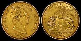
Double mohur (1835)
King William IV


- Support as nominator – Godot13 (talk) 18:28, 4 July 2015 (UTC)
- Support -- DreamSparrow Chat 18:42, 4 July 2015 (UTC)
- Support – You never hear much about William IV – who oddly enough was a defender of slavery. Interesting bio article. Sca (talk) 22:01, 4 July 2015 (UTC)
- Support - Always nice to have. — Chris Woodrich (talk) 23:38, 4 July 2015 (UTC)
- Support - I actually like ol' Bill; if I remember my high school history correctly he did a nice job of strong-arming the House of Commons over a couple of suffrage bills. I always liked his style. :-) --Ser Amantio di NicolaoChe dicono a Signa?Lo dicono a Signa. 14:29, 6 July 2015 (UTC)
- Well, his friend 'Mrs. Jordan' certainly was anything but bland. Sca (talk) 21:09, 6 July 2015 (UTC)
- Support Lemon martini (talk) 01:10, 11 July 2015 (UTC)
Promoted File:India 1862 One Mohur.jpg --Armbrust The Homunculus 18:30, 14 July 2015 (UTC)
Promoted File:India 1835 2 Mohurs.jpg --Armbrust The Homunculus 18:30, 14 July 2015 (UTC)
Aztec Ruins National Monument
Voting period is over. Please don't add any new votes. Voting period ends on 14 Jul 2015 at 18:53:16 (UTC)

- Reason
- It's of a high technical standard that exceeds our expectations for minimum resolution.
- Articles in which this image appears
- Aztec Ruins National Monument
- FP category for this image
- Wikipedia:Featured pictures/Places/Architecture
- Creator
- RO
- Support as nominator – RO(talk) 18:53, 4 July 2015 (UTC)
- Weak oppose – This pic was recently subbed for this one. Personally, I find the previous photo sharper and more visually interesting, due in part to contrast from shadowing. (Though I realize the nominated pic shows more of the ruins.) Sca (talk) 21:39, 4 July 2015 (UTC)
- Oppose - Useful, but it only shows parts of the ruins, and the lens distortion around the edges (particularly that right edge) is horrendous. — Chris Woodrich (talk) 00:51, 6 July 2015 (UTC)
- Useful, but it only shows parts of the ruins; the only way to show the entire ruin is from the air, such as with this image I uploaded in May: File:Aztec West.png RO(talk) 22:28, 6 July 2015 (UTC)
- Oppose per Chris Woodrich - the blur/softness at the edges is a big issue. Only the very centre of the picture seems to have clarity... gazhiley 10:47, 6 July 2015 (UTC)
- Comment You guys were right about the blurriness, so I cropped out the edges. Does it look better now? RO(talk) 22:46, 6 July 2015 (UTC)
- Not for me sorry - the whole picture is blurred, other than a very small part in the centre... Cropping the edges doesn't change that... gazhiley 14:14, 13 July 2015 (UTC)
- It's probably just the light but it looks washed-out to me. I prefer the panorama shot in the article (also yours) though being a lazy cow I've only had a quick look at it. Belle (talk) 00:03, 9 July 2015 (UTC)
Not Promoted --Armbrust The Homunculus 18:54, 14 July 2015 (UTC)
Tremella encephala
Voting period is over. Please don't add any new votes. Voting period ends on 14 Jul 2015 at 19:17:59 (UTC)

- Reason
- High quality and good EV
- Articles in which this image appears
- Tremella encephala
- FP category for this image
- Wikipedia:Featured pictures/Fungi
- Creator
- Ireen Trummer
- Support as nominator – Tomer T (talk) 19:17, 4 July 2015 (UTC)
- Weak oppose - Strikes me as lacking DOF. Mind, for such reflective surface, it's hard to tell. — Chris Woodrich (talk) 23:40, 4 July 2015 (UTC)
- Support Poor nom is getting no attention; sure it looks like a bit of brain matter has fallen on some lichen, but that's what it looks like. Belle (talk) 00:04, 12 July 2015 (UTC)
Not Promoted --Armbrust The Homunculus 19:18, 14 July 2015 (UTC)
Hungo Pavi
Voting period is over. Please don't add any new votes. Voting period ends on 14 Jul 2015 at 21:56:05 (UTC)

- Reason
- The image is of a high technical standard that meets or exceeds our minimum resolution requirements.
- Articles in which this image appears
- Hungo Pavi
- FP category for this image
- Wikipedia:Featured pictures/Culture, entertainment, and lifestyle/Culture and lifestyle
- Creator
- RO
- Support as nominator – RO(talk) 21:56, 4 July 2015 (UTC)
- Comment – Article is 75-word stub. Sca (talk) 14:57, 5 July 2015 (UTC)
- Oppose EV aside, there is a lot of softness or motion blur - very little detail visable, especially in the background cliff face... gazhiley 10:26, 6 July 2015 (UTC)
Not Promoted --Armbrust The Homunculus 21:57, 14 July 2015 (UTC)
Convair X-6
Voting period is over. Please don't add any new votes. Voting period ends on 15 Jul 2015 at 00:37:19 (UTC)

- Reason
- It's a plane meant to be powered by nuclear energy. Technical quality is good for its age, and the coolness factor makes me feel like a little boy again, imagining holing up against zombies in the Diefenbunker... (I was, needless to say, a little strange)
- Articles in which this image appears
- Convair X-6, Nuclear powered aircraft, +2
- FP category for this image
- Wikipedia:Featured pictures/Vehicles/Air
- Creator
- United States Air Force
- Support as nominator – — Chris Woodrich (talk) 00:37, 5 July 2015 (UTC)
- Very interesting historical photograph. 109.153.225.51 (talk) 13:57, 5 July 2015 (UTC)
- Support – Aviation-history EV. Interesting that both the U.S. and the Soviet Union developed test planes but soon abandoned their programs. (Hard to understand how a nuke could actually "power" a jet or turboprop engine.) Sca (talk) 14:50, 5 July 2015 (UTC)
- I'm guessing it was a "small" (how many meters? five? ten?) reactor. Theoretically, such an airplane could stay up indefinitely... no small wonder why they wanted to make it. — Chris Woodrich (talk) 15:17, 5 July 2015 (UTC)
- Support Interesting. Brandmeistertalk 17:53, 5 July 2015 (UTC)
- Support EV is huge, and looks visually captivating... gazhiley 08:45, 6 July 2015 (UTC)
- Support - I'm positively glowing with envy that you've found this *a-hyuk-hyuk-hyuk* --Ser Amantio di NicolaoChe dicono a Signa?Lo dicono a Signa. 14:27, 6 July 2015 (UTC)
- Support - Stellar...-Godot13 (talk) 16:05, 6 July 2015 (UTC)
- Support -Jobas (talk) 00:02, 7 July 2015 (UTC)
- Support - P. S. Burton (talk) 23:03, 7 July 2015 (UTC)
- Support I can't understand why we don't have nuclear powered planes; sounds so safe. Belle (talk) 23:43, 8 July 2015 (UTC)
- But in case of a crash.... likely a nuclear boom. Check out Sergei Preminin who manually prevented an impending nuclear meltdown on a submarine at the cost of his own life. Brandmeistertalk 11:40, 10 July 2015 (UTC)
- Support Lemon martini (talk) 01:11, 11 July 2015 (UTC)
Promoted File:NB-36H with B-50, 1955 - DF-SC-83-09332.jpeg --Armbrust The Homunculus 00:54, 15 July 2015 (UTC)
Skeptics with a K
Voting period is over. Please don't add any new votes. Voting period ends on 14 Jul 2015 at 23:12:57 (UTC)

- Reason
- Let's go with an unusual topic. I am fairly involved with the Skeptics movement in the UK, and Merseyside Skeptics Society are one of the most important groups in the United Kingdom after the award-winning Edinburgh Skeptics, who have excellent taste in speakers. Anyway! Conferences are a bit of a hard place to get good photos in, but I think this is a quite good one. The height differences affect the composition, but otherwise, it's quite good. Conflict of Interest note: I do know Michael Marshall a bit, and have been introduced to Alice Howarth. However, I am acting as my own person in this. I also know the photographer. Still acting as my own person, though.
- Articles in which this image appears
- Merseyside Skeptics Society, Skeptics with a K
- FP category for this image
- You could argue this, but... Wikipedia:Featured pictures/People/Entertainment?
- Creator
- Your Funny uncle
- Support as nominator – Adam Cuerden (talk) 23:12, 4 July 2015 (UTC)
- Neutral - Technically quite good, but I'm not too sure on the composition. I'd have found it better with their faces more central, rather than a 3/4-length group portrait — Chris Woodrich (talk) 00:00, 5 July 2015 (UTC)
- I suspect that this was chosen due to height differences between them. Adam Cuerden (talk) 08:46, 5 July 2015 (UTC)
- Comment. To me seems a fairly unremarkable snap of three people in a corridor. 109.153.225.51 (talk) 13:56, 5 July 2015 (UTC)
- Support Good quality, notable subjects (they have two articles - that's good enough for me) and the poses they are displaying show character. Happy to support this... gazhiley 09:59, 6 July 2015 (UTC)
- Oppose I have to agree with the IP editor above. While useful, this image isn't of featured quality given the problems with its composition. Nick-D (talk) 10:29, 6 July 2015 (UTC)
- Oppose Composition is not FP: tallest or shortest should be in the middle, too tight framing, small distracting elements (exit sign, light over shoulder). They don't seem sceptical about posed photos... --ELEKHHT 06:06, 8 July 2015 (UTC)
Not Promoted --Armbrust The Homunculus 00:56, 15 July 2015 (UTC)
Petroglyph Point at Mesa Verde National Park
Voting period is over. Please don't add any new votes. Voting period ends on 15 Jul 2015 at 19:22:29 (UTC)

- Reason
- The image is of a high technical quality, resolution, and EV.
- Articles in which this image appears
- Mesa Verde National Park, Petroglyph
- FP category for this image
- Wikipedia:Featured pictures/Culture, entertainment, and lifestyle/Culture and lifestyle
- Creator
- RO
- Support as nominator – RO(talk) 19:22, 5 July 2015 (UTC)
- Comment – It's an okay photo, but once again EV is doubtful. Only info about this petroglyph is in caption; nothing in article. (Note: Most of the capitalized words in the caption shouldn't be capitalized.) Doesn't appear at Petroglyph. – Sca (talk) 21:49, 5 July 2015 (UTC)
- Both Eagle and Mountain Lion clans, as well as the other names, are proper nouns in this useage. EV is doubtful; this is the first picture on Wikipedia of petroglyphs at Mesa Verde. What's your definition of EV? RO(talk) 22:07, 5 July 2015 (UTC)
- I've added it to Petroglyph: ([1]), and it was the first addition to the article of a rock art image from the continental United States. RO(talk) 23:00, 5 July 2015 (UTC)
Not Promoted --Armbrust The Homunculus 19:23, 15 July 2015 (UTC)
Nymphaea odorata
Voting period is over. Please don't add any new votes. Voting period ends on 16 Jul 2015 at 00:36:46 (UTC)

- Reason
- Well detailed image of the flower, making it easily identifiable, with good technical quality, and does not suffer from under or overexposure. It offers some scientific detail as well, with clear view to the reproductive organs, three of the four bracts, the top side and underside of the lily pads, developing lily pads, and venation on the underside of the lily pad is visible. A few stems of the lily pads are visible as well.
- Articles in which this image appears
- Nymphaea odorata
- FP category for this image
- Wikipedia:Featured pictures/Plants/Flowers
- Creator
- SanctuaryX
- Support as nominator – SanctuaryX (talk) 00:36, 6 July 2015 (UTC)
- Comment - Looks to be some haloing around the petals. — Chris Woodrich (talk) 00:50, 6 July 2015 (UTC)
- Support -Jobas (talk) 00:02, 7 July 2015 (UTC)
- Oppose – Haloing, DOF, tight crop. Would love to see a shot like the previous nom with all details sharp. Sca (talk) 13:09, 7 July 2015 (UTC)
- Comment - Sca, not entirely sure what's wrong with the DOF, but there was only cropping on the top left and left sides. The flower was about 4 inches across, so I just got as close as possible.SanctuaryX (talk) 15:15, 7 July 2015 (UTC)
.jpg)
Not Promoted --Armbrust The Homunculus 02:22, 16 July 2015 (UTC)
Egg fruit cross section DS.jpg
Voting period is over. Please don't add any new votes. Voting period ends on 16 Jul 2015 at 19:21:55 (UTC)


- Reason
- Good quality and EV
- Articles in which this image appears
- Pouteria campechiana
- FP category for this image
- Wikipedia:Featured pictures/Plants/Fruits
- Creator
- Augustus Binu
- Support as nominator – DreamSparrow Chat 19:21, 6 July 2015 (UTC)
- Support set - Of course, our question has to be: does it taste like egg? — Chris Woodrich (talk) 23:24, 6 July 2015 (UTC)
- Yup, it exactly tastes like boiled Yolk. DreamSparrow Chat 10:14, 7 July 2015 (UTC)
- Support -Jobas (talk) 00:02, 7 July 2015 (UTC)
- Support Any fruit that can be in a fruit salad omelette is cool by me Lemon martini (talk) 01:13, 11 July 2015 (UTC)
- Support - The edges of the cross-sectioned image feel a bit too soft (but not enough for a comment or oppose), and the EV is clearly there.--Godot13 (talk) 02:36, 11 July 2015 (UTC)
- Support set Adam Cuerden (talk) 02:40, 11 July 2015 (UTC)
- I'd like some sense of scale; I have no idea if I can eat these by the bowlful or whether I have to dislocate my jaw like a snake to eat even one (I never mentioned the snake jaw thing btw; I forgot it's covered by my Illuminati NDA) Belle (talk) 23:51, 11 July 2015 (UTC)
- Support set --Yann (talk) 14:30, 15 July 2015 (UTC)
Promoted File:Egg fruit cross section DS.jpg --Armbrust The Homunculus 19:22, 16 July 2015 (UTC)
Promoted File:Egg fruit DS.jpg --Armbrust The Homunculus 19:22, 16 July 2015 (UTC)
Aida: Act IV, Scene 2
Voting period is over. Please don't add any new votes. Voting period ends on 16 Jul 2015 at 20:43:04 (UTC)

- Reason
- A high-quality example of 19th-century operatic set design, from the première of a rather important opera. I did a bit of restoration to it because it was damaged enough (mainly on the border) to be distracting, but it's faithful to the original. Zoom in for a sense of scale.
- Articles in which this image appears
- Aida
- FP category for this image
- Wikipedia:Featured pictures/Culture, entertainment, and lifestyle/Theatre
- Creator
- Philippe Chaperon; restored by Adam Cuerden
- Support as nominator – Adam Cuerden (talk) 20:43, 6 July 2015 (UTC)
- Support - Glad to see it finally worked. :) — Chris Woodrich (talk) 23:36, 6 July 2015 (UTC)
- Support -Jobas (talk) 00:02, 7 July 2015 (UTC)
- Support Lemon martini (talk) 01:14, 11 July 2015 (UTC)
- Support - Excellent restoration.--Godot13 (talk) 02:29, 11 July 2015 (UTC)
- Support --Yann (talk) 14:29, 15 July 2015 (UTC)
Promoted File:Set design by Philippe Chaperon for Act4 sc2 of Aida by Verdi 1880 Paris.jpg --Armbrust The Homunculus 20:44, 16 July 2015 (UTC)
Guinea baboon with juvenile
Voting period is over. Please don't add any new votes. Voting period ends on 18 Jul 2015 at 10:55:47 (UTC)

- Reason
- High resolution, good quality picture with high EV of a Guinea baboon with her juvenile riding on her back; illustrates offspring rearing and bonding.
- Articles in which this image appears
- Guinea baboon
- FP category for this image
- Wikipedia:Featured pictures/Animals/Mammals
- Creator
- William Warby
- Support as nominator – —Bruce1eetalk 10:55, 8 July 2015 (UTC)
- Support --PetarM (talk) 11:15, 8 July 2015 (UTC)
- Support - Love it. — Chris Woodrich (talk) 13:05, 8 July 2015 (UTC)
- Comment Is it just me, or is the tip of the adult baboon's tail out of focus/soft, especially in comparison to the rest of its body? RO(talk) 18:42, 8 July 2015 (UTC)
- That's correct. It's a natural result of the limited depth of field produced by the camera and lens at 150mm and f2.8 (the very tip of the tail is a little out of the focus zone; focus drops drastically with this combination). It's so minor, however, that I don't have an issue with it. — Chris Woodrich (talk) 23:33, 8 July 2015 (UTC)
- Support Both should be wearing top hats for it to be perfect, but as it's so rare to capture them in evening dress that I think I'll have to let that slide. Belle (talk) 23:36, 8 July 2015 (UTC)
- Support If you want them with decorative headgear on,you go try and dress them yourself :) Lemon martini (talk) 01:15, 11 July 2015 (UTC)
- Support-Jobas (talk) 17:38, 11 July 2015 (UTC)
- Support --Yann (talk) 14:27, 15 July 2015 (UTC)
Promoted File:Papio papio and juvenile Port Lympne Wild Animal Park.jpg --Armbrust The Homunculus 10:57, 18 July 2015 (UTC)
Lens Olympus Zuiko OM 50 mm f/1.8
Voting period is over. Please don't add any new votes. Voting period ends on 18 Jul 2015 at 11:11:23 (UTC)

- Reason
- Good quality, high resolution macro stack of 2 photos, focus on front and on the blades.
- Articles in which this image appears
- Olympus OM system
- FP category for this image
- Wikipedia:Featured pictures/Photographic techniques, terms, and equipment
- Creator
- Petar Milošević
- Support as nominator – PetarM (talk) 11:11, 8 July 2015 (UTC)
- Comment. Chopped-off appearance at bottom spoils it for me I'm afraid. The top crop is also slightly too close for comfort. 109.153.232.72 (talk) 11:44, 8 July 2015 (UTC)
- Oppose. I agree, the "[c]hopped-off appearance" of the lens by the soft surface it's resting on, and the very tight bottom crop, spoils its circular shape. —Bruce1eetalk 06:06, 9 July 2015 (UTC)
- Oppose Shouldn't be difficult to shoot a much better version. --Janke | Talk 07:52, 10 July 2015 (UTC)
Not Promoted --Armbrust The Homunculus 11:15, 18 July 2015 (UTC)
Turmeric
Voting period is over. Please don't add any new votes. Voting period ends on 19 Jul 2015 at 01:20:57 (UTC)

- Reason
- High quality image of Turmeric rhizome.
- Articles in which this image appears
- Turmeric +1
- FP category for this image
- Wikipedia:Featured pictures/Food and drink
- Creator
- Simon A. Eugster
- Support as nominator – — Chris Woodrich (talk) 01:20, 9 July 2015 (UTC)
- Support Nice that we've got a suckling piglet and a Dune Guild Navigator in the picture too (I'm sure if this is a Rorschach-type test I've probably just revealed I want to sleep with my imaginary friend; a pig and Dune imagery in the tumeric picture; classic presentation.) Belle (talk) 23:58, 9 July 2015 (UTC)
- Request it will be good to know: it is a focus stack and made from how many images? Where are the exif data? It's a pity not to know this important and educational infos :-( Otherwise a nice image! --Alchemist-hp (talk) 19:38, 10 July 2015 (UTC)
- Information page says a stack of five images. I'm not familiar with CombineZP; does it allow people to keep EXIF data? — Chris Woodrich (talk) 23:33, 10 July 2015 (UTC)
- Ups, I overlooked it.--Alchemist-hp (talk) 05:08, 11 July 2015 (UTC)
- Information page says a stack of five images. I'm not familiar with CombineZP; does it allow people to keep EXIF data? — Chris Woodrich (talk) 23:33, 10 July 2015 (UTC)
- Support now. --Alchemist-hp (talk) 05:08, 11 July 2015 (UTC)
- Support-Jobas (talk) 17:38, 11 July 2015 (UTC)
- Support-This spice is being used by Iranian housewives very very very much as there is very few Iranian meals that don't contain turmeric. This is a reality not kidding. I haven't seen the turmeric root (the shape like this above) till now. Alborzagros (talk) 06:48, 12 July 2015 (UTC)
- Support Not only Iranian, but Indian meals too. --Yann (talk) 14:26, 15 July 2015 (UTC)
- Support - DreamSparrow Chat 15:58, 15 July 2015 (UTC)
Promoted File:Curcuma longa roots.jpg --Armbrust The Homunculus 05:06, 19 July 2015 (UTC)
Jade Raymond
Voting period is over. Please don't add any new votes. Voting period ends on 19 Jul 2015 at 08:26:16 (UTC)


- Reason
- Good composition and overall a strong portrait. Personally I'd prefer some left/right crop, so will upload if needed.
- Articles in which this image appears
- Jade Raymond
- FP category for this image
- People/Business
- Creator
- ZCooperstown
- Support as nominator – Brandmeistertalk 08:26, 9 July 2015 (UTC)
- Support with preference for Alt. Excellent potrait. Shame they placed the paper backdrop so close behind her, it's a little distracting to be honest! But other than that, the lighting and composition are good. I'd probably have cropped it a bit tighter around the left and right sides for a square frame though. Ðiliff «» (Talk) 11:59, 9 July 2015 (UTC)
- Weak support - I like this portrait, but I agree that a crop would be nice. — Chris Woodrich (talk) 23:40, 9 July 2015 (UTC)
- Crop has been added. Brandmeistertalk 08:10, 10 July 2015 (UTC)
- @Crisco 1492: Does this weak support also applies to the alt too? Armbrust The Homunculus 05:18, 19 July 2015 (UTC)
- Yes. I'd have gone 1 * 1.3 — Chris Woodrich (talk) 05:39, 19 July 2015 (UTC)
- Weird left eye (her left); if the photographic jargon of "weird" is too technical for you, I mean the iris and pupil are noticeably stretched vertically and it appears to have a line down the sclera; if anybody says that's my eyes making it look weird I will cry (but only one extra long tear from my weird elongated left eye). Belle (talk) 23:45, 9 July 2015 (UTC)
- Her left eye's pupil and iris looks bigger than her right's in other pictures of her too. 1,
2. — Chris Woodrich (talk) 00:37, 10 July 2015 (UTC)- The first one is totally the same picture as the second one with the background cut out, but I don't see anything so weird in that one (if anything I'd say her right eye was bigger there). Belle (talk) 00:54, 10 July 2015 (UTC)
- I agree, I don't think her eye looks weird in those pic, but it definitely does in the original. Hmmm. Does this change my vote? I like the image but it definitely seems digitally manipulated. But why would someone warp her eye like that?? Could be an accident that nobody noticed... Ðiliff «» (Talk) 14:26, 10 July 2015 (UTC)
- After thinking about it, I think I know. She was probably squinting slightly in her other eye and the Photoshopper decided to stretch it open slightly. You can see that it's slightly softer than the surrounding area which suggests it's been smeared. It's a pretty minor error in the grand scheme of things so I don't think it changes my vote, but it's disappointing that they did such a bad job of it. Ðiliff «» (Talk) 14:29, 10 July 2015 (UTC)
- I agree, I don't think her eye looks weird in those pic, but it definitely does in the original. Hmmm. Does this change my vote? I like the image but it definitely seems digitally manipulated. But why would someone warp her eye like that?? Could be an accident that nobody noticed... Ðiliff «» (Talk) 14:26, 10 July 2015 (UTC)
- The first one is totally the same picture as the second one with the background cut out, but I don't see anything so weird in that one (if anything I'd say her right eye was bigger there). Belle (talk) 00:54, 10 July 2015 (UTC)
- Her left eye's pupil and iris looks bigger than her right's in other pictures of her too. 1,

- Weak oppose – EV? Pleasant (promotional-looking) pic, but her brief article reads like a resumé. Sca (talk) 13:43, 10 July 2015 (UTC)
- Note: Re her left eye/pupil, such may result from trauma to optic nerves – as I can attest due to a nasty bike crash three years ago. Sca (talk) 13:43, 10 July 2015 (UTC)
- Sca, you've probably forgot the real promotional pics :) Brandmeistertalk 14:15, 10 July 2015 (UTC)
- Note: Re her left eye/pupil, such may result from trauma to optic nerves – as I can attest due to a nasty bike crash three years ago. Sca (talk) 13:43, 10 July 2015 (UTC)
- Comment. As per my comments above, I think the eye has been digitally manipulated. I decided to 'Be Bold' and try to reverse what's been done so I'll overwrite both the original and alt with my edit. Ðiliff «» (Talk) 14:37, 10 July 2015 (UTC)
- Support The left side could be eventually cropped, but not the right. --Yann (talk) 14:14, 15 July 2015 (UTC)
- @Yann: Does this mean that you only support the original? Armbrust The Homunculus 05:18, 19 July 2015 (UTC)
- Support And I prefer the cropped version. Rainbow unicorn (talk) 00:04, 17 July 2015 (UTC)
- Support prefer alt version. Rreagan007 (talk) 20:00, 18 July 2015 (UTC)
Promoted File:Jade Raymond Feb 2012.jpg --Armbrust The Homunculus 10:44, 19 July 2015 (UTC)
- Only the original has enough support for promotion (despite that some people supporting both expressed a preference for the alt). Armbrust The Homunculus 10:44, 19 July 2015 (UTC)
All Saints, Margaret Street London Interior
Voting period is over. Please don't add any new votes. Voting period ends on 19 Jul 2015 at 11:55:47 (UTC)

- Reason
It's a fascinating interior photo of a notable (and entirely kaleidoscopic!) London church, well captured with good sharpness and detail. I quote from the article: "Simon Thurley, the Chief Executive of English Heritage, listed All Saints as one of the ten most important buildings in the country.".
For those who crave even more detail, I also took this image which is even more detailed (180 megapixels!). I was tempted to make this the main interior image but the angle of view is less wide and the depth of field is not as good so I didn't think it would make such a good image for the article. Still, the detail is quite amazing if your browser can handle the filesize!
- Articles in which this image appears
- All Saints, Margaret Street
- FP category for this image
- Wikipedia:Featured pictures/Places/Interiors
- Creator
- User:Diliff
- Support as nominator – Ðiliff «» (Talk) 11:55, 9 July 2015 (UTC)
- Support - Beautiful -- DreamSparrow Chat 12:12, 9 July 2015 (UTC)
- Support – Startling. Talk about "high Victorian ostentatiousness [and] obtrusiveness" (from the article). Makes Baroque seem almost austere. Sca (talk) 13:13, 9 July 2015 (UTC)
- Support – Another fantastic Diliff photo. Mattximus (talk) 21:35, 9 July 2015 (UTC)
- I keep saying no Ðiliff, no comment; (It is Ðiliff? Ok, then Support; and I'm happy you took down the chandeliers in this one.) Belle (talk) 23:31, 9 July 2015 (UTC)
- Support - I was wondering why you were letting Commons have all the fun. — Chris Woodrich (talk) 23:38, 9 July 2015 (UTC)
- I'll nominate a couple of others then. :-) I've got quite a few good candidates. Ðiliff «» (Talk) 16:54, 10 July 2015 (UTC)
- Just reminding you that monkeys in hats is a new FP criterion (in case you forgot and were going to upload more pictures of empty churches). Belle (talk) 23:45, 10 July 2015 (UTC)
- Ahh, well if it's monkeys in hats you want, I have just the thing.. I've been taking lots of photos of monkeys in hats at the tennis recently. ;-) Kidding, I don't mean anything by that selection other than they're all wearing hats and are in various vaguely monkey-like poses or positions! Other than that, there's.. err.. an empty bridge? Ðiliff «» (Talk) 00:23, 11 July 2015 (UTC)
- Just reminding you that monkeys in hats is a new FP criterion (in case you forgot and were going to upload more pictures of empty churches). Belle (talk) 23:45, 10 July 2015 (UTC)
- I'll nominate a couple of others then. :-) I've got quite a few good candidates. Ðiliff «» (Talk) 16:54, 10 July 2015 (UTC)
- Support Beautiful photograph,even if it lacking the monkeys waltzing down the aisles Lemon martini (talk) 01:18, 11 July 2015 (UTC)
- Support-Jobas (talk) 17:38, 11 July 2015 (UTC)
- Support Another excellent picture... Slightly behind on the monkey conversation, but I'd happily see a version of this with Monkeys in Hats........... gazhiley 17:00, 12 July 2015 (UTC)
Promoted File:All Saints Margaret Street Interior 1, London, UK - Diliff.jpg --Armbrust The Homunculus 11:57, 19 July 2015 (UTC)
Verdi conducts Aida
Voting period is over. Please don't add any new votes. Voting period ends on 19 Jul 2015 at 16:09:29 (UTC)

- Reason
- One of the few featureable images of Verdi himsellf (It is HARD to get images of him at bigger than web resolution - unless you count massive upscales). I've recently went through Aida - which was a mess beforehand - and tried to get it down to only images that add a substantial amount of value, appropriately positioned (the other issue with images before - there really was no rhyme or reason to image positioning).
- Articles in which this image appears
- Aida
- FP category for this image
- Wikipedia:Featured pictures/Culture, entertainment, and lifestyle/Theatre
- Creator
- Adrien Marie, restored by Adam Cuerden
- Support as nominator – Adam Cuerden (talk) 16:09, 9 July 2015 (UTC)
- Support – Cote d'Azur (talk) 17:04, 9 July 2015 (UTC)
- Comment My search yielded at least two featurable photographs of Verdi, both by André-Adolphe-Eugène Disdéri, one from Stadtmuseum Berlin and the other one at Radio Télévision Suisse. Both would need some restoration though, don't know whether they are on Commons already. Brandmeistertalk 19:51, 9 July 2015 (UTC)
- Thank you; I'll add those to my list. The first looks like it'll have many an annoying discussion about crop or don't crop, so I'll probably start on the second. Still think this is a very useful image for showing a side photographs of the time weren't good enough to show. Adam Cuerden (talk) 20:49, 9 July 2015 (UTC)
- Comment - Not sure on the EV. If this could be worked into the main Verdi article, there'd be enough EV for me to support. — Chris Woodrich (talk) 23:39, 9 July 2015 (UTC)
- I think it has a fair bit of EV in the Aida article; I'm hesitant about the Verdi article, as it doesn't really fit anywhere in it with high EV - it's a later performance of Aida, during a time the article (quite rightly) is focusing on his Mass and Otello, major works of the period. But, in Aida, it illustrates the section on other notable 19th century performanes - which it certainly depicts - and thus has much higher EV and illustrative value. It's also the only image of Verdi in that article, increasing the EV furher. I'm certainly not against it being in Giuseppe Verdi, of course, but only if it's appropriate. Adam Cuerden (talk) 05:38, 10 July 2015 (UTC)
- Support I think that it is him conducting it makes it EVey enough. [subliminal: "Monkeys in hats; monkeys in hats"] Belle (talk) 00:03, 10 July 2015 (UTC)
- Support - Alright. I would like to see it in Verdi, but your point is well taken. — Chris Woodrich (talk) 13:34, 10 July 2015 (UTC)
- Question: Was that a pen & ink drawing? Sca (talk) 13:48, 10 July 2015 (UTC)
- @Sca: I'm not sure. It's a little hard to tell when it's converted to printing. It'll be something like that, but it could, for example, be ink with washes, or watercolour. The originals may exist, but it's rare to ever see them. Adam Cuerden (talk) 14:37, 10 July 2015 (UTC)
- So it's a print from an etched lead plate ... ? Sca (talk) 14:52, 10 July 2015 (UTC)
- I'm honestly unsure. It's from a newspaper, so it'll be some sort of engraving, but the standard for this time was woodblock and it's kind of unusual for that, which throws me. Adam Cuerden (talk) 15:21, 10 July 2015 (UTC)
- If this old boy remembers right, the old newspaper 'cuts' were wood blocks topped with a layer of lead alloy. Then they were 'stereotyped' onto curved lead-alloy printing plates for the old rotary (letterpress) presses. Sca (talk) 16:08, 10 July 2015 (UTC)
- I think that's more modern than was used in 1881, though. Pretty sure that was before rotary plates. Adam Cuerden (talk) 16:50, 10 July 2015 (UTC)
- Probably so. And maybe the 'cuts' were zinc-topped not lead-alloy.
- I do remember the gnomes emerging from Engraving in acid-ravaged clothes. Sca (talk) 17:15, 10 July 2015 (UTC)
- Ach, if you have photos of any of this, we need them on Wikipedia. =) Adam Cuerden (talk) 17:27, 10 July 2015 (UTC)
- I think that's more modern than was used in 1881, though. Pretty sure that was before rotary plates. Adam Cuerden (talk) 16:50, 10 July 2015 (UTC)
- If this old boy remembers right, the old newspaper 'cuts' were wood blocks topped with a layer of lead alloy. Then they were 'stereotyped' onto curved lead-alloy printing plates for the old rotary (letterpress) presses. Sca (talk) 16:08, 10 July 2015 (UTC)
- I'm honestly unsure. It's from a newspaper, so it'll be some sort of engraving, but the standard for this time was woodblock and it's kind of unusual for that, which throws me. Adam Cuerden (talk) 15:21, 10 July 2015 (UTC)
- So it's a print from an etched lead plate ... ? Sca (talk) 14:52, 10 July 2015 (UTC)
- @Sca: I'm not sure. It's a little hard to tell when it's converted to printing. It'll be something like that, but it could, for example, be ink with washes, or watercolour. The originals may exist, but it's rare to ever see them. Adam Cuerden (talk) 14:37, 10 July 2015 (UTC)
- Question: Was that a pen & ink drawing? Sca (talk) 13:48, 10 July 2015 (UTC)
Promoted File:Verdi conducting Aida in Paris 1880 - Gallica - Restoration.jpg --Armbrust The Homunculus 16:10, 19 July 2015 (UTC)
Joe banknotes of Demarary and Essequibo (1830s)
Voting period is over. Please don't add any new votes. Voting period ends on 20 Jul 2015 at 00:21:02 (UTC)
- Reason
- High quality, high EV (presented as a complete set). Prior to the use of banknotes in the British colonies of Demerara and Essequibo, one of the most commonly accepted monetary instruments was the Portuguese gold Johannes coin (c. mid-18th century). Colloquially referred to as Joes, the coins were eventually replaced by banknotes (1809), dually-denominated in Guilders and Joes. There are no reports that any of these early notes still exist. Two issues in the 1830s were prepared but not circulated. These unsigned remainders are the only existing examples of the paper Joe. As an 1830s denomination, the two Joes note is extremely rare and, prior to being discovered in the NNC, the 20 Joe was unknown as denomination.
- Original
- A five-note complete denomination set of known Demerara and Essequibo (later British Guiana) banknotes (1830s).
- Articles in which these images appear
- Banknotes of Demarary and Essequibo, British Guianan guilder, Demerara
- FP category for this image
- Currency
- Creator
- Kingdom of Great Britain for British Guiana
From the National Numismatic Collection, National Museum of American History, Smithsonian Institution.
Images by Godot13.
Banknotes of Demarary and Essequibo (1830s)
Complete denomination set of known notes
Complete denomination set of known notes
-

One Joe
(22 Guilders) -

Two Joes
(22 Guilders each) -

Three Joes
(22 Guilders each)
(1830s).jpg)
(1830s).jpg)
(1830s).jpg)
-

10 Joes
(220 Guilders) -

20 Joes
(440 Guilders)
(1830s).jpg)
(1830s).jpg)
- Support as nominator – Godot13 (talk) 00:21, 10 July 2015 (UTC)
- Support - Did you know that jo means "beloved"? Looking at these notes, I don't think it's a coincidence. — Chris Woodrich (talk) 00:32, 10 July 2015 (UTC)
- Support- High quality portrayal of a very rare currency to find in such good condition. Purely for my own enlightenment,why do the 1,10 and 20 Joes appear to have the numbers in what looks like Arabic numbers too? Lemon martini (talk) 01:22, 11 July 2015 (UTC)
- Lemon martini- Thanks for your interest. The 1, 10, and 20 Joe notes are all from the first issue, the 2 and 3 Joe notes are from the second issue. They all appear to have Arabic numerals... Are you referring to the large D and E (for Demerary and Essequebo) in the upper center of those three notes?--Godot13 (talk) 02:17, 11 July 2015 (UTC)
- Ah no-I meant the little boxes in the top right. I see now on a second look that it appears to be 'No.' in the very ornate font,which at first made it look like some sort of Arabic calligraphy,especially with the small dots and circle.That reminds me-I need an eye test soon :) Lemon martini (talk) 05:14, 11 July 2015 (UTC)
- Support-Jobas (talk) 17:36, 11 July 2015 (UTC)
- Support That'll be 10 Joes, please; to the normal account Belle (talk) 23:39, 11 July 2015 (UTC)
Promoted File:BR-GUI-A1-Demerary & Essequebo-One Joe (22 Guilders)(1830s).jpg --Armbrust The Homunculus 00:23, 20 July 2015 (UTC)
Promoted File:BR-GUI-B2-Demerary & Essequebo-Two Joes (22 Guilders each)(1830s).jpg --Armbrust The Homunculus 00:23, 20 July 2015 (UTC)
Promoted File:BR-GUI-B3-Demerary & Essequebo-Three Joes (22 Guilders each)(1830s).jpg --Armbrust The Homunculus 00:23, 20 July 2015 (UTC)
Promoted File:BR-GUI-A4-Demerary & Essequebo-10 Joes (220 Guilders)(1830s).jpg --Armbrust The Homunculus 00:23, 20 July 2015 (UTC)
Promoted File:BR-GUI-A5-Demerary & Essequebo-20 Joes (440 Guilders)(1830s).jpg --Armbrust The Homunculus 00:23, 20 July 2015 (UTC)
George Clinton
Voting period is over. Please don't add any new votes. Voting period ends on 19 Jul 2015 at 23:46:17 (UTC)
.jpg)
- Reason
- High quality contemporary depiction of the second highest ranking Clinton in the US government to date.
- Articles in which this image appears
- George Clinton (vice president) +5
- FP category for this image
- Wikipedia:Featured pictures/People/Political
- Creator
- Ezra Ames
- Support as nominator – — Chris Woodrich (talk) 23:46, 9 July 2015 (UTC)
- Support-Jobas (talk) 17:37, 11 July 2015 (UTC)
- Support Odd background, elaborate jellyfish exploding from his shirt, and he seems to have been made up of the top half of a normal-sized man and the bottom half of a sumo wrestler; what's not to like? Belle (talk) 00:36, 13 July 2015 (UTC)
- Support- Good EV as lead image for the bio.--Godot13 (talk) 03:07, 14 July 2015 (UTC)
- Support --Yann (talk) 14:11, 15 July 2015 (UTC)
Promoted File:George Clinton by Ezra Ames (full portrait).jpg --Armbrust The Homunculus 00:42, 20 July 2015 (UTC)
Albert Bridge at night
Voting period is over. Please don't add any new votes. Voting period ends on 20 Jul 2015 at 17:04:36 (UTC)

- Reason
- It's an unusual and interesting view of Albert Bridge, a notable bridge on the River Thames in London.
- Articles in which this image appears
- Albert Bridge, London
- FP category for this image
- Wikipedia:Featured pictures/Places/Architecture
- Creator
- User:Diliff
- Support as nominator – Ðiliff «» (Talk) 17:04, 10 July 2015 (UTC)
- Support - its awesome -- DreamSparrow Chat 18:26, 10 July 2015 (UTC)
- Support - Indeed. I love this view — Chris Woodrich (talk) 00:31, 11 July 2015 (UTC)
- Support Very impressive-pinpoint clarity.I love the little touches-the yellow lines changing to pink,the notice that 'Troops must break rank whilst crossing the bridge'And very impressively nothing to distract the eye-pavements beautifully clean,not a speck of litter.How on earth did you manage to achieve that?! Lemon martini (talk) 01:24, 11 July 2015 (UTC)
- Well, I didn't go around picking up all the litter if that's what you're asking! The hard part was actually capturing it while cars drove across it and caused trouble for me. It's a 5 exposures x 2 rows x 3 columns panorama, and took about 5-10 minutes to shoot, each segment taken in between cars and people walking across the bridge. Because I was actually standing in the right hand turn lane to take the shot (as you can see from the arrow in the foreground), I actually had to get off the road at one point and come back when the car had gone, trying to find exactly the same point to set the tripod up on again. Technically challenging to say the least. Ðiliff «» (Talk) 11:09, 11 July 2015 (UTC)
- Support - Very nice.--Godot13 (talk) 02:39, 11 July 2015 (UTC)
- Support-Jobas (talk) 17:36, 11 July 2015 (UTC)
- Support Extremely bridgey. Belle (talk) 23:36, 11 July 2015 (UTC)
- Support Wow... The quality is awesome, and love the look on the lights - the way they sparkle... gazhiley 16:34, 12 July 2015 (UTC)
- Comment. Aesthetically I think it is a lovely picture, but I am uneasy about such heavily faked photos being used for encyclopedic purposes. 109.153.244.21 (talk) 03:10, 13 July 2015 (UTC)
- Faked how? gazhiley 09:06, 13 July 2015 (UTC)
- Yeah, I concur with Gaz... Why do you think it's faked? It's not at all. I'm a bit uneasy about anonymous people coming in here and making false accusations about the authenticity of my photography! ;-) If you want to take a ridiculously hard line on it, all photography is 'fake' because it is a two dimensional representation of a three dimensional space and therefore isn't 'reality'. But if you accept that there are limitations to what photography can show, then you should be able to accept that stitching might not absolutely capture a moment in time (it captures multiple moments and combines them seamlessly), but nor does it need to. It's a static object and this is absolutely how it looks from this position. There's nothing fake about it! Ðiliff «» (Talk) 09:36, 13 July 2015 (UTC)
- I believe this is the same IP editor who is a hardliner against panoramas in general. Mind, I may be wrong. — Chris Woodrich (talk) 10:25, 13 July 2015 (UTC)
- Hard to know what exactly you're dealing with when you can't verify any editing history and the accusation is left unexplained. Either way, I'd like to hear why they think it's faked, and to clarify further if necessary. Ðiliff «» (Talk) 10:53, 13 July 2015 (UTC)
- The photographer explains above that it was stitched together from multiple images taken at different times. In other words, it is not an image of a scene that ever actually existed. That is why I said it is "faked". This is not an egregious example, but because of the wider possibility for more misleading manipulation, I am generally against doctoring of images for Wikiepdia. 109.153.244.21 (talk) 11:46, 13 July 2015 (UTC)
- That's an incredibly narrow-minded way of looking at it. The scene as you see it here did actually exist. It's simply that my methodology requires multiple images for a wider angle view and higher resolution. And to set the record straight, was over a period of 5-10 minutes. It's not like I took some photos during the day and some at night and blended them together. The end result is better than a single photo, but it is not less real. In any case, I ask you, why does it matter that the component images were taken at slightly different times? As I said already, it's a static object. It didn't change in any way between the shots, and therefore doesn't misrepresent the bridge. If you're going to argue that it's been 'doctored', you have to be specific about the significance of the doctoring to its encyclopaedic value and how it misrepresents reality. Ðiliff «» (Talk) 16:49, 13 July 2015 (UTC)
- Fake is a strong word to use for that description. At the most I would go with manipulated, but as Ðiliff has pointed out it's a static object, and each stitch is an actual image not edited, so this is about as accurate as it's going to get. The alternative is a much smaller image, with random cars moving (and most likely blurred due to the length of exposure needed for this level of clarity), and people walking etc - this is a much better image EV wise. Plus many many high quality pictures on this site are stitched, so you are fighting a losing battle here I'm afraid. But thank you for your comment, and feel free to register a username so that you may be able to have your opionion counted as a vote - the more the better... gazhiley 09:24, 14 July 2015 (UTC)
- That's an incredibly narrow-minded way of looking at it. The scene as you see it here did actually exist. It's simply that my methodology requires multiple images for a wider angle view and higher resolution. And to set the record straight, was over a period of 5-10 minutes. It's not like I took some photos during the day and some at night and blended them together. The end result is better than a single photo, but it is not less real. In any case, I ask you, why does it matter that the component images were taken at slightly different times? As I said already, it's a static object. It didn't change in any way between the shots, and therefore doesn't misrepresent the bridge. If you're going to argue that it's been 'doctored', you have to be specific about the significance of the doctoring to its encyclopaedic value and how it misrepresents reality. Ðiliff «» (Talk) 16:49, 13 July 2015 (UTC)
- The photographer explains above that it was stitched together from multiple images taken at different times. In other words, it is not an image of a scene that ever actually existed. That is why I said it is "faked". This is not an egregious example, but because of the wider possibility for more misleading manipulation, I am generally against doctoring of images for Wikiepdia. 109.153.244.21 (talk) 11:46, 13 July 2015 (UTC)
- Hard to know what exactly you're dealing with when you can't verify any editing history and the accusation is left unexplained. Either way, I'd like to hear why they think it's faked, and to clarify further if necessary. Ðiliff «» (Talk) 10:53, 13 July 2015 (UTC)
- I believe this is the same IP editor who is a hardliner against panoramas in general. Mind, I may be wrong. — Chris Woodrich (talk) 10:25, 13 July 2015 (UTC)
- Hey IP, it's not really CGI; that was just me pulling Diliff's leg as I think it would have been easier to do with CGI. If it had Bigfoot crossing the bridge you'd have a point though; have you spotted him? Belle (talk) 11:27, 13 July 2015 (UTC)
Promoted File:Albert Bridge at night, London, UK - Diliff.jpg --Armbrust The Homunculus 17:08, 20 July 2015 (UTC)
- Added image to Places/Panorama instead. Armbrust The Homunculus 17:08, 20 July 2015 (UTC)
Médée
Voting period is over. Please don't add any new votes. Voting period ends on 21 Jul 2015 at 03:01:06 (UTC)

- Reason
- While not my highest-value score cover - this isn't temporally close to the original performance - this does, however, represent a major revision of the opera that was very influential: the late 1909 hybrid Italian version with translations of German recitatives. Okay, long story short, this is theoretically a grand tragic opera, but Cherubini never wrote the recitatives because the theatre he got to perform it was one of the theatres that did opéra-comique - e.g. operas with dialogue between the numbers; not necessarily with a happy ending. See [2] for more. He then translated it to Italian. In the 19th century, it was restored to a tragédie lyrique - but in a German translation. Then in 1909, the German recitatives were translated to Italian.
It's a little confusing.
- Articles in which this image appears
- Médée (Cherubini)
- FP category for this image
- Wikipedia:Featured_pictures/Culture,_entertainment,_and_lifestyle/Theatre
- Creator
- Giuseppe Palanti; restored by Adam Cuerden
- Support as nominator – Adam Cuerden (talk) 03:01, 11 July 2015 (UTC)
- Support - Artistically, this is my favourite of the covers I uploaded for you. — Chris Woodrich (talk) 04:37, 11 July 2015 (UTC)
- It has a lot of lovely touches from the Art Nouveau/Art Deco transition. Adam Cuerden (talk) 04:48, 11 July 2015 (UTC)
- Support Good choice. Brandmeistertalk 08:47, 11 July 2015 (UTC)
- Support-Jobas (talk) 17:36, 11 July 2015 (UTC)
- Support- Bit somber for me, but the cleaning/restoration is excellent.--Godot13 (talk) 03:04, 14 July 2015 (UTC)
Promoted File:Cherubini, Luigi - Medea - Restoration.jpg --Armbrust The Homunculus 03:02, 21 July 2015 (UTC)
Cosimo I de' Medici, Grand Duke of Tuscany
Voting period is over. Please don't add any new votes. Voting period ends on 22 Jul 2015 at 00:52:16 (UTC)

- Reason
- High quality image. Proof that Batman wasn't the first one to have nipples on his armor.
- Articles in which this image appears
- Cosimo I de' Medici, Grand Duke of Tuscany +3
- FP category for this image
- Wikipedia:Featured pictures/People/Political
- Creator
- Bronzino
- Support as nominator – — Chris Woodrich (talk) 00:52, 12 July 2015 (UTC)
- Support - An awesome and unique painting. Alborzagros (talk) 09:04, 12 July 2015 (UTC)
- Support. Great candidate. Josh Milburn (talk) 13:31, 12 July 2015 (UTC)
- Support I have a similar bra (though my breasts aren't in my armpits; give it time). Belle (talk) 00:05, 13 July 2015 (UTC)
- That's also EV-ish, I must admit. Brandmeistertalk 08:08, 13 July 2015 (UTC)
- SupportDo the spikes also rotate and zap out lazerbeams of light? Lemon martini (talk) 20:59, 13 July 2015 (UTC)
- Support --Yann (talk) 14:06, 15 July 2015 (UTC)
- Support -- DreamSparrow Chat 15:58, 15 July 2015 (UTC)
- Support --Jobas (talk) 12:16, 17 July 2015 (UTC)
Promoted File:Agnolo Bronzino - Cosimo I de' Medici in armour - Google Art Project.jpg --Armbrust The Homunculus 01:26, 22 July 2015 (UTC)
Tadrart Acacus desert, Libya
Voting period is over. Please don't add any new votes. Voting period ends on 22 Jul 2015 at 06:08:32 (UTC)

- Reason
- HQ + EV
- Articles in which this image appears
- Orographic lift, Tadrart Acacus, Wave cloud, and List of cloud types.
- FP category for this image
- Wikipedia:Featured pictures/Places/Landscapes
- Creator
- Pir6mon
- Support as nominator – Alborzagros (talk) 06:08, 12 July 2015 (UTC)
- Comment The picture was nominated before. this is 2nd chance. --Alborzagros (talk) 06:16, 12 July 2015 (UTC)
- Weak support - Sadly the Moul n'ga Cirque (depicted here) isn't discussed at all. — Chris Woodrich (talk) 08:00, 12 July 2015 (UTC)
- Oppose Whole ridge is halo'd sorry - sun just seems to be at an angle that doesn't help with this sort of picture... gazhiley 16:30, 12 July 2015 (UTC)
- Support A nice, versatile image Rainbow unicorn (talk) 23:24, 16 July 2015 (UTC)
- Support very nice image. Rreagan007 (talk) 20:02, 18 July 2015 (UTC)
- Weak support per Chris. Adam Cuerden (talk) 05:09, 20 July 2015 (UTC)
- Support Hafspajen (talk) 16:11, 20 July 2015 (UTC)
Promoted File:Tadrart01.JPG --Armbrust The Homunculus 06:42, 22 July 2015 (UTC)
Ai-jen Poo
Voting period is over. Please don't add any new votes. Voting period ends on 23 Jul 2015 at 02:16:18 (UTC)
- Reason
- High technical quality of this notable activist
- Articles in which this image appears
- Ai-jen Poo
- FP category for this image
- Wikipedia:Featured pictures/People/Political or Wikipedia:Featured pictures/People/Others, maybe
- Creator
- John D. and Catherine T. MacArthur Foundation
- Support as nominator – — Chris Woodrich (talk) 02:16, 13 July 2015 (UTC)
- Comment. I'm not sure how much it really matters, but there is something a bit odd with the colours on her shirt (e.g. look under her left arm). 109.153.244.21 (talk) 03:05, 13 July 2015 (UTC)
- Reds are notoriously easy to blow, especially with a bright color like this. This image was desaturated by 30 or so and the reds were still overwhelming. — Chris Woodrich (talk) 03:19, 13 July 2015 (UTC)
- I agree with you, although I think the image has been a bit overprocessed. I don't think the reds were blown this bad at the time of the photo (unless the photographer accidentally overexposed and had to darken it in post), I think the blown reds were introduced by editing. Just my suspicion though. Also, it probably doesn't help that the WB is a bit off. There's a definite red tint to the photo, which is probably introduced by the red wall on her left (camera right). Even so, it's fairly easily corrected. Mind if I upload over the top of it to correct it? (nothing I can do about the shirt though) Ðiliff «» (Talk) 09:47, 13 July 2015 (UTC)
- Reds are notoriously easy to blow, especially with a bright color like this. This image was desaturated by 30 or so and the reds were still overwhelming. — Chris Woodrich (talk) 03:19, 13 July 2015 (UTC)
- No worries about overwriting. (I overwrote the Junot Díaz image, from the same source, with an edit a while back). — Chris Woodrich (talk) 10:05, 13 July 2015 (UTC)
- (OP) Actually, looking at this again, I now think the red shirt overload probably does matter -- enough at least to scupper this one's chances of attaining FP status. 109.153.244.21 (talk) 12:14, 13 July 2015 (UTC)
- Weak Support. It's a good portrait, and I don't think there's much wrong with it. Just the slightly off-putting tones on her shirt makes it hard to give full support. We are notoriously harsh on portraits though. We often reject what would be happily accepted by commercial clients! Ðiliff «» (Talk) 10:39, 13 July 2015 (UTC)
- Support The red suits her and I like the office setting more than the clichéd equation-filled whiteboard, glass and steel corridor or mood-lit laboratory. Belle (talk) 00:24, 14 July 2015 (UTC)
- Support --Yann (talk) 14:05, 15 July 2015 (UTC)
- Support --Jobas (talk) 12:15, 17 July 2015 (UTC)
- Support nice portrait. Rreagan007 (talk) 20:03, 18 July 2015 (UTC)
Promoted --Armbrust The Homunculus 02:40, 23 July 2015 (UTC)
Interior with Young Woman Seen from the Back
Voting period is over. Please don't add any new votes. Voting period ends on 24 Jul 2015 at 00:03:41 (UTC)

- Reason
- Shows the Danes' hatred of bright colours, the outdoors and faces. Actually this is classic Hammershøi and although the colours are muted and the setting stark it is still light and airy; I like it (which is reason enough for you to support it).
- Articles in which this image appears
- Just Vilhelm Hammershøi at the mo, but I shall endeavour to do a little snippet on this painting once I'm properly remojofied.
- I'm only partially remojofied; not firing on full mojos, but I've started Interior with Young Woman Seen from the Back as a stub and I'll expand it before this nomination expires.
- FP category for this image
- Wikipedia:Featured pictures/Artwork/Paintings
- Creator
- Vilhelm Hammershoi (not able to support it himself except through Ouijapedia)
- Support as nominator – Belle (talk) 00:03, 14 July 2015 (UTC)
ConditionalSupport - Assuming we can get that article Belle's promised. Did ya pinkie swear yet? — Chris Woodrich (talk) 00:27, 14 July 2015 (UTC)- Support – Unusual, intriguing. (But could we please re-title this nom in English?) Sca (talk) 14:09, 14 July 2015 (UTC)
- I think I might break it if I do that. I named it in Danish as I didn't know (and still don't) what the correct title is in English as there are four or five minor variations. You could learn Danish; it's very useful if you come across any of the seven Danes that don't speak English; or if you know how to move it without breaking it you can put it at "Interior with Young Woman Seen from the Back". Belle (talk) 14:25, 14 July 2015 (UTC)
- Well, in my oafish non-techie way I tried renaming it here, but evidently there's something I don't understand about the process. Sca (talk) 16:00, 14 July 2015 (UTC)
- Support - it's quite lovely and also haunting. The next time I'm in mourning (or retiring!) it's going on my page. Victoria (tk) 00:40, 17 July 2015 (UTC)
- Support --Jobas (talk) 12:14, 17 July 2015 (UTC)
- Support -- But I have spent 10 minutes on trying to find out how to edit this as I came from here. Not all Danes hate bright colours. Just look at their flag and the houses in Nyhavn. In contrast to the Swedes who love white, they are positively chromatic!--Ipigott (talk) 20:24, 17 July 2015 (UTC)
- Support --Hafspajen (talk) 19:35, 18 July 2015 (UTC)
- Support -- yes, it's gloomy and uplifting at the same time. I thought from Swedish I could vaguely read Danish, but I learnt today that frokost is lunch not breakfast, and have is garden not sea, no idea why. Maybe Danes like to have lunch in gardens when they aren't standing about in darkened rooms. Chiswick Chap (talk) 13:12, 20 July 2015 (UTC)
Promoted File:Vilhelm Hammershoi - Interieur mit Rueckenansicht einer Frau - 1903-1904 - Randers Kunstmuseum.jpg --Armbrust The Homunculus 02:33, 24 July 2015 (UTC)
Amplang
Voting period is over. Please don't add any new votes. Voting period ends on 24 Jul 2015 at 00:24:22 (UTC)

- Reason
- High quality macro image of this Indonesian krupuk (like a cracker)
- Articles in which this image appears
- Amplang
- FP category for this image
- Wikipedia:Featured pictures/Food and drink
- Creator
- — Chris Woodrich (talk)
- Support as nominator – — Chris Woodrich (talk) 00:24, 14 July 2015 (UTC)
- I'm not sure about this one; the composition is a bit strange as there are two whole amplang yet we can only really see three and a bit sides and the lighting mutes the contours. I guess they aren't the most exciting shape and you are trying to add interest by arranging them in an action pose, but they look a little like they are about to mate. Belle (talk)
- Indeed, the shape isn't the most attractive in and of itself, and the contours don't have any sharp lines. That may be part of the reason why pages and pages of Google Image Results just show them in bags or on plates. However, I figured it would be best for an infobox picture to show one or two. This allows us to see in detail the shape of the snack itself. — Chris Woodrich (talk) 01:26, 14 July 2015 (UTC)
- Could you break one open? This would give some sense of scale (like the powder in the Tumeric pic) and show off the structure a bit better; and be a novel way of illustrating them (I can't find any images of them broken or crumbled); and make you redo all your hard work; and stop me whining (maybe). Belle (talk) 08:18, 16 July 2015 (UTC)
- My wife has... processed... all of them, sadly. Next time I get some, I'll give that a shot. — Chris Woodrich (talk) 08:58, 16 July 2015 (UTC)
- Could you break one open? This would give some sense of scale (like the powder in the Tumeric pic) and show off the structure a bit better; and be a novel way of illustrating them (I can't find any images of them broken or crumbled); and make you redo all your hard work; and stop me whining (maybe). Belle (talk) 08:18, 16 July 2015 (UTC)
- Indeed, the shape isn't the most attractive in and of itself, and the contours don't have any sharp lines. That may be part of the reason why pages and pages of Google Image Results just show them in bags or on plates. However, I figured it would be best for an infobox picture to show one or two. This allows us to see in detail the shape of the snack itself. — Chris Woodrich (talk) 01:26, 14 July 2015 (UTC)
- Comment I would rather see them within some sort of context in order to judge the size. Resorting to a scale seems awkward to me. Kaldari (talk) 05:16, 15 July 2015 (UTC)
- What could be standardized to measure size? Bowls come in all shapes and sizes. Coins are troublesome (especially since the vast majority of readers will have no reference point for an Indonesian coin). To avoid ambiguity, a scale works best. (Though yes, I must admit that at high resolutions these look almost like small loaves of bread). — Chris Woodrich (talk) 05:47, 15 July 2015 (UTC)
- Support I wonder what's the test of this... ;oS --Yann (talk) 13:56, 15 July 2015 (UTC)
- Fish. I don't really like the taste, but my wife loves snacks like this. (The kue gapit was more my type) — Chris Woodrich (talk) 08:58, 16 July 2015 (UTC)
- Support -- I feel this may the best way it can be captured. I am not much concerned about the sharpness of the edge in this -- DreamSparrow Chat 19:08, 15 July 2015 (UTC)
- Support --Jobas (talk) 12:14, 17 July 2015 (UTC)
- Support Rreagan007 (talk) 20:04, 18 July 2015 (UTC)
Promoted File:Amplang from Kotabaru, South Kalimantan 2015-05-23 01.jpg --Armbrust The Homunculus 02:36, 24 July 2015 (UTC)
The interior of St Etheldreda's Church, Ely Place, London
Voting period is over. Please don't add any new votes. Voting period ends on 24 Jul 2015 at 10:53:51 (UTC)

- Reason
- It's a simple but beautiful small medieval church dating from the 13th century, and the oldest surviving Catholic church in London. The image itself is high resolution and interesting, showing the dark interior and the stained glass windows well.
- Articles in which this image appears
- St Etheldreda's Church
- FP category for this image
- Wikipedia:Featured pictures/Places/Interiors
- Creator
- User:Diliff
- Support as nominator – Ðiliff «» (Talk) 10:53, 14 July 2015 (UTC)
- Support - Love it. — Chris Woodrich (talk) 11:17, 14 July 2015 (UTC)
- Support – Funereal atmospherics. Fascinatingly complex history at St Etheldreda's Church, including a shocking 16th century use of the crypt. Sca (talk) 14:04, 14 July 2015 (UTC)
- Haha, but having been in the crypt, I can tell you it would have made a pretty atmospheric pub! I didn't get a photo though as it was kind of being used as a miscellaneous room and wasn't really very photogenic. Strangely enough, the crypt is actually the entrance to the building. You cross the crypt, go through a door on the far left and then go up the stairs to the actual church. Perhaps the land has been excavated since the church was built. That's the opposite of what seems to have been the case elsewhere in London, where Roman ruins were undiscovered for over a thousand years 5 metres underneath the ground level of existing buildings. Ðiliff «» (Talk) 14:48, 14 July 2015 (UTC)
- Support Need I mention the obvious? Belle (talk) 16:27, 14 July 2015 (UTC)
- Support Top quality as usual sir... gazhiley 07:05, 15 July 2015 (UTC)
- Support --Yann (talk) 13:54, 15 July 2015 (UTC)
- Support --Jobas (talk) 12:14, 17 July 2015 (UTC)
- Support --Now to tackle Belle's rather worrying monkey fixation.... Lemon martini (talk) 00:55, 23 July 2015 (UTC)
Promoted File:St Etheldreda's Church Interior, London, UK - Diliff.jpg --Armbrust The Homunculus 11:41, 24 July 2015 (UTC)
Sherlock Holmes and Moriarty fight to the death at the Reichenbach Falls
Voting period is over. Please don't add any new votes. Voting period ends on 3 Aug 2015 at 09:53:09 (UTC)

- Reason
- Iconic image of detective fiction; the grudge match between The Great Detective and The Napoleon of Crime. I admit this isn't a sure thing for FP because it is actually lower resolution that the image it replaced and has competition from the original pen and ink drawing. However I think having the caption and frame to the plate is important as this is how it was originally presented, and the Paget artwork was only produced to allow the print to be created, so don't make yourself look silly by arguing against it on those points (I'm attempting peer pressure here). The line across the print is because the original artwork was in two pieces.
- Articles in which this image appears
- The Final Problem, The Adventure of the Empty House and in a gallery in Reichenbach Falls
- FP category for this image
- Wikipedia:Featured pictures/Artwork/Literary illustrations
- Creator
- Sidney Paget
- Support as nominator – Belle (talk) 09:53, 24 July 2015 (UTC)
- Oppose - Below the minimum resolution. Otherwise very nice. — Chris Woodrich (talk) 13:29, 24 July 2015 (UTC)
- Is it? There's 2369280 pixels in this image and in a minimum square one (1500x1500) there would be 2250000; so, as I calculate, it has 119280 more pixels than the minimum (it had even more before I cropped the monkey out). Belle (talk) 13:49, 24 July 2015 (UTC)
- Problem is, our minimum isn't megapixels. It's a fixed length. There are exceptions (that scroll a bit further below is one) but for something that could easily be scanned at a higher resolution such as this, I can't consider it an exception. — Chris Woodrich (talk) 14:34, 24 July 2015 (UTC)
- Is it? There's 2369280 pixels in this image and in a minimum square one (1500x1500) there would be 2250000; so, as I calculate, it has 119280 more pixels than the minimum (it had even more before I cropped the monkey out). Belle (talk) 13:49, 24 July 2015 (UTC)
Not Promoted --Armbrust The Homunculus 17:14, 24 July 2015 (UTC)
- Withdrawn nomination. --Armbrust The Homunculus 17:14, 24 July 2015 (UTC)
La forza del destino
Voting period is over. Please don't add any new votes. Voting period ends on 24 Jul 2015 at 20:47:30 (UTC)

- Reason
- An attractive poster showing two out of the three (four, if you prefer the original) key deaths that make up this leg-slapping comedy of an opera. The woman has just been stabbed in the heart by her brother, who she ran to after he was injured. Note: Her brother's a dick.
- As with others in this series, this is part of my commemoration of the work on Wikipedia by Viva-Verdi.
- Articles in which this image appears
- La forza del destino
- FP category for this image
- Wikipedia:Featured pictures/Culture, entertainment, and lifestyle/Theatre
- Creator
- Alexander Charles Lecocq, restored by Adam Cuerden
- Support as nominator – Adam Cuerden (talk) 20:47, 14 July 2015 (UTC)
- Comment – You mean her brother's a dirk? Sca (talk) 21:51, 14 July 2015 (UTC)
- Support - Some JPG artefacting, but I believe it to be within reasonable limits. — Chris Woodrich (talk) 23:38, 14 July 2015 (UTC)
- Yeah, Gallica has some issues with that occasionally. There's a Falstaff poster I'd snap up in a minute, but for that. However, this one is pretty good. Adam Cuerden (talk) 00:14, 15 July 2015 (UTC)
- Support --Yann (talk) 13:50, 15 July 2015 (UTC)
- Support -- DreamSparrow Chat 16:21, 15 July 2015 (UTC)
- Support - delicious!--Smerus (talk) 06:49, 16 July 2015 (UTC)
- Support --Jobas (talk) 12:13, 17 July 2015 (UTC)
- Support Lemon martini (talk) 00:56, 23 July 2015 (UTC)
Promoted File:Alexandre Charles Lecocq - Giuseppe Verdi - La forza del destino.jpg --Armbrust The Homunculus 21:23, 24 July 2015 (UTC)
Lettering guide
Voting period is over. Please don't add any new votes. Voting period ends on 24 Jul 2015 at 23:44:06 (UTC)

- Reason
- Brilliantly encyclopedic shot showing a piece of equipment that a lot of us may have used (at least in elementary school) but is now relatively uncommon.
- Articles in which this image appears
- lettering guide
- FP category for this image
- Wikipedia:Featured pictures/Culture, entertainment, and lifestyle/Culture and lifestyle
- Creator
- Lucasbosch
- Support as nominator – — Chris Woodrich (talk) 23:44, 14 July 2015 (UTC)
- Support somehow dull and excellent simultaneously. Belle (talk) 13:12, 15 July 2015 (UTC)
- Support --Yann (talk) 13:49, 15 July 2015 (UTC)
- Support -- DreamSparrow Chat 16:21, 15 July 2015 (UTC)
- Support. I like it. Shame the article's a little basic. Josh Milburn (talk) 19:17, 15 July 2015 (UTC)
- Support --Jobas (talk) 12:13, 17 July 2015 (UTC)
Promoted File:Standardgraph 2522 2.5–7 mm lettering guides.jpg --Armbrust The Homunculus 01:13, 25 July 2015 (UTC)
Iris Pruysen long jump
Voting period is over. Please don't add any new votes. Voting period ends on 25 Jul 2015 at 02:21:15 (UTC)

- Reason
- Striking illustration, lede image for the article, already featured on Commons
- Articles in which this image appears
- Disabled sport and just added to Stade Sébastien Charléty
- FP category for this image
- Wikipedia:Featured pictures/People/Sport
- Creator
- Pyb
- Support as nominator – Pine✉ 02:21, 15 July 2015 (UTC)
- Oppose I think I'm going to be in the minority here judging by the support it got on Commons, but I don't see it as a particular good representation. The pit is reduced to a thin strip and the sharp lines of the runway somewhat blurred by the puddles which takes it out of context a bit; her placement with regard to the jumping line is unclear (I'm not sure if she has taken off or is still approaching); her leg is obscured by her body and her prosthesis blends in, so at first glance at "normal" image size it is unclear what her disability is. Belle (talk)
- Support --Yann (talk) 13:48, 15 July 2015 (UTC)
- Oppose – A dramatic capture to be sure, but: Background clutter, loose crop, middling subject detail. Sca (talk) 14:49, 15 July 2015 (UTC)
- Support - If anything, the busy background has EV - it shows just how few people watch the sport. Look at all the empty chairs. — Chris Woodrich (talk) 01:46, 16 July 2015 (UTC)
- Support Rainbow unicorn (talk) 23:10, 16 July 2015 (UTC)
- Support Rreagan007 (talk) 20:13, 18 July 2015 (UTC)
- Support -- DreamSparrow Chat 16:36, 21 July 2015 (UTC)
- Comment. Agree with many of the points made above by Belle, and also I have a compositional problem with that distractingly bright orange cone right next to her hand. 81.152.224.92 (talk) 21:04, 24 July 2015 (UTC)
Promoted File:Meeting d'Athlétisme Paralympique de Paris - Iris Pruysen 01.jpg --Armbrust The Homunculus 02:54, 25 July 2015 (UTC)
A photo taken by HDR technology (HDR ART function), EX-ZR200
Voting period is over. Please don't add any new votes. Voting period ends on 25 Jul 2015 at 09:10:27 (UTC)
_Alborzagros.JPG)
- Reason
- HQ + EV
- Articles in which this image appears
- Casio Exilim +High-dynamic-range imaging (recently added)
- FP category for this image
- Wikipedia:Featured pictures/Photographic techniques, terms, and equipment
- Creator
- Alborzagros
- Support as nominator – Alborzagros (talk) 09:10, 15 July 2015 (UTC)
- Oppose I think any featured picture for this sort of HDR shot would have to be part of a set showing either the images used to make it up or a "normal" shot for comparison. Like this it looks just like a slightly blurry lamp. (The image has been removed from High-dynamic-range imaging btw). Belle (talk) 13:49, 15 July 2015 (UTC)
- Oppose I agree. In order to have encyclopedic value for an HDR shot, it should show the individual images and the composite for comparison. Looking at this lamp we don't know what makes it an HDR shot. Mattximus (talk) 21:13, 16 July 2015 (UTC)
Not Promoted --Armbrust The Homunculus 09:24, 25 July 2015 (UTC)
A four year old cute girl performing Odissi
Voting period is over. Please don't add any new votes. Voting period ends on 25 Jul 2015 at 19:24:37 (UTC)
.jpg)
- Reason
- We have already an FP in this particular article but still a four year old girl performing this classical dance form which really need number of years experience forced me to create this nomination. Still it doesn't add more scope to its EV but good quality and one of the finest pose.
- Articles in which this image appears
- Odissi, Abhinaya
- FP category for this image
- Wikipedia:Featured pictures/Culture, entertainment, and lifestyle/Entertainment
- Creator
- Augustus Binu
- Support as nominator – DreamSparrow Chat 19:24, 15 July 2015 (UTC)
- Support with a caveat: I think this would have far higher EV if in the section on Abhinaya, the type of Odissi she is doing. Adam Cuerden (talk) 19:42, 15 July 2015 (UTC)
- Adam Cuerden, I have added this to Abhinaya and And it is having better EV now. DreamSparrow Chat 20:39, 15 July 2015 (UTC)
- Good place for it, thanks! Adam Cuerden (talk) 20:59, 15 July 2015 (UTC)
- Support - Very good. — Chris Woodrich (talk) 01:47, 16 July 2015 (UTC)
- Support --Jobas (talk) 12:12, 17 July 2015 (UTC)
- Support Rreagan007 (talk) 20:13, 18 July 2015 (UTC)
- Support. Very nicely done. All that make up on such a young girl is slightly disturbing for me though. Ðiliff «» (Talk) 17:23, 20 July 2015 (UTC)
Promoted File:Shrinika performing Abhinaya (Kede Chhanda Janilu Tuhi).jpg --Armbrust The Homunculus 19:26, 25 July 2015 (UTC)
White phosphorus burns
Voting period is over. Please don't add any new votes. Voting period ends on 25 Jul 2015 at 19:34:13 (UTC)
| Hidden at the request of those who prefer not to see horrific injuries for two weeks straight. Click to show. |
|---|
| The following discussion has been closed. Please do not modify it. |
 |
- Reason
- Stumbled across this while trying to remember the name of the luminescent substance used in the 19th century that was actually horribly dangerous. It's.... compelling, and horrible. VERY horrible. Sometimes, a shocking image is more valuable than a thousand words at communicating an idea. This is a vicerally horrible image, but shows the horror of the weapon better than any description would. I've used an undersized thumbnail as I think people should see the image, but maybe not every time they visit the FP page for two weeks.
- Articles in which this image appears
- White phosphorus
- FP category for this image
- Wikipedia:Featured_pictures/History/War?
- Creator
- International Solidarity Movement
- Support as nominator – Adam Cuerden (talk) 19:34, 15 July 2015 (UTC)
- Comment - How can I support or oppose without seeing the photograph ? I seriously don feel to see. Is it possible to hide the picture ? DreamSparrow Chat 20:51, 15 July 2015 (UTC)
- @Mydreamsparrow: I hate hiding images, as I think it vastly increases a chance of a nomination not reaching quorum. (To be clear, I do definitely think this would be fine for the main page, but there's a difference between one day on a landing page and two weeks on one where people are actively working. Adam Cuerden (talk) 20:58, 15 July 2015 (UTC)
- Adam, Thanks for hiding. Excuse for this time because it is seriously effective. I couldn't see to it for a second time. I will surely be avoiding the main page on that particular day. DreamSparrow Chat 21:02, 15 July 2015 (UTC)
- MMMMM! This is horrifying! I would still Support this mainly on the grounds on how rare it might be to get a photo like this. Though I would like to ask if there are any other images on the chopping block soon, like one on a napalm victim. GamerPro64 00:00, 16 July 2015 (UTC)
- @GamerPro64: No plans for such. Maybe if I get depressed enough to do that Nagasaki image. Adam Cuerden (talk) 02:41, 16 July 2015 (UTC)
- The one on my talk page? I haven't been able to get back to it for months. I can send you the half-done TIF if you want it. — Chris Woodrich (talk) 04:11, 16 July 2015 (UTC)
- @GamerPro64: No plans for such. Maybe if I get depressed enough to do that Nagasaki image. Adam Cuerden (talk) 02:41, 16 July 2015 (UTC)
- Support An image of an underrepresented area. --Fauzan✆ talk✉ mail 04:16, 17 July 2015 (UTC)
- Oppose. I'm not convinced about the composition, here. Imagine this was a less shocking image of a similar subject (say, of a kind of tattoo, or of a non-invasive medical procedure)- would we support? I don't think I would. Josh Milburn (talk) 16:34, 21 July 2015 (UTC)
- @J Milburn: Counter argument to that is we can afford to be picky about tattoo photos, as tattoos are easy to find and get. This image also has rarity: there's not going to be white phosphorus burns except as act of war. Adam Cuerden (talk) 16:48, 21 July 2015 (UTC)
- I agree, but rarity concerns cannot be overriding- we have to balance them with other questions. I think reasonable people will balance them differently; there's a judgement call to be made. (And I said "a particular kind of tattoo" because I was thinking of, for example, a cultural/religious practice of a small non-western group, plausibly also something that'd be rare/unusual for our purposes.) Josh Milburn (talk) 17:01, 21 July 2015 (UTC)
- @J Milburn: Well, I can see your point, but I disagree in this case. =) Adam Cuerden (talk) 17:34, 21 July 2015 (UTC)
- I agree, but rarity concerns cannot be overriding- we have to balance them with other questions. I think reasonable people will balance them differently; there's a judgement call to be made. (And I said "a particular kind of tattoo" because I was thinking of, for example, a cultural/religious practice of a small non-western group, plausibly also something that'd be rare/unusual for our purposes.) Josh Milburn (talk) 17:01, 21 July 2015 (UTC)
- @J Milburn: Counter argument to that is we can afford to be picky about tattoo photos, as tattoos are easy to find and get. This image also has rarity: there's not going to be white phosphorus burns except as act of war. Adam Cuerden (talk) 16:48, 21 July 2015 (UTC)
- Oppose While it has plenty of encyclopedia value I don't think it is a very good picture. I think that a featured picture needs to be more than encyclopedic, it also needs to be a good picture. While this is a difficult subject to get a photo of, sadly I don't think that another will not be taken. Chillum 17:39, 21 July 2015 (UTC)
Not Promoted --Armbrust The Homunculus 19:35, 25 July 2015 (UTC)
M2 light tank
Voting period is over. Please don't add any new votes. Voting period ends on 25 Jul 2015 at 23:52:30 (UTC)

- Reason
- One of the only high resolution pictures of objects from that period of time.
- Articles in which these images appear
- Alfred T. Palmer
- FP category for this image
- Wikipedia:Featured pictures/History/War
- Creator
Jan ArkesteijnAlfred T. Palmer
- Support as nominator – Tomandjerry211 (alt) (talk) 23:52, 15 July 2015 (UTC)
- Oppose - It has little to no EV in the only article it's used in. Also, the creator is not Jan, but Alfred T. Palmer — Chris Woodrich (talk) 01:41, 16 July 2015 (UTC)
- Oppose Per Crisco. No encyclopedic value in the article it's used in. Mattximus (talk) 21:12, 16 July 2015 (UTC)
Not Promoted --Armbrust The Homunculus 00:08, 26 July 2015 (UTC)
Cuba, Five Gold Pesos (1915)
Voting period is over. Please don't add any new votes. Voting period ends on 26 Jul 2015 at 01:14:31 (UTC)

- Reason
- High quality image, high EV. Commissioned by the Cuban government in 1915–16, the US Mint struck gold pesos. Design by Charles E. Barber and struck at the Philadelphia Mint.
- Articles in which these images appear
- Cuban peso, José Martí, Coat of arms of Cuba
- FP category for this image
- Currency
- Creator
- Charles E. Barber and the Philadelphia Mint for Cuba (coin), National Numismatic Collection (image).
- Support as nominator – Godot13 (talk) 01:14, 16 July 2015 (UTC)
- Support - Great shot. — Chris Woodrich (talk) 01:47, 16 July 2015 (UTC)
- Support - Nice -- DreamSparrow Chat 08:03, 16 July 2015 (UTC)
- Support Shiny. Belle (talk) 08:42, 16 July 2015 (UTC)
Support- Eurovisionman2015 (talk) 10:35, 16 July 2015 (UTC)- Support --Jobas (talk) 12:11, 17 July 2015 (UTC)
- Support Rreagan007 (talk) 20:15, 18 July 2015 (UTC)
- Support Excellent condition for a 100-year-old coin Lemon martini (talk) 00:58, 23 July 2015 (UTC)
Promoted File:Cuba 1915 5 Pesos.jpg --Armbrust The Homunculus 01:27, 26 July 2015 (UTC)
Tectarius coronatus
Voting period is over. Please don't add any new votes. Voting period ends on 26 Jul 2015 at 01:54:47 (UTC)

- Reason
- High quality image of an attractive shell
- Articles in which this image appears
- Tectarius coronatus
- FP category for this image
- Wikipedia:Featured pictures/Animals/Molluscs
- Creator
- H. Zell
- Support as nominator – — Chris Woodrich (talk) 01:54, 16 July 2015 (UTC)
- Support - Perfect shot with nice EV -- DreamSparrow Chat 08:05, 16 July 2015 (UTC)
- Support I think I've just found my hat for Ladies' Day. Belle (talk) 08:22, 16 July 2015 (UTC)
- Support --Jobas (talk) 12:11, 17 July 2015 (UTC)
- Support Rreagan007 (talk) 20:10, 18 July 2015 (UTC)
- Support Very attractive set of pictures and the black background sets them off beautifully Lemon martini (talk) 00:59, 23 July 2015 (UTC)
Promoted File:Tectarius coronatus 01.JPG --Armbrust The Homunculus 01:55, 26 July 2015 (UTC)
Ceiling of the Santa Maria della Vittoria in Rome
Voting period is over. Please don't add any new votes. Voting period ends on 26 Jul 2015 at 11:16:38 (UTC)

- Reason
- The extensive, detailed 3D nature of the ceiling, combined with minimal distortion makes for a fantastic image.
- Articles in which this image appears
- Santa Maria della Vittoria
- FP category for this image
- Wikipedia:Featured pictures/Places/Interiors, probably?
- Creator
- LivioAndronico
- Support as nominator – Adam Cuerden (talk) 11:16, 16 July 2015 (UTC)
- Support - Amazing quality picture of a BEAUTIFUL work, loved it. DreamSparrow Chat 11:20, 16 July 2015 (UTC)
- Support – Good detail, very recent pic. Sca (talk) 14:28, 16 July 2015 (UTC)
- Abstain Thanks at all --LivioAndronico (talk) 16:14, 16 July 2015 (UTC)
- Support even though it is upside down. [holds laptop over head, looks up] Now it's perfect. Belle (talk) 17:44, 16 July 2015 (UTC)
- Weak Support - Technically pretty darn good, but this painting / vault is barely mentioned in the article. — Chris Woodrich (talk) 23:42, 16 July 2015 (UTC)
- @Crisco 1492: I think it gains a fair bit of EV from its strong connection to the church's patron saint and - what's the term for the specific descriptions of the saint? Aspect?. Adam Cuerden (talk) 00:07, 17 July 2015 (UTC)
- This painting inspired the book "Angels and Demons" --LivioAndronico (talk) 08:15, 19 July 2015 (UTC)
- Hence the weak. There is some EV, but I'd like a bit more information on the work. — Chris Woodrich (talk) 02:28, 17 July 2015 (UTC)
- @Crisco 1492: I think it gains a fair bit of EV from its strong connection to the church's patron saint and - what's the term for the specific descriptions of the saint? Aspect?. Adam Cuerden (talk) 00:07, 17 July 2015 (UTC)
- Weak Support per Chris Woodrich - I agree with the EV issue. It's only really mentioned once by name, let alone explained what you are looking at... Lovely picture, with excellent clarity though... gazhiley 11:16, 17 July 2015 (UTC)
- Support --Jobas (talk) 12:11, 17 July 2015 (UTC)
Promoted File:Santa Maria della Vittoria in Rome - Ceiling.jpg --Armbrust The Homunculus 11:19, 26 July 2015 (UTC)
Black Amber Plum
Voting period is over. Please don't add any new votes. Voting period ends on 26 Jul 2015 at 11:16:54 (UTC)

- Reason
- Very good quality, EV and composition.
- Articles in which this image appears
- Plum
- FP category for this image
- Wikipedia:Featured pictures/Plants/Fruits
- Creator
- Augustus Binu
- Support as nominator – DreamSparrow Chat 11:16, 16 July 2015 (UTC)
- This has the same problem as the egg fruit picture further down the page: no sense of scale; the plum could be the size of a cherry or the size of my head (those are different sizes, although I appreciate without a picture and some sense of scale you can't tell I don't have a cherry-sized head). Belle (talk) 17:41, 16 July 2015 (UTC)
- Comment Much better job on the cut-out. However, you've still got a few sharp angles that make the cut-out a bit obvious. (Also, I suspect that focus stacking would have helped here) — Chris Woodrich (talk) 23:40, 16 July 2015 (UTC)
- Support --Jobas (talk) 12:10, 17 July 2015 (UTC)
- Support Rreagan007 (talk) 20:10, 18 July 2015 (UTC)
- Support, unusual fruit. --Hafspajen (talk) 16:29, 24 July 2015 (UTC)
- Weak oppose - Would be better without the background removed. In most fruit pictures we have a white background, but not a cut-out like this. It looks very weird to me. Kaldari (talk) 21:44, 24 July 2015 (UTC)
Not Promoted --Armbrust The Homunculus 11:20, 26 July 2015 (UTC)
Faith Bacon
Voting period is over. Please don't add any new votes. Voting period ends on 26 Jul 2015 at 22:20:00 (UTC)

- Reason
- A vintage portrait of Faith Bacon, who was one of the most famous burlesque dancers during her time. During the height of her career, she was billed as "America's Most Beautiful Dancer", and I think this picture shows why.
- Articles in which this image appears
- Faith Bacon
- FP category for this image
- Wikipedia:Featured pictures/People/Others
- Creator
- John de Mirjian
- Support as nominator – Rainbow unicorn (talk) 22:20, 16 July 2015 (UTC)
- Oppose and Speedy close - Below the minimum size requirements — Chris Woodrich (talk) 23:38, 16 July 2015 (UTC)
- @Chris Woodrich I just resized it to 1,500 × 2,223, I thought since it was an old image it would be exempt from that requirement. — Preceding unsigned comment added by Rainbow unicorn (talk • contribs) 00:21, 17 July 2015 (UTC)
- That's not how the image size requirement works. It is available at higher resolution (as this person selling it [4] has a higher resolution image); finding it is the challenge; typing "faith bacon" into Google images doesn't work and that is the limit of my image finding skills. Belle (talk) 00:58, 17 July 2015 (UTC)
- @Belle I tried looking, but could not find a version of a higher resolution. In the Featured picture criteria it says exceptions can be made to the size requirement. So could this picture qualify? — Preceding unsigned comment added by Rainbow unicorn (talk • contribs) 02:03, 17 July 2015 (UTC)
- Upsampling doesn't work. Period. It does not reintroduce the data lost during downsampling. The technical quality just isn't there. — Chris Woodrich (talk) 02:16, 17 July 2015 (UTC)
Not Promoted --Armbrust The Homunculus 00:37, 27 July 2015 (UTC)
La favorite
Voting period is over. Please don't add any new votes. Voting period ends on 27 Jul 2015 at 00:04:45 (UTC)

- Reason
- A high-quality lithograph of notable singers in the premiére of a major opera by Gaetano Donizetti. Encyclopedic value is very high.
- Articles in which this image appears
- La favorite, Gilbert Duprez, Rosine Stoltz
- FP category for this image
- Wikipedia:Featured_pictures/Culture,_entertainment,_and_lifestyle/Theatre
- Creator
- Émile Desmaisons, after François-Gabriel Lépaulle. Restored by Adam Cuerden
- Support as nominator – Adam Cuerden (talk) 00:04, 17 July 2015 (UTC)
- Support more opera? where are my monkeys? Belle (talk) 00:36, 17 July 2015 (UTC)
- Trying to find encyclopædic ones that I can make stick in articles. Would goats do? Adam Cuerden (talk) 00:43, 17 July 2015 (UTC)
- Support — Chris Woodrich (talk) 02:16, 17 July 2015 (UTC)
- Support --Jobas (talk) 12:10, 17 July 2015 (UTC)
- Support -- DreamSparrow Chat 19:33, 17 July 2015 (UTC)
Promoted File:Gilbert Duprez & Rosine Stoltz in Donizetti's La Favorite.jpg --Armbrust The Homunculus 00:51, 27 July 2015 (UTC)
Maria I of Portugal
Voting period is over. Please don't add any new votes. Voting period ends on 26 Jul 2015 at 23:55:04 (UTC)
_-_Google_Cultural_Institute.jpg)
- Reason
- Very good scan. Useful as the lead image in her article.
- Articles in which this image appears
- Maria I of Portugal
- FP category for this image
- Wikipedia:Featured pictures/People/Royalty and nobility
- Creator
- Attributed to Giuseppe Troni
- Support as nominator – — Chris Woodrich (talk) 23:55, 16 July 2015 (UTC)
- Support --Jobas (talk) 12:10, 17 July 2015 (UTC)
- Support -- DreamSparrow Chat 19:33, 17 July 2015 (UTC)
- Support Rreagan007 (talk) 20:09, 18 July 2015 (UTC)
- Support – interesting portrait; the article could be better but provides more than sufficient EV. Looks like it could be a fun article to work on, if only there were more hours in the day. SagaciousPhil - Chat 10:48, 19 July 2015 (UTC)
- Support For a madwoman,she looks reasonably sane here... Lemon martini (talk) 01:02, 23 July 2015 (UTC)
- Things got considerably worse for her in the years after this work was painted. — Chris Woodrich (talk) 14:37, 24 July 2015 (UTC)
Promoted File:Maria I, Queen of Portugal - Giuseppe Troni, atribuído (Turim, 1739-Lisboa, 1810) - Google Cultural Institute.jpg --Armbrust The Homunculus 00:56, 27 July 2015 (UTC)
Aida at Masada in Isræl
Voting period is over. Please don't add any new votes. Voting period ends on 27 Jul 2015 at 00:24:59 (UTC)

- Reason
- By far the best of the images of modern performances of Aida, and, indeed, amongst the best photographs of theatre in progress we have. I'm pretty sure this is the scene with Amneris in Act IV, with the trial of Radames happening offstage. It's the only image of a modern production in the article, and provides high illustrative value thereby. I could see criticism for this production not being explicitly mentioned, but that's... pretty much standard for modern theatre production photos of older works, particularly ones performed as often as Aida. It's also in Israeli Opera, though, admittedly, for... about five minutes as I write this.
- Articles in which this image appears
- Aida, Israeli Opera.
- FP category for this image
- Wikipedia:Featured_pictures/Culture,_entertainment,_and_lifestyle/Theatre
- Creator
- Avinoam Michaeli [NOTE: I did not touch this image]
- Support as nominator – Adam Cuerden (talk) 00:24, 17 July 2015 (UTC)
- The shadow in the large size seems unnaturally blue (not so much in the smaller sizes); is that some problem with my monitor or my eyes or my visual cortex? Belle (talk) 01:07, 17 July 2015 (UTC)
- @Belle: This is an outdoor production lit with stage lighting in a desert. I suspect that'll explain it. Adam Cuerden (talk) 01:20, 17 July 2015 (UTC)
- Comment Is this really in the public domain? The set design is obviously original artwork designed for non-permanent display, and there's no evidence in the record at Commons that the necessary permissions were granted by The Israel Opera. The source of the image might clarify this, but its in Hebrew. I'd also note that the top of the head of the sculpture is cut off by the crop. Nick-D (talk) 12:05, 17 July 2015 (UTC)
- @Nick-D: I see a pretty clear CC-by logo on that page. Adam Cuerden (talk) 15:37, 17 July 2015 (UTC)
- Yes, but is it actually justified? Whoever took the photo can't release images of the set design into the public domain given that they're not the copyright holder of the set design. Google Translating the page [5] indicates that the details there are only about who took the photo. It appears that the photo may have been taken from this Flickr stream, which appears to be that of an skilled amateur photographer who takes them from the audience. Nick-D (talk) 23:24, 17 July 2015 (UTC)
- @Nick-D: commons:Commons:Freedom_of_panorama#Israel seems to indicate we're good. Adam Cuerden (talk) 23:29, 17 July 2015 (UTC)
- Comment - (ec) I remember hearing that "permanent" meant "for the life of the artwork". If the performance stayed in that one venue, then all staging equipment was subsequently destroyed, that would qualify. — Chris Woodrich (talk) 23:32, 17 July 2015 (UTC)
- Yes, but is it actually justified? Whoever took the photo can't release images of the set design into the public domain given that they're not the copyright holder of the set design. Google Translating the page [5] indicates that the details there are only about who took the photo. It appears that the photo may have been taken from this Flickr stream, which appears to be that of an skilled amateur photographer who takes them from the audience. Nick-D (talk) 23:24, 17 July 2015 (UTC)
- @Nick-D: I see a pretty clear CC-by logo on that page. Adam Cuerden (talk) 15:37, 17 July 2015 (UTC)
- Support --Jobas (talk) 12:10, 17 July 2015 (UTC)
- Support Rreagan007 (talk) 20:09, 18 July 2015 (UTC)
- Support - Oh what the heck. I've been feeling neutral for the past while, since I know we've got plans for the Aida article, but this is a good quality shot of the stage, and I doubt we'll be getting another photograph of a performance at FPC. — Chris Woodrich (talk) 23:45, 26 July 2015 (UTC)
Promoted File:PikiWiki Israel 13773 AIDA AT MASADA 2011.jpg --Armbrust The Homunculus 01:07, 27 July 2015 (UTC)
The Lady with the Lamp
Voting period is over. Please don't add any new votes. Voting period ends on 27 Jul 2015 at 13:18:47 (UTC)

- Reason
- A Hi-Res of lithograph Florence Nightingale, shown here in an interpretation of one her many roles - in this specific case, her making the rounds with a lamp at night to check up on the sick and injured, which earned her the nickname "the lady with the lamp." Her lasting legacy would be most felt in World War I, when Red Cross personnel would attempt to emulate her style of care when treating the military casualties.
- Articles in which this image appears
- Florence Nightingale, Henrietta Rae
- FP category for this image
- Wikipedia:Featured pictures/Artwork/Others
- Creator
- Henrietta Rae
- Support as nominator – TomStar81 (Talk) 13:18, 17 July 2015 (UTC)
- I believe most works like this had borders. — Chris Woodrich (talk) 14:38, 17 July 2015 (UTC)
- File:Crimean_War;_Florence_Nightingale_with_her_lamp_at_a_patient_Wellcome_V0015794.jpg indicates this may well be an exception. Maybe. Adam Cuerden (talk) 15:53, 17 July 2015 (UTC)
- Hmm... interesting. The quality's there, so support, but if there was a border, and it's been cropped, I'd opposed. — Chris Woodrich (talk) 23:28, 17 July 2015 (UTC)
- File:Crimean_War;_Florence_Nightingale_with_her_lamp_at_a_patient_Wellcome_V0015794.jpg indicates this may well be an exception. Maybe. Adam Cuerden (talk) 15:53, 17 July 2015 (UTC)
- Support --Hafspajen (talk) 19:34, 18 July 2015 (UTC)
- Support --Jobas (talk) 08:49, 18 July 2015 (UTC)
- Support Adam Cuerden (talk) 13:26, 18 July 2015 (UTC)
- Support Rreagan007 (talk) 20:09, 18 July 2015 (UTC)
- Are those hairs on the lens on her shawl just below her right arm on either side or cracks in the paint? Belle (talk) 00:38, 19 July 2015 (UTC)
- This isn't painted, but thick layers of ink can crack. In any case,they should be edited out. With ephemera, mass-produced, we should be giving the best possible view of the ephemera. Adam Cuerden (talk) 14:43, 21 July 2015 (UTC)
Promoted File:Florence Nightingale. Coloured lithograph. Wellcome V0006579.jpg --Armbrust The Homunculus 13:27, 27 July 2015 (UTC)
Lidder Valley
Voting period is over. Please don't add any new votes. Voting period ends on 27 Jul 2015 at 23:34:46 (UTC)

- Reason
- High quality image of this valley. Good EV
- Articles in which this image appears
- Lidder Valley +4
- FP category for this image
- Wikipedia:Featured pictures/Places/Landscapes
- Creator
- KennyOMG
- Support as nominator – — Chris Woodrich (talk) 23:34, 17 July 2015 (UTC)
- Support --Jobas (talk) 08:49, 18 July 2015 (UTC)
- Support -- Beautiful photograph. The other photos in the article looks far different from this. DreamSparrow Chat 12:46, 18 July 2015 (UTC)
- Support --Hafspajen (talk) 19:34, 18 July 2015 (UTC)
- Support very nice. Rreagan007 (talk) 20:08, 18 July 2015 (UTC)
- Support – Classic mtn. composition – even though clouds partially obscure peaks. Sca (talk) 21:04, 18 July 2015 (UTC)
- Support Very pretty (though you could tell me that valley was anywhere and I'd believe you; Germany, US, Bolivia, the Moon; maybe not the Moon, but the others for sure). Belle (talk) 00:42, 19 July 2015 (UTC)
- Support Top quality picture gazhiley 09:53, 20 July 2015 (UTC)
Promoted File:Pahalgam Valley.jpg --Armbrust The Homunculus 04:04, 28 July 2015 (UTC)
Griffon vulture
Voting period is over. Please don't add any new votes. Voting period ends on 28 Jul 2015 at 23:40:45 (UTC)

- Reason
- Nice bird photo; already featured on Commons, German Wikipedia, and Persian Wikipedia
- Articles in which this image appears
- Griffon vulture, Serbia, Rila Monastery Nature Park
- FP category for this image
- Wikipedia:Featured pictures/Animals/Birds
- Creator
- Kookaburra 81
- Support as nominator – Pine✉ 23:40, 18 July 2015 (UTC)
- Support - Shadows aren't too distracting at full size. — Chris Woodrich (talk) 00:04, 19 July 2015 (UTC)
- Support Missed the birdy's head at first glance, but I'm a bit tipsy and, aside from the difficult-for-me-to-spot head, it is a lovely composition with the wing feathers splayed out and the bluff in the background. Belle (talk) 00:47, 19 July 2015 (UTC)
- Support nice shoot, Greetings to Kookaburra 81 :-) --Alchemist-hp (talk) 09:15, 19 July 2015 (UTC)
- Support --Hafspajen (talk) 11:32, 19 July 2015 (UTC)
- Support lovely detail, enough to overcome the distracting (IMO) background... gazhiley 09:51, 20 July 2015 (UTC)
- Support -- I had a plan for this -- DreamSparrow Chat 10:25, 21 July 2015 (UTC)
- Support --Jobas (talk) 18:38, 28 July 2015 (UTC)
Promoted File:Gyps fulvus in flight - Spain.jpg --Armbrust The Homunculus 01:28, 29 July 2015 (UTC)
Augustus Brine
Voting period is over. Please don't add any new votes. Voting period ends on 29 Jul 2015 at 00:02:00 (UTC)

- Reason
- High quality scan of an interesting painting. Augustus Brine, a Royal Navy Officer, is seen here as a midshipman in 1782, when he was but 13.
- Articles in which this image appears
- Augustus Brine +1
- FP category for this image
- Wikipedia:Featured pictures/People/Military
- Creator
- John Singleton Copley
- Support as nominator – — Chris Woodrich (talk) 00:02, 19 July 2015 (UTC)
- Support Adam Cuerden (talk) 00:56, 19 July 2015 (UTC)
- Support – Good quality and backed up by a reasonable article to provide EV. SagaciousPhil - Chat 10:58, 19 July 2015 (UTC)
- Support - High quality image, good EV use.--Godot13 (talk) 02:30, 20 July 2015 (UTC)
- Support -- Ha ha ha My name in a different form. : DreamSparrow Chat 10:28, 21 July 2015 (UTC)
- Support --Jobas (talk) 18:38, 28 July 2015 (UTC)
Promoted File:Midshipman Augustus Brine.jpg --Armbrust The Homunculus 01:32, 29 July 2015 (UTC)
Lion of Allat
Voting period is over. Please don't add any new votes. Voting period ends on 29 Jul 2015 at 09:29:26 (UTC)

- Reason
- This monument has been recently demolished by ISIL, but I think we got a decent freely licensed photo before demolition, especially since it cannot be retaken. A bitter irony is that the statue had an inscription "Al-lāt will bless whoever will not shed blood in the sanctuary", symbolizing everything ISIL is not.
- Articles in which this image appears
- Lion of Al-lāt, Palmyra
- FP category for this image
- Artwork/Sculpture
- Creator
- Mappo
- Support as nominator – Brandmeistertalk 09:29, 19 July 2015 (UTC)
- Support – Pretty good pic with valuable EV; lengthy, well-documented target article. Sca (talk) 14:40, 19 July 2015 (UTC)
- Support Not a perfect pic, but, sadly, not retakeable. Adam Cuerden (talk) 16:59, 21 July 2015 (UTC)
- Weak support - EV an irreplaceability pushes aside most of the technical issues, but I wonder if it might be straightened a bit more. — Chris Woodrich (talk) 23:40, 21 July 2015 (UTC)
- Support Gazelle not shown to scale or that is one humongous lion. Belle (talk) 22:07, 23 July 2015 (UTC)
- Weak support - EV as Crisco say, of course, but it is a bit of a technical issues with it... Hafspajen (talk) 00:08, 27 July 2015 (UTC)
- Support --Jobas (talk) 18:37, 28 July 2015 (UTC)
Promoted File:Lion in the garden of Palmyra Archeological Museum, 2010-04-21.jpg --Armbrust The Homunculus 09:30, 29 July 2015 (UTC)
Cosmic glitter
Voting period is over. Please don't add any new votes. Voting period ends on 29 Jul 2015 at 18:40:04 (UTC)
.jpg)
- Reason
- Encyclopedic illustration of an irregular galaxy, and is the lede image for two articles.
- Articles in which this image appears
- Galaxy, Irregular galaxy, NGC 1427A
- FP category for this image
- Wikipedia:Featured pictures/Space/Looking out
- Creator
- NASA, ESA, and The Hubble Heritage Team (STScI/AURA)
- Support as nominator – Pine✉ 18:40, 19 July 2015 (UTC)
- Support Standard amount of noise for a long-exposure image. High quality overall. Adam Cuerden (talk) 19:55, 20 July 2015 (UTC)
- Support -- per Adam -- DreamSparrow Chat 10:24, 21 July 2015 (UTC)
- Support Hafspajen (talk) 11:52, 23 July 2015 (UTC)
- Support Glittery. Belle (talk) 08:12, 24 July 2015 (UTC)
- Support --Jobas (talk) 18:37, 28 July 2015 (UTC)
Promoted File:Irregular galaxy NGC 1427A (captured by the Hubble Space Telescope).jpg --Armbrust The Homunculus 18:41, 29 July 2015 (UTC)
Béatrice et Bénédict
Voting period is over. Please don't add any new votes. Voting period ends on 29 Jul 2015 at 22:54:13 (UTC)

- Reason
- A first edition publication is always encyclopædic, even when the image is, admittedly, a little prosaic.
- Articles in which this image appears
- Béatrice et Bénédict
- FP category for this image
- Wikipedia:Featured pictures/Culture, entertainment, and lifestyle/Theatre
- Creator
- Antoine Barbizet (1821-1866); restored by Adam Cuerden
- Support as nominator – Adam Cuerden (talk) 22:54, 19 July 2015 (UTC)
- Note: File:Hector Berlioz, Béatrice et Bénédict score cover.jpg was the rather horrifying file I had to work from. I'm a little shocked I found enough paper to fix this. Adam Cuerden (talk) 23:05, 19 July 2015 (UTC)
- Support — Chris Woodrich (talk) 00:30, 20 July 2015 (UTC)
- Support - Good restoration and EV.--Godot13 (talk) 02:28, 20 July 2015 (UTC)
- Support Good one for typeface and staircase fans. Belle (talk) 14:38, 23 July 2015 (UTC)
- Support Very very nice page. Alborzagros (talk) 12:12, 28 July 2015 (UTC)
- Support --Jobas (talk) 18:37, 28 July 2015 (UTC)
Promoted File:Hector Berlioz, Béatrice et Bénédict score title page - Restoration.jpg --Armbrust The Homunculus 00:19, 30 July 2015 (UTC)
Francine Jordi
Voting period is over. Please don't add any new votes. Voting period ends on 30 Jul 2015 at 00:34:51 (UTC)

- Reason
- High quality image; good EV for the singer at this point in her career.
- Articles in which this image appears
- Francine Jordi
- FP category for this image
- Wikipedia:Featured pictures/People/Entertainment
- Creator
- Manfred Werner
- Support as nominator – — Chris Woodrich (talk) 00:34, 20 July 2015 (UTC)
- Support Nice picture showing her in action, without capturing her with a wierd face as often happens when photographing singers. gazhiley 09:49, 20 July 2015 (UTC)
- Support Brandmeistertalk 15:42, 20 July 2015 (UTC)
- Support. It isn't perfect (low res, crop a bit tight, and a bit noisy), but the composition makes up for it. Nice capture. Ðiliff «» (Talk) 17:22, 20 July 2015 (UTC)
- Support If I were allowed to vote more I would give it 10 supports!!! Alborzagros (talk) 06:31, 21 July 2015 (UTC)
- Support -- DreamSparrow Chat 10:24, 21 July 2015 (UTC)
- Comment. Unfortunate shadows on chins seem to be an occupational hazard for singers. I do find this one rather offputting; it looks like she has a huge skin blemish. 81.152.224.92 (talk) 19:35, 24 July 2015 (UTC)
- Support --Jobas (talk) 18:36, 28 July 2015 (UTC)
Promoted File:Francine Jordi Wien 13-9-2008b.jpg --Armbrust The Homunculus 00:35, 30 July 2015 (UTC)
Protectorate of Bohemia and Moravia koruna (1939–44)
Voting period is over. Please don't add any new votes. Voting period ends on 30 Jul 2015 at 02:17:12 (UTC)
- Reason
- High quality, high EV (presented as a complete set). The first (provisional) issue of paper currency in the Protectorate of Bohemia and Moravia (March 1939) was an unissued 1938 Republic of Czechoslovakia 1 koruna note originally intended for the Czech army. During the beginning of the German occupation of Czechoslovakia, an oval stamp was applied to the unissued 1938 stock of notes, identifying the currency as valid in the Protectorate. Overprint reads: Protektorat Böhmen und Mähren, Protektorat Cechy a Morava. By the 1940 issue, the notes had been customized as Protectorate currency and the stamp was no longer needed. NOTE: The 1 koruna note from 1939 is already featured individually and would simply become part of the set (it would not be featured a second time).
- Original
- A nine-note complete set of the short-lived Protectorate of Bohemia and Moravia issued koruna (1939–44).
- Articles in which these images appear
- Bohemian and Moravian koruna (all), single images in Protectorate of Bohemia and Moravia, German occupation of Czechoslovakia
- FP category for this image
- Currency
- Creator
- National Bank for Bohemia and Moravia, Protectorate of Bohemia and Moravia
From the National Numismatic Collection, National Museum of American History, Smithsonian Institution.
Images by Godot13.
Protectorate of Bohemia and Moravia koruna (1939–44)
-
 1 Koruna ND(1939)
 -
 5 Korun ND(1939)
 -
 1 Koruna ND(1940)
ND.jpg)
ND.jpg)
ND.jpg)
-
 5 Korun ND(1940)
 -
 50 Korun (1940)
 -
 100 Korun (1940)
ND.jpg)
.jpg)
.jpg)
-
 10 Korun (1942)
 -
 20 Korun (1944)
 -
 50 Korun (1944)
.jpg)
.jpg)
.jpg)
- Support as nominator – Godot13 (talk) 02:17, 20 July 2015 (UTC)
- Support - Love it. — Chris Woodrich (talk) 04:06, 20 July 2015 (UTC)
- Support – Historical EV, as usual. Odd that in the beginning the Nazis would have overprinted notes from the (by them) reviled Czech Republic. Sca (talk) 13:10, 20 July 2015 (UTC)
- Support -- As usual : DreamSparrow Chat 10:22, 21 July 2015 (UTC)
- Comment I presume the notes varied slightly in size, and not in resolution of scanning? Might be losing that in this; you might want to start listing dpi or sizes on the image descriptions. Not enough of an issue to oppose, though, so Support. Adam Cuerden (talk) 17:08, 21 July 2015 (UTC)
- Support I like the American milk carton style missing children images on the 10 and 20 Korun notes. Do you know the whereabouts of Hansel or Gretel? Last seen in the dark forest. Belle (talk) 17:34, 21 July 2015 (UTC)
- Support A beautifully presented set of notes Lemon martini (talk) 01:00, 23 July 2015 (UTC)
- Support -- colorful money. Hafspajen (talk) 16:38, 24 July 2015 (UTC)
- Support --Jobas (talk) 18:36, 28 July 2015 (UTC)
Promoted File:BOH&MOR-2-Protectorate of Bohemia and Moravia-5 Korun (1939)ND.jpg --Armbrust The Homunculus 05:47, 30 July 2015 (UTC)
Promoted File:BOH&MOR-3-Protectorate of Bohemia and Moravia-1 Koruna (1940)ND.jpg --Armbrust The Homunculus 05:47, 30 July 2015 (UTC)
Promoted File:BOH&MOR-4-Protectorate of Bohemia and Moravia-5 Korun (1940)ND.jpg --Armbrust The Homunculus 05:47, 30 July 2015 (UTC)
Promoted File:BOH&MOR-5a-Protectorate of Bohemia and Moravia-50 Korun (1940).jpg --Armbrust The Homunculus 05:47, 30 July 2015 (UTC)
Promoted File:BOH&MOR-7a-Protectorate of Bohemia and Moravia-100 Korun (1940).jpg --Armbrust The Homunculus 05:47, 30 July 2015 (UTC)
Promoted File:BOH&MOR-8-Protectorate of Bohemia and Moravia-10 Korun (1942).jpg --Armbrust The Homunculus 05:47, 30 July 2015 (UTC)
Promoted File:BOH&MOR-9a-Protectorate of Bohemia and Moravia-20 Korun (1944).jpg --Armbrust The Homunculus 05:47, 30 July 2015 (UTC)
Promoted File:BOH&MOR-10-Protectorate of Bohemia and Moravia-50 Korun (1944).jpg --Armbrust The Homunculus 05:47, 30 July 2015 (UTC)
- Additionally File:BOH&MOR-1-Protectorate of Bohemia and Moravia-1 Koruna-(1939)ND.jpg is also part of the set. Armbrust The Homunculus 05:47, 30 July 2015 (UTC)
The Hegassen scroll
Voting period is over. Please don't add any new votes. Voting period ends on 30 Jul 2015 at 13:30:10 (UTC)

- Reason
- Different. But since we have THIS stuff on the Fisherman's Wife called the The Dream of the Fisherman's Wife, by Hokusai .... Why not. Note the file size is 16.05 MB, but considering the format, very vide and long, hope it is fine. The format: 29.6 cm × 1003.1 cm (11.7 in × 394.9 in).
- Articles in which this image appears
- He-gassen.
- FP category for this image
- Wikipedia:Featured pictures/Artwork/East Asian art
- Creator
- Unknown artist, Edo period (1603 - 1868)
- Support as nominator – Hafspajen (talk) 13:30, 20 July 2015 (UTC)
- Support as co-nominator – Bgwhite (talk) 21:05, 31 July 2015 (UTC)
- Support - Interesting scroll. Some stitching errors, but not really something I can imagine fixing. — Chris Woodrich (talk) 14:47, 20 July 2015 (UTC)
- Support interesting. This volume of farting looks more like championship. Brandmeistertalk 15:50, 20 July 2015 (UTC)
- Support – SchroCat (talk) 20:54, 20 July 2015 (UTC)
- Support I came to tell you boys to grow up but, although I'm not sure the EV is as strong as it could be, I've been won over by flatulence. One thing ruins it though: poor kitty gets it; tree gets blown down; panels get smashed; rider gets unseated; meals get ruined; but not one monkey gets its hat blown off! Unknown artist of the Edo period, I am disappoint. Belle (talk) 23:24, 20 July 2015 (UTC)
- Support. -- Magioladitis (talk) 06:03, 21 July 2015 (UTC)
- Support We do need a bit of humor! This would be perfect for POTD on April 1st... --Janke | Talk 09:14, 21 July 2015 (UTC)
- Support -- DreamSparrow Chat 10:22, 21 July 2015 (UTC)
- Support. Great quality, outstanding subject matter, good definition. Drmies (talk) 00:47, 24 July 2015 (UTC)
- Support - I'm blown away. (On a related note: I'm traveling at the moment, and saw this for the first time on my hotel computer last night. Now I have to find away to work the phrase "Japanese farting in Tallinn" into conversation...) --Ser Amantio di NicolaoChe dicono a Signa?Lo dicono a Signa. 20:18, 24 July 2015 (UTC)
- Support --Jobas (talk) 18:35, 28 July 2015 (UTC)
Promoted File:Hegassen scroll.jpg --Armbrust The Homunculus 15:16, 30 July 2015 (UTC)
Old Woman Frying Eggs
Voting period is over. Please don't add any new votes. Voting period ends on 30 Jul 2015 at 23:19:50 (UTC)
.jpg)
- Reason
- Because you can't teach your grandmother to suck eggs, only to cook them (actually, because it's of good quality, and a good slice of life)
- Articles in which this image appears
- Old Woman Frying Eggs +1
- FP category for this image
- Wikipedia:Featured pictures/Artwork/Paintings
- Creator
- Diego Velázquez
- Support as nominator – — Chris Woodrich (talk) 23:19, 20 July 2015 (UTC)
- Support not a big fan but undoubtedly FP material. Belle (talk) 23:31, 20 July 2015 (UTC)
- So what don't you like, the yellows or the whites? — Chris Woodrich (talk) 23:50, 20 July 2015 (UTC)
- Unfertilized; no, that's the reponse to a different egg question. Belle (talk) 00:05, 21 July 2015 (UTC)
- Well, I do think this is no yolking matter. — Chris Woodrich (talk) 00:08, 21 July 2015 (UTC)
- What an egg-cellent exchange of puns...gazhiley 09:53, 21 July 2015 (UTC)
- Yolk gazhiley , omelette you finish...Belle (talk) 10:41, 21 July 2015 (UTC)
- You've 'poached' that joke from somewhere, my brain is too fried to work out where though.....gazhiley 14:27, 21 July 2015 (UTC)
- I shell try and find out for you. — Chris Woodrich (talk) 15:18, 21 July 2015 (UTC)
- Nothing to add to this discussion. I just felt like egging y'all on. --Ser Amantio di NicolaoChe dicono a Signa?Lo dicono a Signa. 21:00, 23 July 2015 (UTC)
- I shell choose to disregard this comment so as not to rise to the provocation... Unless it was just a friendly yolk...gazhiley 16:22, 27 July 2015 (UTC)
- Nothing to add to this discussion. I just felt like egging y'all on. --Ser Amantio di NicolaoChe dicono a Signa?Lo dicono a Signa. 21:00, 23 July 2015 (UTC)
- I shell try and find out for you. — Chris Woodrich (talk) 15:18, 21 July 2015 (UTC)
- You've 'poached' that joke from somewhere, my brain is too fried to work out where though.....gazhiley 14:27, 21 July 2015 (UTC)
- Yolk gazhiley , omelette you finish...Belle (talk) 10:41, 21 July 2015 (UTC)
- What an egg-cellent exchange of puns...gazhiley 09:53, 21 July 2015 (UTC)
- Well, I do think this is no yolking matter. — Chris Woodrich (talk) 00:08, 21 July 2015 (UTC)
- Unfertilized; no, that's the reponse to a different egg question. Belle (talk) 00:05, 21 July 2015 (UTC)
- So what don't you like, the yellows or the whites? — Chris Woodrich (talk) 23:50, 20 July 2015 (UTC)
- My question is — Is she frying, poaching or basting? Target article says, "The boiling pan is particularly well-captured, with its spitting oil.... (My emphasis.) Bing translates the Spanish title's verb merely as cooking. Sca (talk) 14:33, 21 July 2015 (UTC)
- Frying; Bing is wrong. Freir is to fry; cocinar to cook (other languages and cooking methods available on request). Belle (talk) 15:17, 21 July 2015 (UTC)
- Agree. Looks like frying. — Chris Woodrich (talk) 15:18, 21 July 2015 (UTC)
- Frying; Bing is wrong. Freir is to fry; cocinar to cook (other languages and cooking methods available on request). Belle (talk) 15:17, 21 July 2015 (UTC)
- Support. Josh Milburn (talk) 16:22, 21 July 2015 (UTC)
- Comment: I don't like the caption (if it is going to play any future part). Saying "This genre painting" makes it look as if there are others. Change to "The genre painting" or simply reword: ...is a genre painting in oils on canvas by Diego Velázquez. Depicting an old woman frying eggs, it is held at the Scottish National Gallery. I also wonder how many more works from the Google art project will be displayed on the front page. The images are good but so are many outside the Google field of competence.--Ipigott (talk) 18:57, 21 July 2015 (UTC)
- The main page caption (which, considering the average queue time, we won't have to worry about until early 2017) will not be the same as the caption here. The caption here is just for FPC !voters, so that they know what the image they are reviewing is. As for the Google question: we've actually got FPs from a wide variety of sources. Among the more commons sources are the National Gallery in London, the Metropolitan Museum of Art in New York, the National Gallery of Art in Washington, D.C., the Rijksmuseum in Amsterdam, and the Prado in Madrid. I'm always on the lookout for museum web pages hosting high resolution files. — Chris Woodrich (talk) 23:36, 21 July 2015 (UTC)
- Support --Ipigott (talk) 18:57, 21 July 2015 (UTC)
- Support - would support more with ham. --Ser Amantio di NicolaoChe dicono a Signa?Lo dicono a Signa. 21:00, 23 July 2015 (UTC)

_-_Original.jpg)
_Alborzagros.JPG)
![[4]](/en/File:Privat-Livemont-Absinthe_Robette-1896.jpg)
.JPG)
Promoted File:VELÁZQUEZ - Vieja friendo huevos (National Galleries of Scotland, 1618. Óleo sobre lienzo, 100.5 x 119.5 cm).jpg --Armbrust The Homunculus 06:02, 31 July 2015 (UTC)
Ambroise Thomas
Voting period is over. Please don't add any new votes. Voting period ends on 31 Jul 2015 at 06:27:46 (UTC)

- Reason
- A fine image of a fairly important Romantic-era composer. Colours are a little odd, but appear to be the original, so I didn't touch them. I did lighten the border outside the card a little bit, but haven't tweaked colours beyond that.
- Articles in which this image appears
- Ambroise Thomas +6
- FP category for this image
- Composers seem to go into Wikipedia:Featured pictures/People/Entertainment
- Creator
- Wilhelm Benque, restored by Adam Cuerden
- Support as nominator – Adam Cuerden (talk) 06:27, 21 July 2015 (UTC)
- Support - Brilliant. — Chris Woodrich (talk) 06:44, 21 July 2015 (UTC)
- Support but you can date that photo to after 1894 (and before 1896 obviously!) as he has the Grand Croix badge (look at me, the medal expert). Belle (talk) 09:46, 21 July 2015 (UTC)
- Excellent point! Thanks! I had presumed the BNF dates were as accurate as possible, but I suppose I shouldn't be surprised, given some of the documentation there. Adam Cuerden (talk) 11:25, 21 July 2015 (UTC)
- Support NativeForeigner Talk 14:10, 21 July 2015 (UTC)
- Support - DreamSparrow Chat 16:36, 21 July 2015 (UTC)
- Support as per nom. Mattximus (talk) 21:18, 21 July 2015 (UTC)
- Support- As usual, very well done.--Godot13 (talk) 01:52, 23 July 2015 (UTC)
- Support --Jobas (talk) 18:35, 28 July 2015 (UTC)
Promoted File:Wilhelm Benque - Photograph of Ambroise Thomas.jpg --Armbrust The Homunculus 06:28, 31 July 2015 (UTC)
Kushari
Voting period is over. Please don't add any new votes. Voting period ends on 31 Jul 2015 at 23:47:05 (UTC)

- Reason
- Nice image of an Egyptian dish that a lot of us may have never seen before. I'm interested in trying it ;)
- Articles in which this image appears
- Kushari
- FP category for this image
- Wikipedia:Featured pictures/Food and drink
- Creator
- Dina Said
- Support as nominator – — Chris Woodrich (talk) 23:47, 21 July 2015 (UTC)
- Support Looks good enough to eat........gazhiley 07:20, 22 July 2015 (UTC)
- Support - Good enough ... AND YOU MADE ME HUNGRY. Hafspajen (talk) 10:53, 22 July 2015 (UTC)
- Support - Yummmmmm..... DreamSparrow Chat 17:41, 22 July 2015 (UTC)
- Support - Looks delicious!--Godot13 (talk) 01:50, 23 July 2015 (UTC)
- Support. Very nicely done photograph, but I wonder if someone could identify the various ingredients in little bowls? Clockwise from top left, I'm guessing lentils, chickpeas, onions, hot sauce, tomato/vinegar, onions again? Is that correct? Josh Milburn (talk) 13:01, 27 July 2015 (UTC)
- Sadly, the photographer has left Commons, so I don't think she'd be easy to contact. Your order appears correct to me, but I can't be sure. — Chris Woodrich (talk) 15:04, 27 July 2015 (UTC)
- The bottom left dish (the entirely red one) looks like Sweet Chilli to me - the red chilli pieces and white chilli seeds stand out - I use this sauce almost daily in my cooking so looks very familiar to me. gazhiley 09:37, 28 July 2015 (UTC)
- Sadly, the photographer has left Commons, so I don't think she'd be easy to contact. Your order appears correct to me, but I can't be sure. — Chris Woodrich (talk) 15:04, 27 July 2015 (UTC)
- Support --Jobas (talk) 18:35, 28 July 2015 (UTC)
- Support --Tremonist (talk) 16:00, 31 July 2015 (UTC)
Promoted File:Egyptian food Koshary.jpg --Armbrust The Homunculus 23:48, 31 July 2015 (UTC)